Finally, a BI dashboard built for the business user’s end game
Business users haven’t adopted the dashboard wholeheartedly. Some of that is history, some of that is data illiteracy, and some of that is the fault of dashboard platforms themselves - how and who they’re designed for.
A bit of back story
Historically, the dashboard and analytics have been the domain of the BI analyst because only BI analysts were able to use the early analytics tools that were incredibly complex to use.

Even though today’s BI platforms have been made less complex and more accessible, analysts became the gatekeepers of dashboard platform purchases, meaning the analytics vendors have consistently focused on delivering analyst-focused tools.
However, the most numerous BI platform end user today is, in fact, the business user - not data analysts. This of course does not reduce the critical part that analysts play in the business’ data. But we need to recognise that end users are the biggest user group today.
The analyst focus of vendors has left traditional dashboards awkwardly hanging as a moderately helpful tool for business end users to look at, occasionally, when queries come along. But traditional dashboards still aren’t part of day-to-day use if you’re not an analyst. If dashboards are not being used, then the data isn’t being utilized. If the data isn’t being utilized, the business isn’t being optimized. This is a problem that needs addressing.
There are some barriers facing your business users with traditional dashboards that need to be overcome. Here are four key issues and how those can be solved with a new breed of modern dashboards.
Get the dashboard design you want (without the hassle)
Step one of getting dashboards used regularly is building a dashboard that answers the business user’s questions. Unfortunately, getting a dashboard built is a laborious process that isn’t very collaborative, and it often ends in frustration for all parties involved.
Usually, when a business user wants a dashboard built, they send a list of operational business questions they need answering to the analyst. The analyst then needs to determine the best way of displaying the relevant data for the end user in a BI dashboard. The business person may also send some shapes scrawled on a piece of paper or laid out in a PowerPoint slide to represent the chart types they want and where to place them on the dashboard.

It’s a helpful start (if the analysts manage to get that much information) but it’s not very collaborative and leaves a lot of guesswork for the analyst. Plus, the business user doesn’t get to see what the end product will look like until the dashboard is close to fully built. If any changes are needed, that can mean a lot more work to be done by the analyst (and much to be undone) to get to the final result. Inefficient, badly communicated dashboard builds are problem number one for end users wanting to access data for decision making.
But what if there was a way to mockup dashboards within the BI tool?
We figured that would save a ton of time and also allow the analyst and the dashboard end user to be able to collaborate to get the design right. That’s why there’s now Yellowfin Blueprint. You can create a prototype or wireframe of the dashboard you want and both parties can collaborate on the design via Yellowfin’s real time collaboration.
With a tool like Blueprint, the end user can work out exactly what they want from the end design and the analyst makes a huge time gain as they know exactly what they’re building.
Automated insights - fast and easy
Step two on the way to actionable dashboards that become part of the daily workflow for business users is ensuring the data is readily understood and that insights are fast to find.

While most BI dashboard tools monitor business results, they don’t always explain what caused those results. Traditionally, a business user has to ask a data analyst what happened or do their own self-service analysis. Neither approach is efficient.
Business users don’t have the time (analysis isn’t their primary role) and often don’t have the skill to do in-depth data discovery. This means that data analysts end up overwhelmed with requests from the entire organization and many business questions go unanswered.
Fortunately, more and more BI tools provide automated help. They combine machine-learning with human insight so business users can uncover insights faster. People can get the answers they need quickly, and data analysts can spend more time providing deeper insight into business questions.
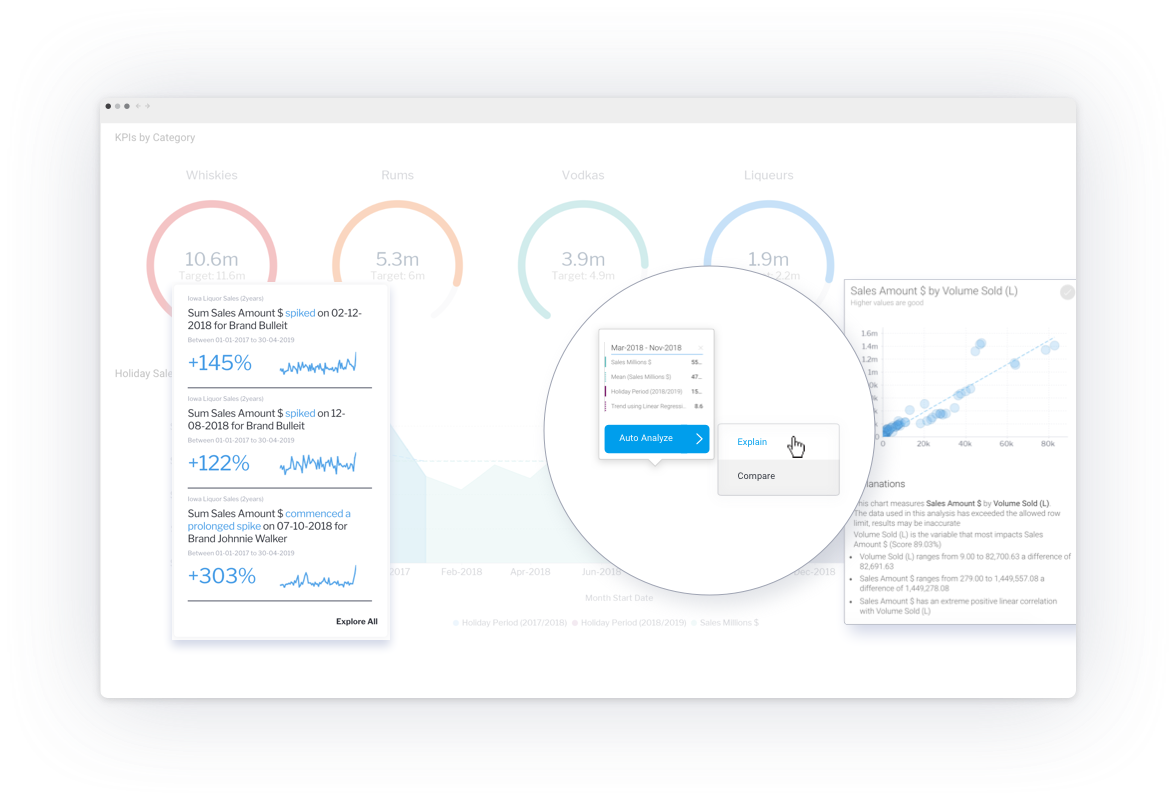
These automated insight features come in many variations including Google-like search bars and right clicks that automatically analyze your data to present the most statistically significant results. Then there are machine learning algorithms that constantly scan your data looking for changes, correlations and related insights and notify you of the most significant changes. This is the beauty of Yellowfin Signals - automated data discovery.
Machine learning and AI have transformed data discovery for business people. They can query the data directly from the dashboard with a click and get instant insights from across their data.
Got insights, now what?
Having insights at your fingertips is great, but what do you do with them?
Not knowing how to proceed is a big barrier to daily adoption of business dashboards. Any form of insight implementation requires people to switch to a different application and take action there.

For example, the stock of two items in a shop is low so the Purchase Manager switches to the stock management software to place a new order. The Digital Marketing Manager sees that a Google advertising campaign is performing particularly well, so they go to Google Ads to adjust the campaign spend. Then they go back to their BI and analytics tools to continue looking at their KPIs. There is a lot of back-and forth between applications. Inefficient.
The traditional dashboard is great at communicating information and it now offers insights, but it’s a workflow dead end.
There is a solution. If the dashboard code is made accessible to developers, they can code in actions - like buttons and forms - that allow the user to take action directly from the dashboard.
Let’s consider our retailer again. They could look at the stock levels of each SKU on their dashboard, see that one is running low, and use the ‘reorder’ button next to the report. Clicking the button will automatically update their stock management software with the new order for that SKU. Or the Digital Marketing Manager could increase the advertising spend by filling out a single box with a figure and pressing ‘submit’ on the dashboard against each ad campaign’s performance. The Google Ad campaign would get automatically updated to reflect the new expenditure.
Having actions embedded right into the dashboard - whether a button or a form - makes data truly actionable. And the business user’s workflow isn’t broken. You can check out Yellowfin’s Dashboard Code Mode to see what this could look like in your organization.
Is it too much to ask to make the dashboard engaging?
If you can create dashboard prototypes collaboratively, get automated insights at a click, and take action on those insights directly from the dashboard, you have a fully functioning, truly useful dashboard. There’s little reason people won’t start to use it in their everyday decision making.
But there is one final hurdle - the look and feel of the design.

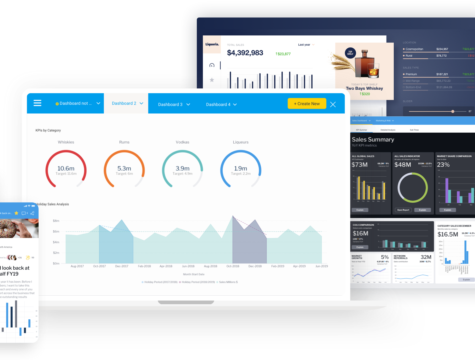
Yes, dashboards are supposed to be functional. They are designed to clearly communicate data. But it’s no secret that something that looks smart really improves user engagement. Every popular app and website has had considerable consideration put into their design. However, dashboards have traditionally kept people to the confines of a grid layout creating dashboards that look very same-y and uninspiring. The organisation’s brand is barely reflected in the analytics and the dashboards are dreary.
No more! With pixel perfect dashboard canvases that have the backend code exposed so the HTML and CSS can be edited as desired, a dashboard need never be blah again. Create dashboards that are graphic, break the grid confines, and that truly reflect the brand you work for in order to engage their audience.
A beautiful dashboard not only looks good, but it helps to visually guide the user through the information with graphics that represent the data they’re viewing and a design that help lead the user through the narrative of the dashboard’s data.
Conclusion
It’s no doubt that traditional dashboards are built on a lot of guesswork, make data discovery difficult, aren’t actionable, and need to have a design makeover to actually engage the user. Dashboards are still not getting much use. But not all is lost.
It’s time to start looking for dashboards that deliver what business users really want.
Business users want dashboards that:
- Are built from the start in collaboration with them
- Automate data discovery
- Allow you to take action from within the dashboard
- Look appealing and really engage with design
With dashboards that do all of the above, you’ll see people beginning to use their dashboards more regularly and begin the data culture change you keep dreaming of.
How to deliver dashboards that automate action
Get the full guide on automating action within your dashboards to get rid of the decision-making deadend.