

Creating a new Analytics Experience – we call it AX.
Do more with your dashboards.
If, like me, you are someone who uses data to make decisions (what we call a business user), I suspect your experience with analytics and in particular dashboards is mixed verging on the ‘not that great’.
How many times have dashboards been set up that you subsequently have failed to really use? The intention was there. That is, “we have all this data, let’s make more informed decisions with it” But in reality you end up not really looking. The data and the gold within it goes unnoticed and decisions and actions are made with the finest gut feel you can muster. The influx of all this data was supposed to mark a brave new world of data-led decision making. Yet here we are sticking our fingers up to the wind.
I can safely say you are not alone and It’s pretty easy to see why. Dashboards don’t seem to change often enough so any insights seem to come way too late. The data is so rolled up that they don’t seem to pick up the little gems that might guide us. If you do happen to stumble upon an insight, there is no workflow in a dashboard to facilitate a next step. On top of this, us non-data-analyst-types (most of the world) are not trained in properly using a dashboard or exploring data. And finally, they often look like rubbish and don’t have instructions – best left to the experts!
I believe the reliance on data experts to drive a data culture is the fundamental reason why most businesses fail to become data-led.
It’s the fault of BI companies just like us that got us in this predicament. You see, we have a problem – Innovation in the BI industry died about 30 years ago. Whilst dashboards may look a little better, what’s delivered to business users is exactly the same. And subsequently, businesses are still failing to be data-led.
At Yellowfin we have been on a journey to change this situation by thinking about the end to end BI process – where data comes from all the way to how a business user gets value from it – and creating a suite of innovative analytics products that consider the needs of all users, not just data analysts. This is abundantly clear in our recently launched Yellowfin 9 dashboards which captures our desire to bring relevance to one of most common tools.
A better experience for business users & analysts.
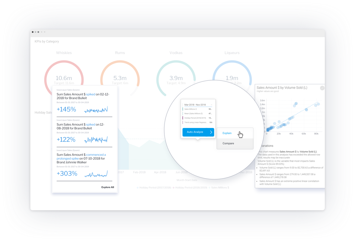
The introduction of machine learning to traditional dashboards in the form of automated analysis has enabled us to create dashboards that can analyse themselves. People like me will never pick up a change beyond the obvious but with automated insight discovery embedded in a traditional dashboard, I don’t need to. And when I find something, automated insights can explain the factors that may have led to the change, in generated natural narrative. This immediately changes the experience of a dashboard from monitoring to discovery and gives users a reason to check back regularly. Rather than stumbling around trying to find things, automation tells us where to look.
We have also introduced action buttons that enable workflows to be incorporated into a dashboard. Yes, now you can actually do something in a dashboard. Imagine (and we have built this) a dashboard that monitors your web traffic with GA and allows you to generate tasks in Jira or Slack off the back of poor performing pages – All in a dashboard.
These two features alone are quite possibly the biggest innovation to dashboards in a very long time.
A better experience for designers
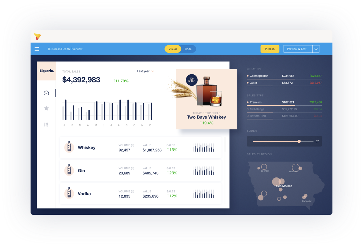
We believe that ‘design matters’ and people like using things (and buying things) that look and feel better. Until now, it’s been a somewhat difficult process to create really good looking dashboards. We now provide the tool kit that designers and developers need to build the pixel perfect dashboard experiences they want with all the flexibility and freedom they have come to expect.
Design freedom starts with the free form canvas created as part of our dashboard builder that gives designers the ability to break the grid. Almost all BI tools are grid based – so offering this flexibility immediately breaks many of the design constraints found in dashboards.
These features makes it much easier to create dashboards that need to meet any bespoke corporate brand or product requirements, an absolute must if you want to embed dashboards into your software or have them feel more part of the company mix.
A better experience for developers
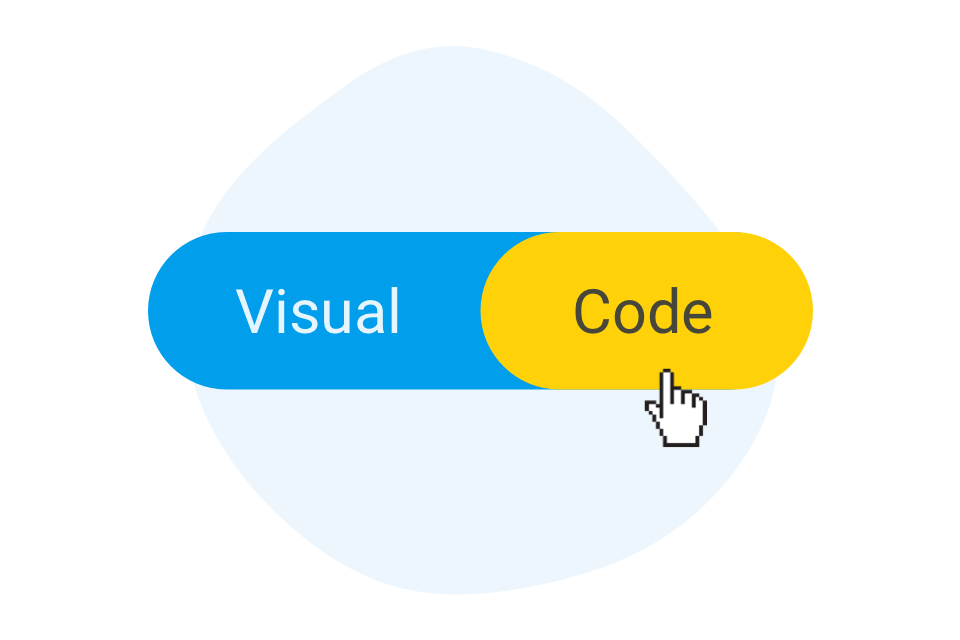
I won’t talk much about this as there are people in our organisation that are far better qualified to explain how we have changed the dashboard experience for developers forever. This includes ‘Code mode’, the latest edition to the developer friendly, open and extensible Yellowfin platform. Code mode allows a developer to see the code that dashboards generate – HTML, Javascript and CSS and then extend the capabilities of their dashboards – using development languages that they already understand.
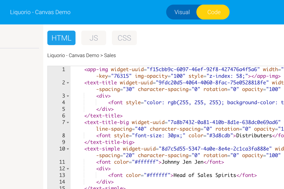
From an experience perspective, developers do not need to learn any new languages and can collaborate with others much like they do already. A key factor to bringing designers and developers into a place where their skills can be better applied to analytics was to not force them to do things differently.
An experience that facilitates collaboration.
Ultimately, our goal in creating Yellowfin 9 was to help facilitate more people across different skill sets being able to contribute to creating better dashboard experiences that should lead to higher usage and engagement rates.
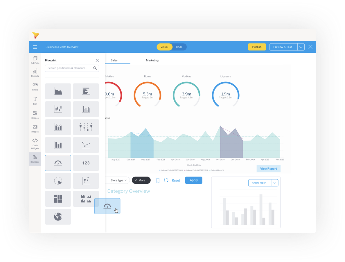
With our collaboration tool blueprint, a business user can ‘sketch’ what they might need using draggable prototype widgets and at the same time describe to the analyst exactly what they want placed there. Simple charts can be quickly created by analysts simply clicking on the prototype and initiating the report creation process to fulfill more complex data reporting needs.
In this way we have bridged the gap between the business user and the analysts, designers and developers who are building content for them by making it incredibly easy to define exactly what is required in a dashboard without needing the skills to actually build it.
Finally designers and developers can build out and enhance the dashboard using in-built design and developer tools.
A better analytics experience
Our innovative approach to dashboards has been built off a belief that more people will use dashboards if they are simply easier and better to use, that is; facilitate insight discovery, give you something to do with your learnings and of course look amazing. I actually can’t wait to see what our customers will do given the freedom they now have to do things with dashboards that we haven’t even thought of.
Explore Yellowfin Dashboards or click here for a full list of features