

Makeover Monday with Yellowfin: African American Baseball Participation
Makeover Monday is a social data project where each week the organisers post a link to a chart and its data, and then people rework the chart. Maybe they re-tell the story more effectively, or find a new story in the data.
For this week’s Makeover Monday, the data set was participation rates by race in Major League Baseball (MLB) over time. The time to do the makeover is typically short on this sort of exercise (it’s suggested to time-box to an hour) so this post is a little bit of a walkthrough on how we built our submission, and how we could have done it better.
Here is what we did:
Getting Started
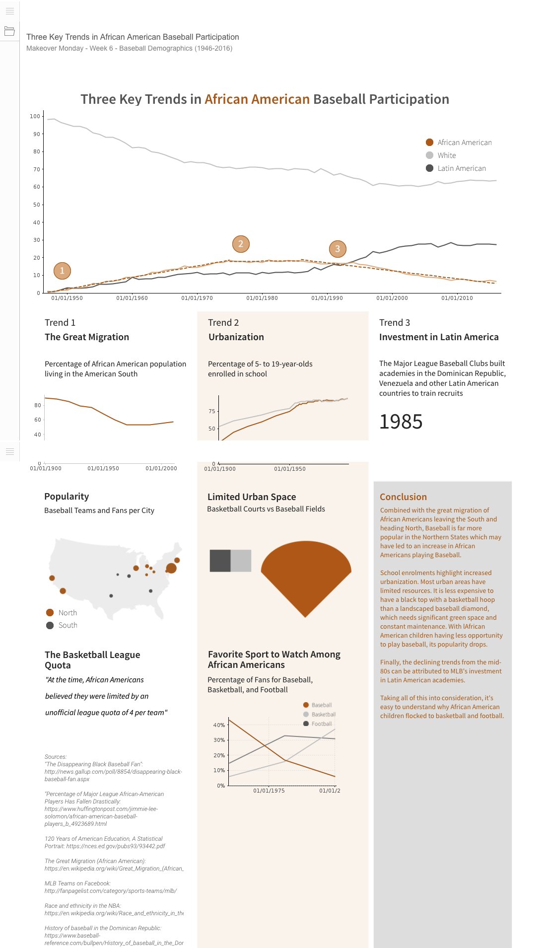
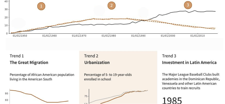
The first thing we did was analyze the data: just looking at a simple plot of the 3 lines (White, African American, and Latin American). Being Black History Month, we focussed on the African American participation rate.
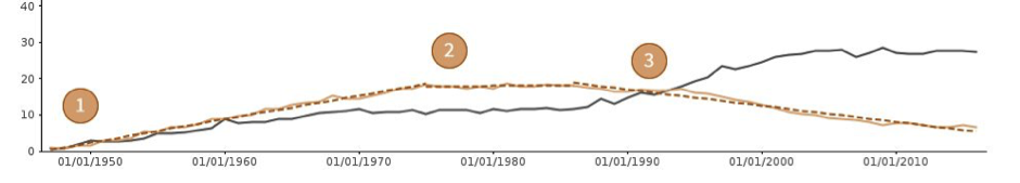
What struck us immediately were the three distinct trends: pre-1975s growth, the 1975-85 plateau and post-1985 decline.
We believe that when creating a visualization, it is simply not good enough to describe what’s there. If the viz is well designed, the trends are self-evident and should not need further discussion. Instead we focussed on the Why i.e Why are we seeing such trends in the data?
Hypothesis and Research
Having identified the trends, our goal now was to explain them. So we brainstormed a few possible explanations: being massive fans of African American music, we thought that the 1975-85 plateau could be due to massive social changes in Black America which were also echoed in the rise of hip hop in the 70s. This would reflect both urbanization and a possible shift in popularity to basketball.
With a bit of web research we found that, yes, black urbanization (versus whites’ shift to the suburbs) could and did have an impact. Not having the space for a baseball field made it super hard for children to start playing the sport – whilst a half basketball court or simply a ring could be just about anywhere. If you can’t play a sport we can also assume that the overall popularity of the sport in that demographic would wane overtime – and it did.
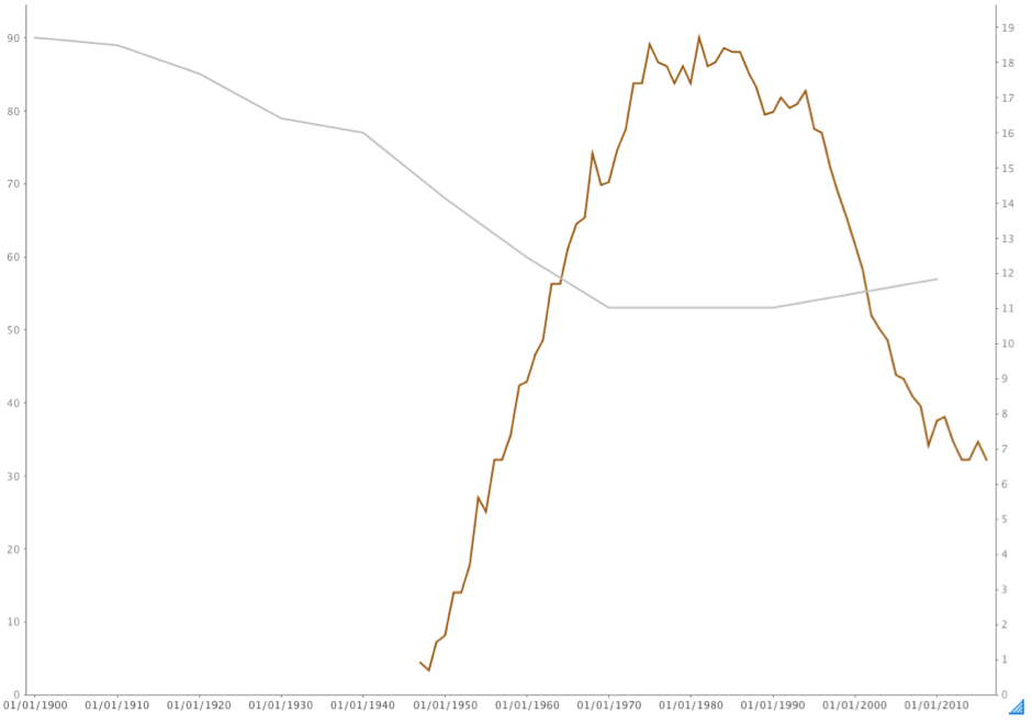
Our research also uncovered a very interesting fact: the great migration. The great migration was African Americans leaving the American South and heading to the northern states. Interestingly, the migration trend completely mirrors the growth in participation pre-1975. Why was this so? Google the most popular baseball teams and you’ll find that overwhelmingly they are in the North. So as more African Americans move to the northern states, they naturally start to take part in the local and most popular sport at the time (a trend compounded by the belief that quotas existed for other sports limiting black participation).
Lastly, what happened post-1985? For baseball participation, the percentages for Latinos goes up, and down for African Americans. A bit of desk research on the topic and you’ll find that the MLB invested heavily in Latin America as a source of players – diverting funds that would have helped disadvantaged African Americans from entering the sport.
That’s Trend 3 ticked off.
The Data Set(s)
As part of the research, we managed to get a couple of extra data sets as well. We merged these with the main data set provided by the Makeover Monday team.
The Viz – A Critique
Firstly, the trends
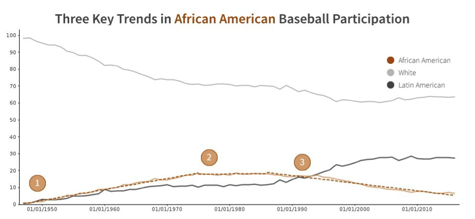
We applied Set Analysis to isolate the 3 trends.
This basically filters the data to different periods of interest and allows separate trends to be seen. It also helps to show the user precisely what we are investigating. An awesome feature in Yellowfin (yes, I am a bit biased) and really highlights the areas you are interested in analyzing.
Since we identified 3 trends, we decided to create 3 columns to tell the story of each trend individually. These columns also aligned somewhat to the actual numbered dots on the chart. These columns were created on the Canvas – just via the placement of content to create a sense of 3 specific columns, text, and charts. On the whole, this worked very well and the background colours were applied to help separate them and make them more obvious.
Trend Dots
The trend dots were images placed on the canvas – we could have used text and shapes – but this was a touch faster. A nice touch would have been to anchor the trends i.e click on a number in the line chart and jump to a trend column (that is currently not possible in Yellowfin – we will add that to the Canvas wish list!). Alternatively, we could have also moved them up slightly, aligned them with each other and centrally to the specific trend column – to look more like annotation.
The Great Migration
Although the trend mirrors the growth of black participation in baseball, what we should have done was to overlay the two series. This would have been a lot clearer than just a single line chart. In this case, because of the different scales we would have used a dual axis to overlay them and better show the relationship.
Popularity
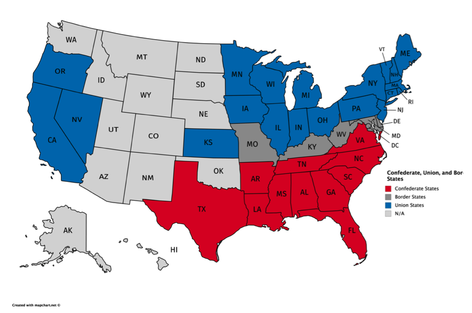
For the map image, we actually took the data which was geocoded, used Yellowfin to plot it on a map, and then used that map to create a simple vector image of the US. This allowed us to remove all other superfluous map data. Thinking back, it would have been good to actually highlight on the map the union versus confederate states. Even though the cities are colour coded, this would have made the map’s details a little bit more obvious.
Urbanization
This chart probably needed its own explanation – explaining the reason why school data was used as a proxy for urbanization, etc.
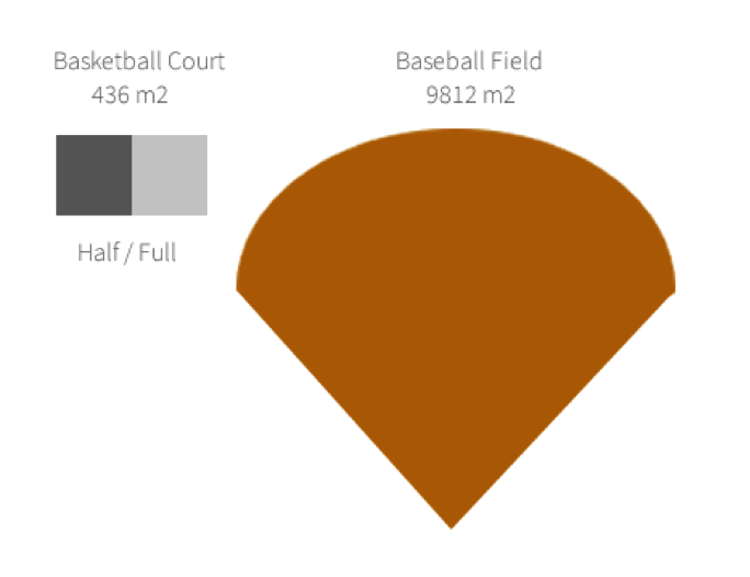
Limited Urban Space
A little rushed in this one. We should have labelled the basketball court for clarity – full and half as well as the baseball field. Adding the actual area would have been a nice touch too. In fact, in adding the area we realised that the image was not scaled correctly: baseball fields are WAY bigger.
Latino Participation
We should have added an additional chart showing Latino and African American participation with an annotation at 1985 – just to further highlight the relationship and shift.
Conclusion
This was a super interesting data set (thanks Eva and Andy!) – not because it was about baseball but because we feel it tells a compelling story about Black History in America. Scratch the surface on baseball participation and you have a story of post-civil war mass migration, adoption of northern states sports and customs, and the growth of black identity in post 60’s America.
If you’d like to participate in Makeover Monday, come join us at Data.World, otherwise you can follow our submissions and interact with us on Twitter and Instagram.