

Makeover Monday with Yellowfin: Global Drugs and Medicines Exports
Makeover Monday is a social data project where each week the organisers post a link to a chart and its data, and then people rework the chart. Maybe they re-tell the story more effectively, or find a new story in the data.
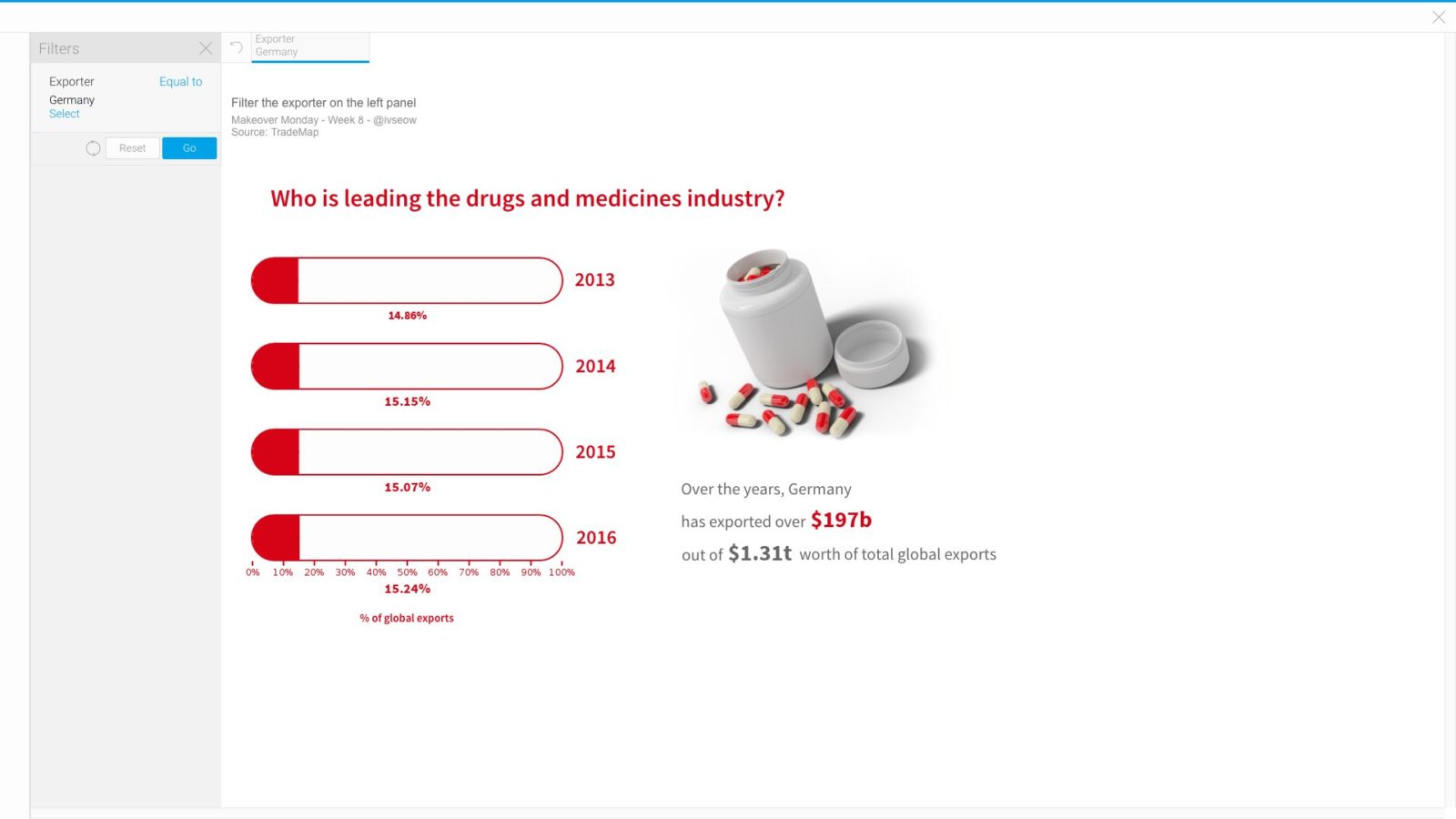
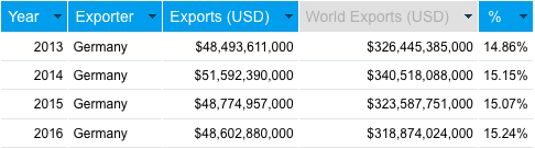
For this week’s Makeover Monday, the data set was around global exports of drug and medicines from 2013-2016 which comprised of 3 columns: exporter country, export year, and total exports (USD). A fairly simple data set and rather than embarking on a deep analysis, we decided to have some fun with the visualization this week with a red/white “pill” theme and allow interactivity.
Here is what we did:
Getting Started
We wanted to have a pill for each year from 2013-2016 and having it show the % exports against the world for a selected country. With that in mind, we grabbed the initial columns and then performed a basic Sub Query to append the “World Export (USD)” data as a column. This is because the initial World Export value was only available as a row within the dataset. The % ratio was then calculated with a simple Calculated Field.
Visualizing the Pill
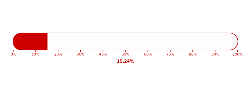
The pill aesthetic was done via a Thermometer chart.
The configuration and styling options for Meter, Thermometer, and Gauge charts are really flexible, so much so that a Thermometer could be turned into a Bullet Chart as well. To achieve the pill aesthetic for our submission, we styled the Thermometer chart with these configurations:
- Outline, Tick Line, Indicator, and Band Color: #cc0000
- Outline Width: 2 px
- Show Tick Lines: Major
- Major Tick Units: 10
- Major Tick Length: 6 px
- Show Value: Yes
- Manual Target: 100
- Show Bulb: No
- Orientation: Horizontal
- Rounded Corners: 100
One Pill, One Year
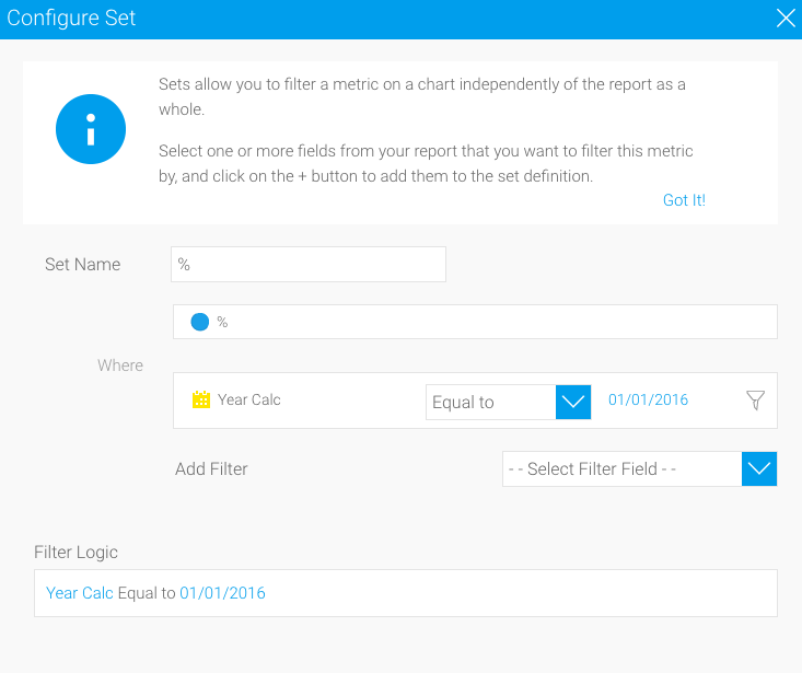
To make each pill show a particular year, we used Set Analysis to only grab the % ratio for a specific year.
Dynamic Text in a Widget
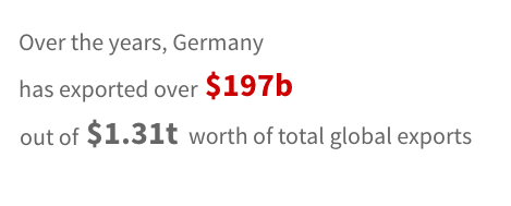
With the Exporter Country being available as a filter, readers could select a country and see its export % grow or decline over the years with the “pills” on the canvas. To offer some context around monetary values, we also included a text widget that dynamically updated according to the selected country. To achieve this, we utilized Parameter Replacements within a Text Widget.
Parameter Replacements within a Text Widget allow authors to print out filter or column values directly into a Text Widget. Since we only have a one Exporter Country filter in this instance, we refer to it as [filter:1]:
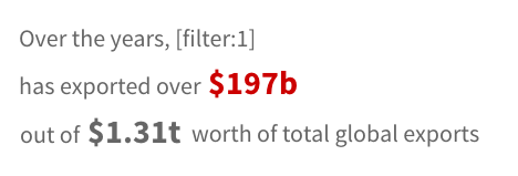
Upon filtering the published chart, readers will then see a dynamic narrative based on their filter selections:
And that’s it for this week!
If you’d like to participate in Makeover Monday, come join us at Data.World, otherwise you can follow our submissions and interact with us on Twitter and Instagram.