

What is a KPI Dashboard? 6 Key Benefits & Best Practice Examples
TL;DR
KPI dashboards provide a real-time view of your most important metrics, helping teams track performance against strategic goals. When designed correctly, they are clear, focused, and tailored to specific business roles. A well-built KPI dashboard improves accountability, speeds up decision-making, and keeps teams aligned around shared priorities. With Yellowfin, you can create customizable, white-labeled dashboards that combine KPIs, narratives, and alerts in one unified view.
Try Yellowfin free
From business-wide objectives to long-term targets, every organization has specific metrics they need to track. One way to communicate those insights is a KPI dashboard.
Key performance indicator (KPI) dashboards are a great way for executives to improve their management of strategic goals, and keep on top of changes, issues and trends in performance at a high-level, with many useful applications when used correctly, alongside other modern business intelligence dashboard and analytics tools.
This blog covers the role of KPI dashboards can play in organizations today, its business benefits, and best practice examples to ensure your users can get the most out of them.
What is a KPI dashboard and what are they used for?
Simply put, KPI dashboards are visual tools that indicate your key performance indicators using charts and graphs. It shows you how your company is doing in a quick and easy way, using important numbers and graphics. Think of it like a central command center where you can see everything at-a-glance, allowing you to make smarter decisions based on real information, not guesswork. These dashboards can be customized for different parts of the company, so everyone has the information they need to be informed before making day-to-day and long-term business decisions.
As an example, a KPI dashboard could be used in your company as a top-level graphical summary of core business objectives, or more specific outcomes like departmental targets. It can be referenced at-a-glance to more efficiently track your general progress toward set goals, analyze performance and spot emerging trends before they happen.
With supporting charts and tables, key performance indicator dashboards also allow users to compare and understand the detail behind the numbers. Many line-of-business users may not readily ascertain insights from just viewing spreadsheet metrics alone; having interactive data visualization opens new avenues for evaluating overall organizational performance.
Most importantly, they provide helpful high-level insight into performance, rather than every single detail. They don’t provide all the answers for a user, but act as a springboard to determine which areas of the business may need deeper or additional analysis.
Read more: KPI dashboards - Official definition and meaning
What do KPI dashboards include?
Every BI and analytics platform is different, but typically modern KPI dashboards can make use of a wide range of different data visualizations and KPI categories, including conversion rate, revenue growth, churn rate, budget threshold, net profit, share-of-voice (SoV), etc.
The best solutions allow you to build clear and dashboards tailored to each user’s requirements, whether they’re a leader in charge of a department or a project manager handling accounts, with visualized KPIs highlighted based on their relevance.

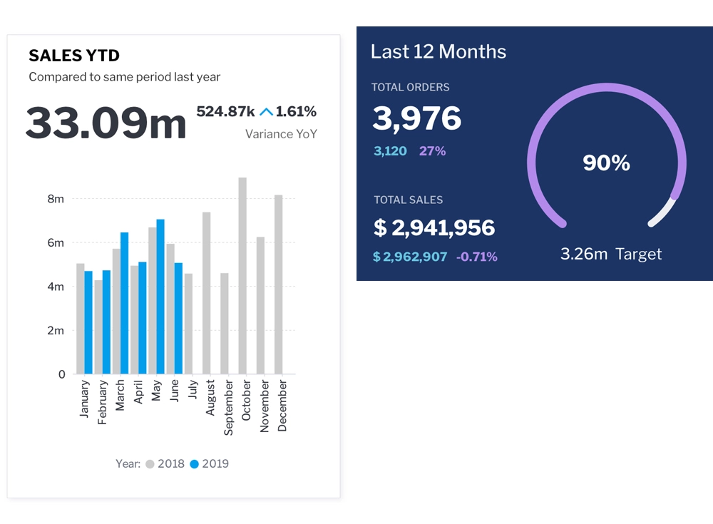
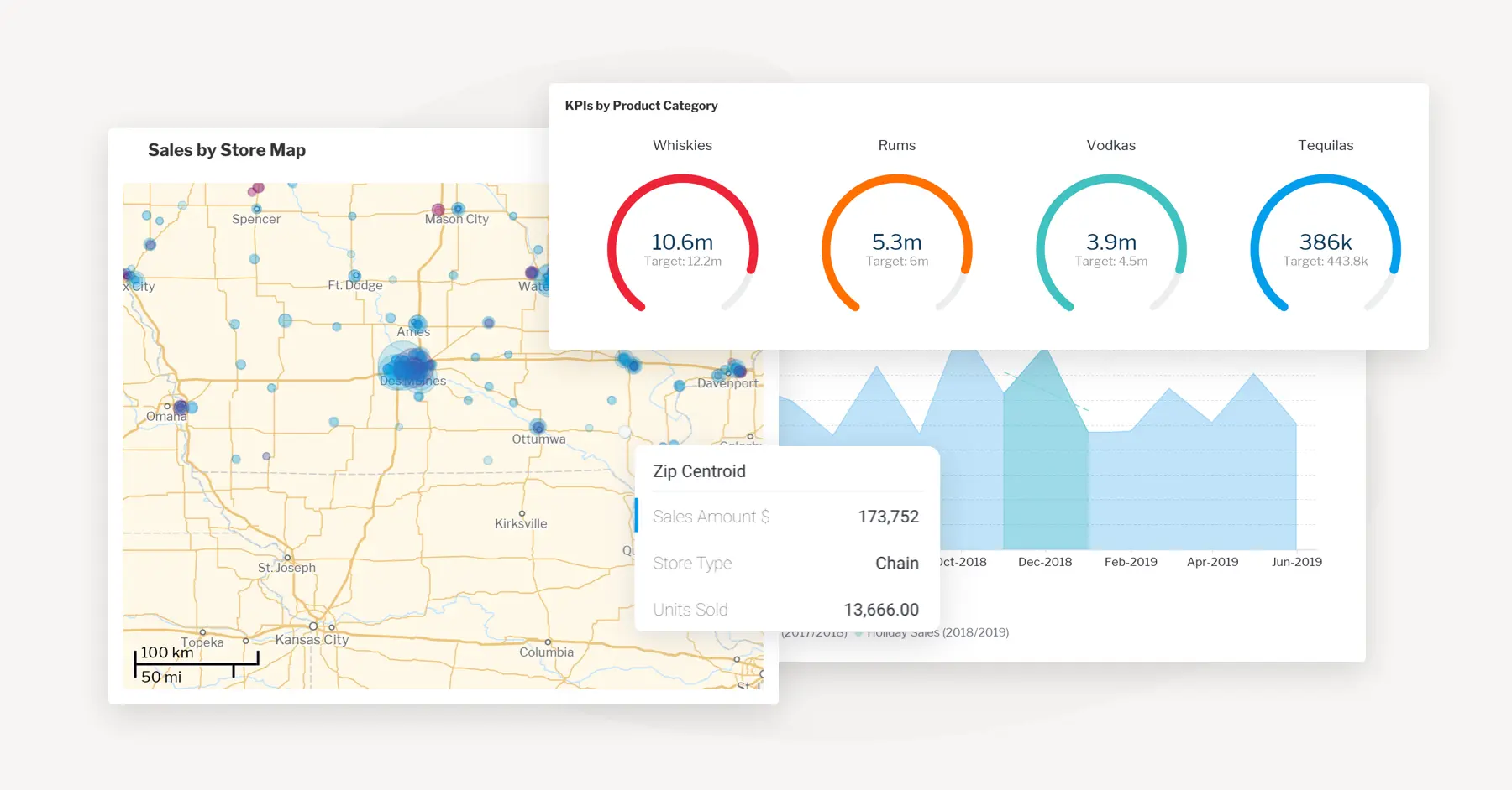
For example, in Yellowfin’s best practice KPI dashboard example, which you can view in our interactive dashboard gallery, sales are provided a high level overview of year-on-year liquor sales across KPIs, products and store locations. Within it, you can:
- Find latest updated numbers for major overarching KPI categories, such as Sales YTD
- Filter through KPI categories to slice-and-dice and view different perspectives
- Drill down deeper within the dataset, such as through a specific data hierarchy; from overarching product category -> specific types of whiskey
- Drill through data by clicking on any KPI segment to be brought into another linked chart or report for that selected segment for more detail; sales YTD -> Sum sales total amount -> sales by brand -> brand sales itself
- Explore sales by store map, featuring an interactive heatmap of each store region
We recommend checking out Yellowfin’s dashboard hub for a deeper look into the level of actionable insights made possible with our KPI dashboards and full product suite.
Best KPIs dashboard examples
Sales KPI dashboard
The sales dashboard KPI is designed to assess the efficiency of your sales mechanisms. This complete overview enables sales managers, executives, and other stakeholders to easily and quickly monitor important performance indicators in their analytics workflow.
This type of KPI dashboard aids in the early detection of possible deficiencies by actively examining these parameters, therefore mitigating their major influence on your financial performance. This facilitates the use of data to make informed decisions in order to improve sales tactics and guarantee continuous success.
Here are some key indicators that are displayed in a sales KPI dashboard:
- Average deal size
- Sales revenue
- Cycle length of sales
- Sales growth
- Customer retention rate
- Conversion rate
Operational KPI dashboard
The operational key performance indicator dashboard is essential for middle managers and operational teams in daily management tasks. This type of KPI dashboard is designed to provide practical and useful information, including important measurements relating to effectiveness, manufacturing, inventory management, and the usage of resources.
The operational key performance indicators dashboard typically includes metrics like:
- Efficiency ratio
- Customer service metrics
- Production output
- Quality metrics
- Inventory turnover
- Cycle time
Marketing KPI dashboard
A marketing key performance indicator dashboard helps marketing professionals examine and improve their strategic approaches. This type of KPI dashboard provides a detailed picture of marketing success, allowing teams to assess the effectiveness of their campaigns, identify effective channels, and fine-tune their strategy for maximum results.
Outlined below are the core metrics typically included in a marketing KPI dashboard:
- Lead generation
- Email marketing metrics
- Website traffic
- Conversion rates
- Social media engagement
- Cost per lead (CPL)
Executive KPI dashboard
There is a lot for executives to do, and it can be hard to keep track of every KPI. One way to do that is with an executive key performance indicators dashboard. Consider it like a personalized cheat sheet made just for business goal management. This is the most important data about the health of the company in one place, so management can quickly see how things are going.
Here are a few key metrics that the executive KPI dashboard typically includes:
- Revenue growth
- Return on investment (ROI)
- Profit margins
- Sales growth
- Customer satisfaction
- Employee engagement
- Customer acquisition cost (CAC)
By closely monitoring these key performance indicators, teams are given the authority to simplify procedures, identify areas of operation bottlenecks, and enhance everyday workflows to achieve better performance.
6 key business benefits of KPI dashboards
Today’s users have the luxury of having advanced analytics solutions, such as automated business monitoring, embedded analytics and natural language to help them analyze their data. However, for operational use cases, a unified KPI dashboard is still a great BI tool to use to find quick answers for top-level questions related to performance.
Below, we summarize 6 key benefits KPI dashboards can bring, when used correctly:
1. Detailed dive: KPI dashboards allow users to organize, filter, drill down, analyze and visualize their most important key targets for any given business area or project in a highly interactive way, which typically helps translate large, complex data into an easy-to-understand format, instead of having to wade through non-curated, unfiltered datasets.
2. Discover changes or issues at scale: Whether they’re segmented by department, overarching objectives or high-level targets, having an organized dashboard that displays critical KPIs next to each other allows users to easily and instantly determine which outcomes are being met according to targets, and what may demand priority or need detailed examination to take effective remedial action.
3. Efficient decision-making: KPI dashboards bring the most critical operational data of a business into one convenient place, helping eliminate data silos in the business, make reporting of KPIs more visible in general and increase efficiency in analyzing performance, setting objectives, allocating investment and improving user workflows.
4. Increased collaboration: Having a high-level visual overview of progress toward KPIs fosters better collaboration and communication among users, as everyone has shared visibility and fast, ready access to the same dashboards to discuss performance and where the team can come together to improve it.
5. Real-time ROI analysis: With the ability to monitor and analyze the organization’s most important performance metrics in real-time, users can see which decisions and investments have worked and by how much, allowing for more proactive analysis and the ability to drive better financial outcomes long-term.
6. Unearth new opportunities and trends: KPI dashboards help users to spot discernable patterns in their data, and unearth potential opportunities and areas of strength (or underperformance) to define or refine their objectives, and enhance and improve the overall performance of the business
How to build a KPI dashboard: Best practice
The best KPI dashboards display an organization’s most important metrics by following key dashboard design principles (more detail in the link). Here’s a quick summary:
- All critical targets and information must be presented clearly to guide the user through a data journey based on their use case (department, project, etc)
- Visual consistency in colors, graphic elements and topography
- Effective use of language (fonts, headers, etc) to highlight critical metrics
- Efficient use of interactive elements (buttons, links, etc) to lead to appropriate action
- Careful balance of only displaying what the user needs, so they are able to interpret and use the data presented in front of them without cognitive overload
At the end of the day, a user can only get insights out of the data presented on a KPI dashboard if the way it is built, designed and offered to the user follows core principles. Without, the metrics on display may lack clear meaning or usability for proper analysis.
How KPI dashboards can transform your business
In conclusion, KPI dashboards help businesses succeed in today's data-driven world. These dashboards provide clear insight into your company's growth potential and future plans by centralizing your most important key performance indicators in one place.
However, a key performance indicators dashboard is a tool. Its effectiveness depends on how you design and use it. Top practices like creating objectives and choosing KPIs can turn your dashboard into a strategic asset. Always be mindful to use these dashboards to promote data-driven decision-making in your company, above all else.
FAQs
Q: How many KPIs should be on a dashboard?
There is no one-size-fits-all solution, but it is critical to minimize information overload. Aim for a focused dashboard that values clarity. Ideally, focus on 5-10 KPIs that are relevant to your particular objectives. This enables consumers to quickly assimilate information and make educated judgments.
Q: How can I ensure the security and confidentiality of data within a KPI dashboard?
Here are some practical methods to make your KPI dashboard secure.
- Data encryption: This process transforms data into a coded form that only authorized parties can read with a key.
- Authentication: This helps prevent unauthorized access, tampering, or spoofing of your dashboards. You can use passwords, tokens, certificates, or biometrics.
- Data masking and anonymization: This can help protect sensitive data.
- Access control and audit policies: This can help protect sensitive data.
- Regular testing and review: This can help ensure the dashboard protects sensitive data.
Q. What is the right way to integrate KPI dashboards with other business systems (ERP, CRM)?
When integrating KPI dashboards, ensure data compatibility and integrity across all other systems. Define a clear data governance model to maintain data accuracy and consistency. Use APIs for seamless data integration and consider middleware solutions if direct integration is complex.
Furthermore, plan for data synchronization frequency that matches the decision-making speed required by users. Always address security protocols and ensure that data transmission between systems is secure.
Q. What is the main purpose of a KPI dashboard?
A KPI dashboard’s main purpose is to give users a clear, real-time view of their most important metrics so they can make faster and smarter decisions. It consolidates scattered data into one place, turning complex information into simple charts, visuals, and insights that help track performance against goals.
Q. What are the essential elements of a good KPI dashboard?
A good KPI dashboard includes clear and relevant KPIs supported by easy-to-read visualizations and consistent color themes. It should offer useful filters that help users explore data, along with drill-down or drill-through capabilities for deeper analysis. Real-time or scheduled data refresh also plays an important role in keeping the information accurate and actionable. Together, these elements ensure the dashboard delivers value without overwhelming the user.
Q. What are the most common mistakes to avoid when building a KPI dashboard?
Common mistakes when building a KPI dashboard include adding too many KPIs, which can confuse users, or using overly complex visuals that are difficult to interpret. Many dashboards also fail because the KPIs aren’t aligned with actual business goals or because the colors and formats are inconsistent. Other issues include ignoring mobile-friendly design and not refreshing the data regularly. Avoiding these mistakes helps ensure the dashboard stays useful, clear, and actionable for decision-makers.
Q. Who should use a KPI dashboard in an organization?
KPI dashboards are useful across almost every team in an organization. Executives rely on them to monitor company-wide performance, while sales teams use them to track pipeline progress, revenue, and growth. Marketing teams benefit by analyzing traffic, leads, and ROI, and operations teams use dashboards to measure efficiency and output. Finance teams monitor expenses and profit margins, while customer service teams track tickets and satisfaction levels. Essentially, anyone who needs to monitor performance and make data-driven decisions can benefit from using a KPI dashboard.
Q. How often should a KPI dashboard be updated?
The ideal update frequency for a KPI dashboard depends on how it’s being used. Real-time updates are best for sales, operations, inventory, and customer service teams that rely on immediate insights. Marketing and general performance dashboards often work well with daily or weekly refreshes, while executive summaries and financial reports are usually updated monthly. Overall, the update schedule should match the speed at which decisions need to be made.
Q. How do KPI dashboards improve business performance?
KPI dashboards improve performance by helping teams identify problems early and making goals and metrics visible to everyone. They enhance accountability, support data-driven decision-making, and make it easier to spot trends and opportunities. By reducing the time spent on manual reporting, dashboards turn raw data into clear, actionable insights that drive better results across the organization.
Q. Are KPI dashboards only useful for large organizations?
KPI dashboards aren’t just for large organizations—they’re equally valuable for small businesses, startups, and mid-sized companies. Even small teams can benefit from tracking essential KPIs such as sales, cash flow, marketing performance, and customer activity. With modern BI tools like Yellowfin, creating dashboards has become easy, accessible, and affordable for businesses of any size.
Q. What types of KPIs should be included in a dashboard?
The KPIs you include in a dashboard should directly support your business goals. Sales teams often track metrics like revenue, pipeline status, and win rate, while marketing teams focus on leads, traffic, and conversions. Operations may monitor efficiency, output, and cycle time, and finance teams typically analyze cost, margin, and ROI. Executives look at broader indicators such as growth, profitability, and retention. The key is to avoid vanity metrics and focus on KPIs that genuinely support decision-making.
Try Now: Yellowfin KPI dashboard examples
Yellowfin’s action-based, interactive dashboards are designed to make it as easy for users of all skill levels to monitor, explore and use KPI dashboards to inform decisions. See for yourself in Yellowfin's Dashboard Live Gallery.