
Yellowfin 7.3+: Creating next-level visualizations with JavaScript Charts
Yellowfin 7.3 allows you to bring your external JavaScript chart libraries into the platform.
If you have been following our Yellowfin 7.3+ beta, you would’ve seen the recent blogs on our new Conditional Canvas Widgets, as well as the refreshed Meters, Dials, and Gauge charts.
Is that all for data visualization in the Yellowfin 7.3+ release?
Not even close.

We listen to customer feedback, and you have let us know that sometimes, you just need a specific or next-level data visualization that isn’t currently available within the chart library. So rather than wait for new charts to be natively added into the platform, we have enhanced Yellowfin in such a way that all of your external JavaScript chart libraries can be brought into the platform.
From Sankey Diagrams to Force-Directed Network Graphs, D3.js libraries to GoogleCharts – you can now bring all of that into Yellowfin Charts.
If you can imagine it, you can create it within this framework.
How does this work?
In Yellowfin 7.3+, we have introduced a new chart type called JavaScript Charts.
For a quick instructional video on how to get this going in Yellowfin 7.3+, check it out here:
Within this framework, users are enabled to utilize popular JavaScript chart libraries, even add their own code customization, and style it whichever way they like.
This new framework is implemented with RequireJS, an incredibly powerful AMD compatible asynchronous script loader to encapsulate JavaScript libraries.
This functionality is also integrated directly into the Chart Builder, thus leveraging Yellowfin’s enterprise security, governance, and content migration capabilities.
Options – you’ve got plenty of them!
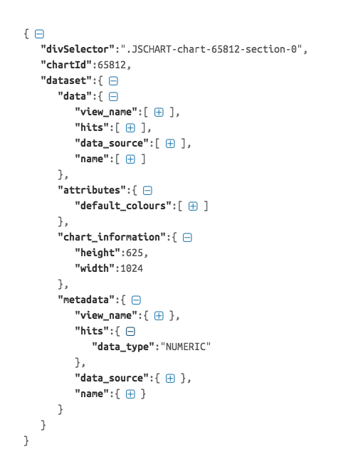
To allow our users to pipe Report data into these new libraries, we have introduced the Options JSON object.
This Options JSON object contains not only Report data but also column metadata – this allows our users to manipulate and process data as they see fit for their respective chart libraries. Other useful metadata including Org Ref Codes, default colour palettes, and conditional formatting colours are included in this object as well!
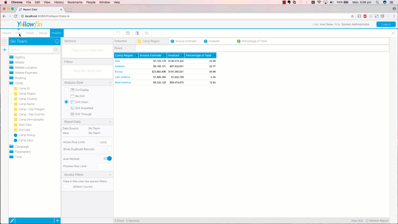
A simple example of using the Options JSON object within the JavaScript Chart framework is seen below where each Camp Region and its Percentage of Total values are fed into a D3 LiquidFillGauge chart:
Want to find out more? Register for the official Launch Webinar HERE