
How to use the chart ‘animation’ option
24 January, 2011
You can animate your chart, so that you can watch how it changes over time.
Below is a little tutorial on how to use this option.
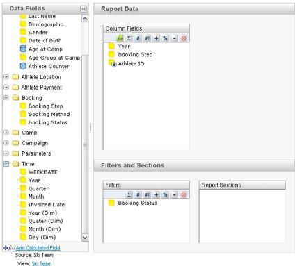
Create a report using the following fields:
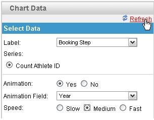
Using the following chart options:
Note:
You can only set animation on time fields.
A chart will be generated for each time period, so using many different time periods will take a while to generate.
It also a good idea to change the title of the report to use the animation field, this way the report name is dynamically updated with the data.
Below is a little tutorial on how to use this option.
Create a report using the following fields:
Using the following chart options:
Note:
You can only set animation on time fields.
A chart will be generated for each time period, so using many different time periods will take a while to generate.
It also a good idea to change the title of the report to use the animation field, this way the report name is dynamically updated with the data.
suggest to change the animation to random. Example, in meter chart the needle will swing when first loaded and settle down at the actual value.
So, no need to depend on so many data value.
Auto swing, the needle will go up 20% of the actual value and go 20% below the actual value and finally settle down at actual value.
This method will be much more simple.
So, no need to depend on so many data value.
Auto swing, the needle will go up 20% of the actual value and go 20% below the actual value and finally settle down at actual value.
This method will be much more simple.
Hi,
How can your animation field be a character? I can't do this using Yellowfin 7.
Thanks,
Kathryn
How can your animation field be a character? I can't do this using Yellowfin 7.
Thanks,
Kathryn