
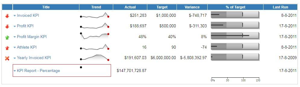
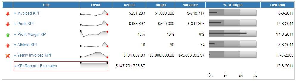
KPI Dashboard TABS – Trend Display
17 August, 2011
The Trend field is displayed using a Sparkline Graph.
This compares the current version of the KPI report run with the previous version, indicates change and whether it is positive or negative.
If the report contains a time field then the trend is display based on time, though if there is no time period, then the trend will depend on each time the report is run (if the data hasn?t changed, the trend will stay the same).
Below you can see no trend line as the report has not run yet:
Below you can see a flat trend line as the data hasn't changed since the last run/refresh:
For more information on how to create Dashboard and KPI reports please see the Dashboard Tutorial Guide.