What data tells us about crime during lockdown
Recently, we took another look at our Chicago crime dataset to see what was different in crime as a result of the COVID-19 lockdown and what we found was fascinating. This is a dataset provided by the City of Chicago that tracks any type of reported crime. We often use it to demonstrate the power of Yellowfin.

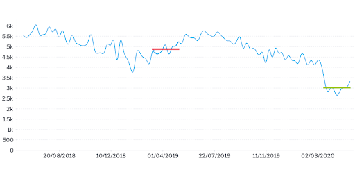
This chart shows crime rates in Chicago over the past two years. You can see there is a significant drop in crime in March when the city went into lockdown compared to the average at the same time last year. But not all crime went down to the same degree.
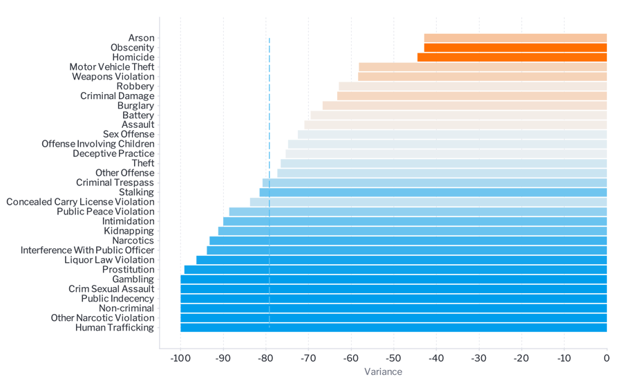
In this next chart, you can see the percentage change from April 2019 compared to April 2020.

While all types of crime have gone down, the orange bars show that there was relatively more of some types of crime compared to last year. What's really interesting is that gun violence and homicide haven't changed much. I think this is because the motivations for gun violence transcend the environment. If you want to shoot someone, you’re not going to be held back by the fact that you’re supposed to be staying at home.
The blue bars show where there was relatively less of that type of crime compared to last year. We believe this has to do with the propensity to commit that crime decreasing. If you’re in lockdown you’re not out getting drunk with friends and are less likely to do criminal damage or assault to someone outside your home. So on the whole, crimes that involve being outside and in environments where assaults could happen are dramatically down because people have less opportunity to commit a crime.
Looking at the dark blue bars, we think the police are reducing contact with people due to social distancing. So crimes like drug possession have gone down dramatically. Now, I don't believe that people are taking less drugs, I just think the police are spending less time arresting those people.
Interesting trends
Interestingly domestic violence was really stable over this time, which is one crime I expected to go up a lot due to the lockdown. The only reason we can think of for this is that if you're in lockdown you don't have an opportunity to leave the environment you’re in and therefore you're less likely to report an incident.
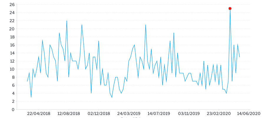
Another interesting trend we saw was that there was a huge increase in weapons based assaults on April 7 as you can see on this chart.

This happened to coincide with a particularly warm day in Chicago. Historically, if you look at the data you can see that's quite normal - the first warm day of spring tends to bring with it a lot of gun violence in Chicago. This year, perhaps there was also some pent up demand as people had been locked up for several weeks by this stage. But what I found most interesting was the media response to this spike in articles like this.
It's all about context
The articles commented on the spike in crime but they didn’t talk about the context. They didn’t talk about how other types of crime are down or how it's not unusual for crime to spike on the first warm day of spring. Instead, they focused on whether the police and health system are going to be overwhelmed by this “crime wave” which was actually just one day with a spike of 25 incidents in a city with nearly three million people.
To me, this speaks to how people use data. They look at a tiny sliver or a point of time and don't give any context about whether what’s happening is normal, consider historical data or what's happening elsewhere. So, if you're a person living in Chicago, you end up fearing for your life because you assume the city's under siege because of just one day.
If you look historically at crime in Chicago, it's actually gone down dramatically in the last 20 years. This goes to show how important it is to look at the trends and context when you’re looking at data. By using Yellowfin for our analysis we were able to actually understand what changed in Chicago and give context to the data.
How to use data to change behaviors
The government's response to COVID-19 is a good example of failed leadership from a data perspective. They’ve failed to use data to take people on a journey.