

Yellowfin Stories and Present: 5 features that change how data flows through your organization
Whether you’re an analyst or non-technical, Yellowfin Stories and Present, our exclusive data storytelling features, make it easy to create and share data-led narratives with peers that provide insightful context, inspires action, and fosters a data-driven culture.
Now, it’s no secret Yellowfin have been big believers of data storytelling since day one. It’s a massive part of our analytics solution, with two dedicated data storytelling modules, Stories and Present, that provide every one of your analytics users with the ability to combine trusted data with the power of words and rich media.
But just how does Yellowfin’s data storytelling features change how you use data throughout the business? Today, we cover 5 features of Stories that are huge reasons you should be paying closer attention to the benefits storytelling bring to your business.
Blog Contents
hide
Feature # 1 - Data Storytelling Feed on your dashboards
Having a single pane view for understanding what happened and why is core to Yellowfin. Instead of having to toggle between different products and workflows, they’re all integrated directly onto dashboards, so users can see the most relevant data, understand what it means, and act on it in the same interface. It’s why we have augmented analytics capabilities, such as automated business monitoring with Signals, and natural language, provided in Assisted Insights, integrated into our dashboards. Back in Yellowfin 9.6, we introduced the Data Storytelling Feed to bring relevant data stories directly into dashboards, too. The first feature of its kind across any BI tool in the world, the Data Storytelling Feed allows dashboard designers to incorporate data stories directly onto a Yellowfin dashboard. This feed, customizable in appearance, can be set to only show stories relevant to content on the dashboard. Business users can even create new data stories instantly from the feed itself through the use of Story Templates.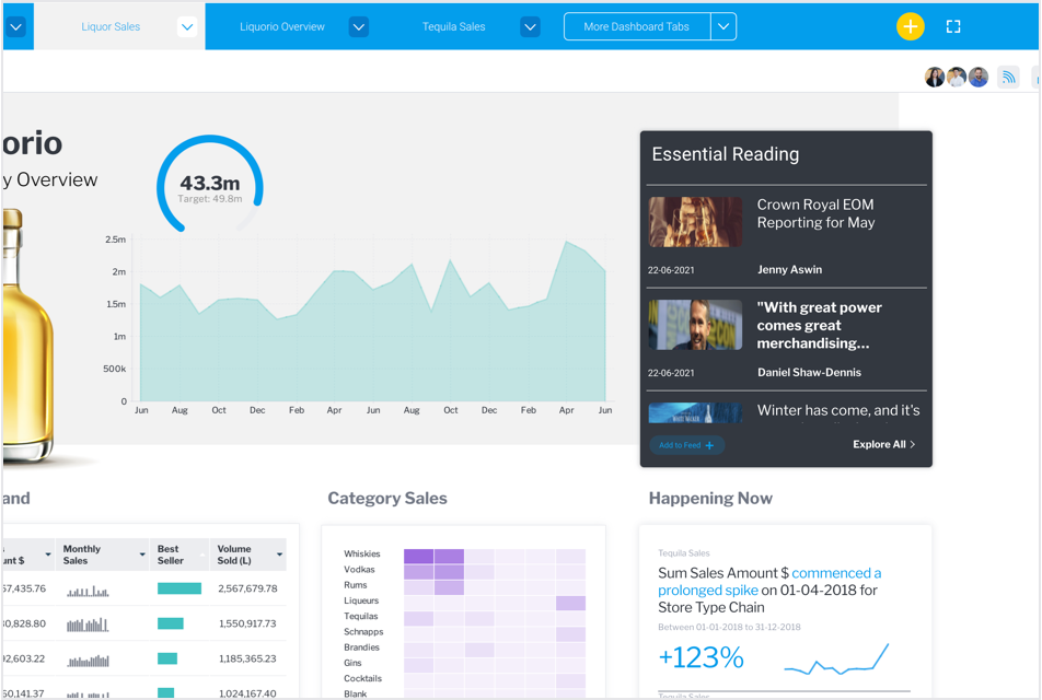 What this all means is every single dashboard consumer gets instant access to rich narratives — while consuming the dashboard as normal — that provide greater context behind the numbers with compelling interpretation, commentary, and expert analysis. All within the same analytics platform they use everyday for work.
Once your user clicks on the feed, the long-form, article-like format of Stories and data-led presentations of Present complement our dashboards and reports to provide depth of understanding around discoveries and insights, help create a data-driven culture, and increase the usage and adoption of your analytics tools across the entire organization.
Adding detailed data stories that are contextual to a specific dashboard also elevates both the value and usability of that dashboard for non-experts. A salesperson can view a story from their team and understand recent sales trends, even if they may not have performed traditional exploration on a sales dashboard, for example. This is all part of our goal to provide features that help open up access to the value of data to more people - a trend called the augmented consumer by industry experts.
Integrating data stories into the regular workflow of a user — their dashboards — ultimately creates a unified analytical experience, and helps transform the daily analytics practice of the average business user. They may have never used narrative before, but now? It’s always in front of them. It's all a part of our unique contextual analytics offering.
What this all means is every single dashboard consumer gets instant access to rich narratives — while consuming the dashboard as normal — that provide greater context behind the numbers with compelling interpretation, commentary, and expert analysis. All within the same analytics platform they use everyday for work.
Once your user clicks on the feed, the long-form, article-like format of Stories and data-led presentations of Present complement our dashboards and reports to provide depth of understanding around discoveries and insights, help create a data-driven culture, and increase the usage and adoption of your analytics tools across the entire organization.
Adding detailed data stories that are contextual to a specific dashboard also elevates both the value and usability of that dashboard for non-experts. A salesperson can view a story from their team and understand recent sales trends, even if they may not have performed traditional exploration on a sales dashboard, for example. This is all part of our goal to provide features that help open up access to the value of data to more people - a trend called the augmented consumer by industry experts.
Integrating data stories into the regular workflow of a user — their dashboards — ultimately creates a unified analytical experience, and helps transform the daily analytics practice of the average business user. They may have never used narrative before, but now? It’s always in front of them. It's all a part of our unique contextual analytics offering.
Feature #2 - Governance, visibility and lineage for all data stories
Data stories are expected to be the most widespread way of consuming analytics by 2025, according to Gartner — that’s less than four years away — and as use of data stories increases, so too does the importance and expectations around ensuring data governance, or ‘trustworthiness’. If you’re seeking to create a narrative around your data discovery output that assists others in their understanding and to engage action, it’s important to recognize that people will naturally ask questions if what they’re reading is backed up by reliable data. Step into their shoes for a second, and ask:- Who is the author of the story, and did any subject matter experts contribute to it?
- What sort of peer review or approval has the story received?
- Where does the data come from, and is it trustworthy and auditable?
- When was the data captured and the story written?
- Why should I believe the data in the story and the author’s assertions?
- How did the author apply their link of thinking on this data?
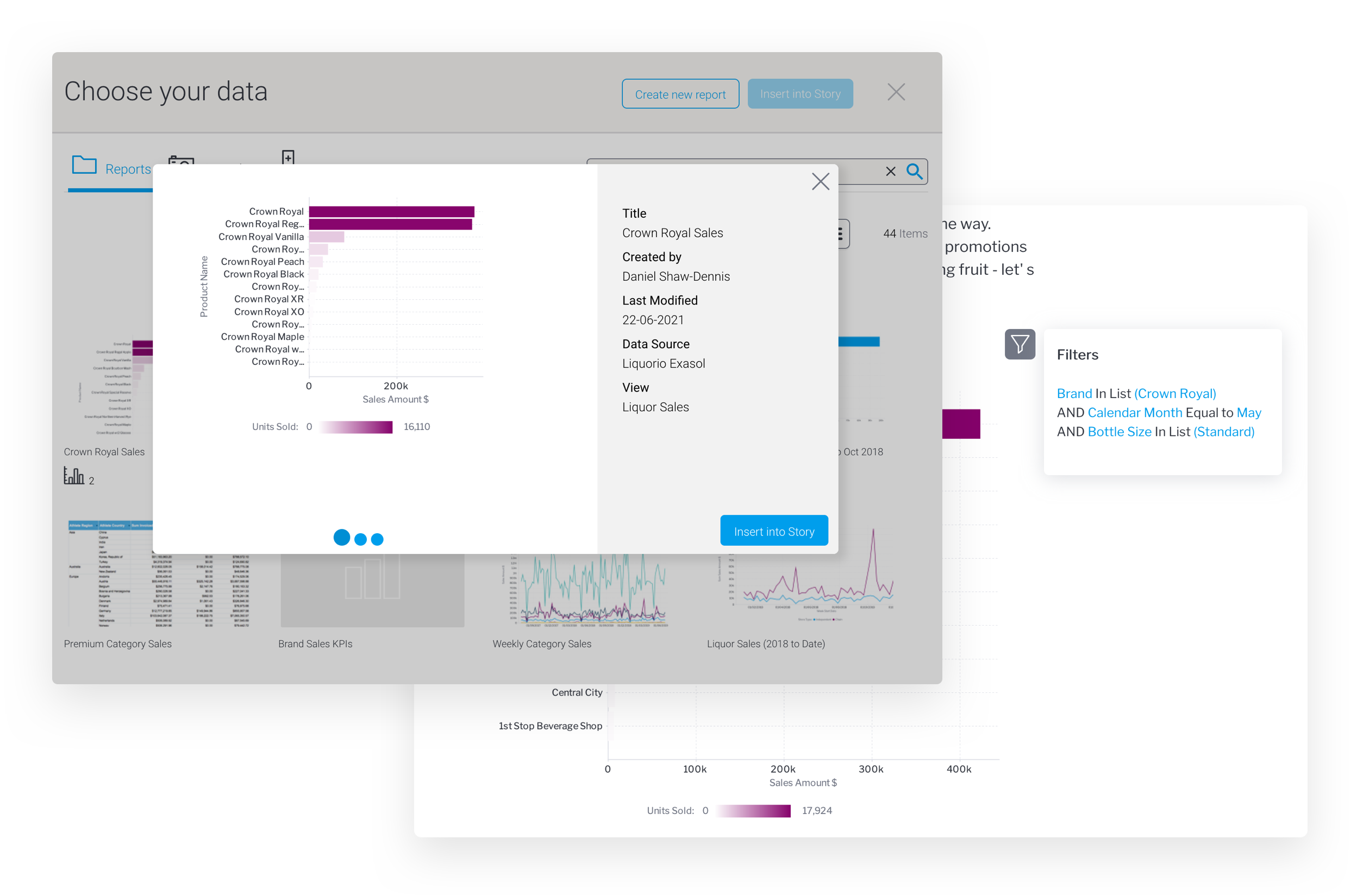 Stories and Present also incorporate curated data models through approved workflows and end-to-end data lineage for embedded analytical content, so that readers can see where the data comes from, how it was curated and if it can be trusted.
For instance, if you use Present to provide your C-suite with a narrative-led presentation, your slides can utilize live data visualizations and data that will automatically update and can be traced back to its original source if additional scrutiny is required or requested.
Stories and Present also incorporate curated data models through approved workflows and end-to-end data lineage for embedded analytical content, so that readers can see where the data comes from, how it was curated and if it can be trusted.
For instance, if you use Present to provide your C-suite with a narrative-led presentation, your slides can utilize live data visualizations and data that will automatically update and can be traced back to its original source if additional scrutiny is required or requested.
 In the age of misinformation, getting everyone on the same page within an organization is more crucial than ever. These features address governance, visibility and lineage considerations to make it easier to ensure so. Watch our video guide below to get a better understanding of what Yellowfin Stories and Present can bring in this area.
Related reading: 3 Reasons Your Data Presentations Need Governed Data, Using Yellowfin Present
In the age of misinformation, getting everyone on the same page within an organization is more crucial than ever. These features address governance, visibility and lineage considerations to make it easier to ensure so. Watch our video guide below to get a better understanding of what Yellowfin Stories and Present can bring in this area.
Related reading: 3 Reasons Your Data Presentations Need Governed Data, Using Yellowfin Present
Feature #3 - Embed different kinds of content directly from your platforms
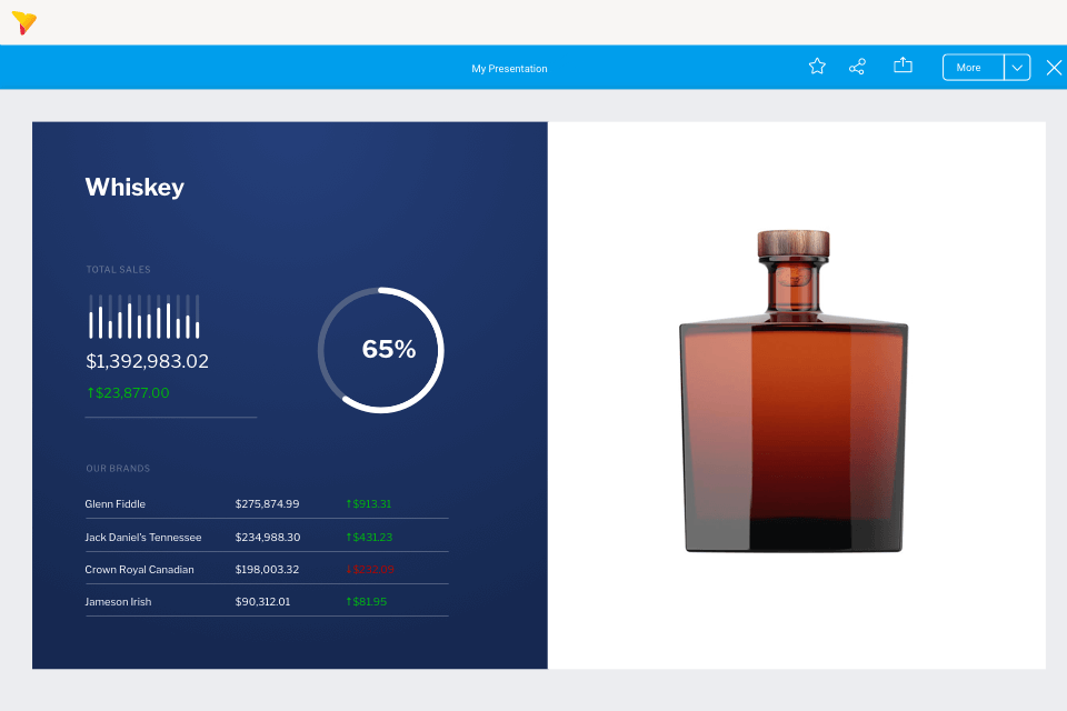
Traditionally, a lot of data storytelling capability had to be accessed in separate and external applications. This meant users would have to toggle between these apps to look at data and create a story, or bring data into their write-up as a screenshot or manual transfer. It’s a clunky scenario, which raises problems around data trustworthiness, and data being outdated quickly after publication. Instead of cutting and pasting reports into other tools such as Word, Google Doc, PowerPoint, writing the commentary separately and then emailing them out, Story authors directly embed live or static content, bookmarks, snapshots, and external media as part of their analysis workflow and share them in their published Stories. Whether it’s a chart created for a sales report, or a killer video detailing new sales methodology, all analytic content across Yellowfin and external digital media can be included. Last but not least, support for content from third-party BI tools means you can even easily embed data from other platforms, such as Tableau, Qlik and Power BI, unifying the output across different tools into a single Story and sharing that with the business.
Whatever story needs to be shared and told, wherever the data is, Yellowfin provides the most flexibility to do so.
Last but not least, support for content from third-party BI tools means you can even easily embed data from other platforms, such as Tableau, Qlik and Power BI, unifying the output across different tools into a single Story and sharing that with the business.
Whatever story needs to be shared and told, wherever the data is, Yellowfin provides the most flexibility to do so.
Feature #4 - Community feedback and interactions for every data story
So you wrote a big story on a recent win. Great! How was it received? Did it resonate with your audience? What sort of insight did they get out of it? Did they make a decision on it? Sourcing such answers to improve your next data-led story is easier with a BI platform that caters to author-to-reader interaction, and that’s exactly what Yellowfin does. Every published Story supports many different ways for tracking how readers interact with it, using familiar social interactions, such as discussions, likes, following, and favorites.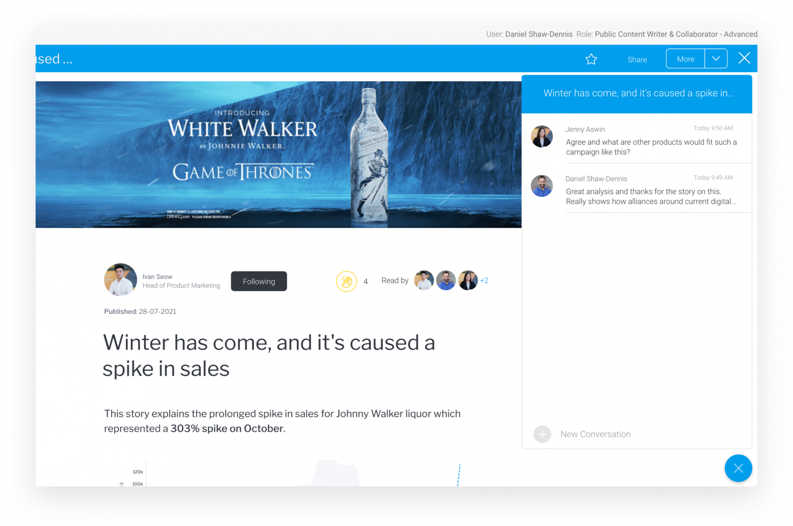 For example, you can gather how many people viewed the story, who commented to add to the discussion, who ‘clapped’ the story (and how many ‘claps’ were received overall), and even who followed the author for notifications on future data stories. All of this visibility adds up to provide both authors and readers greater insight into how pervasive a story is within the organization.
Feature #5 - Yellowfin Stories on mobile, for insights on-the-go
Stories extends your users’ ability to consume, collaborate, and act on insights both on desktop and mobile, with its ready availability through Yellowfin’s native mobile app. The long-form, article-like format of Stories has been specifically tailored around mobile screens and devices, allowing readers to consume data stories at their fingertips, with all the same features as on their work desk computers and laptops. Social interaction features, such as discussions, sharing, subscribing and clapping, are also all available in the app and synchronized across devices — enabling you to pick up where you left off from one device to the next.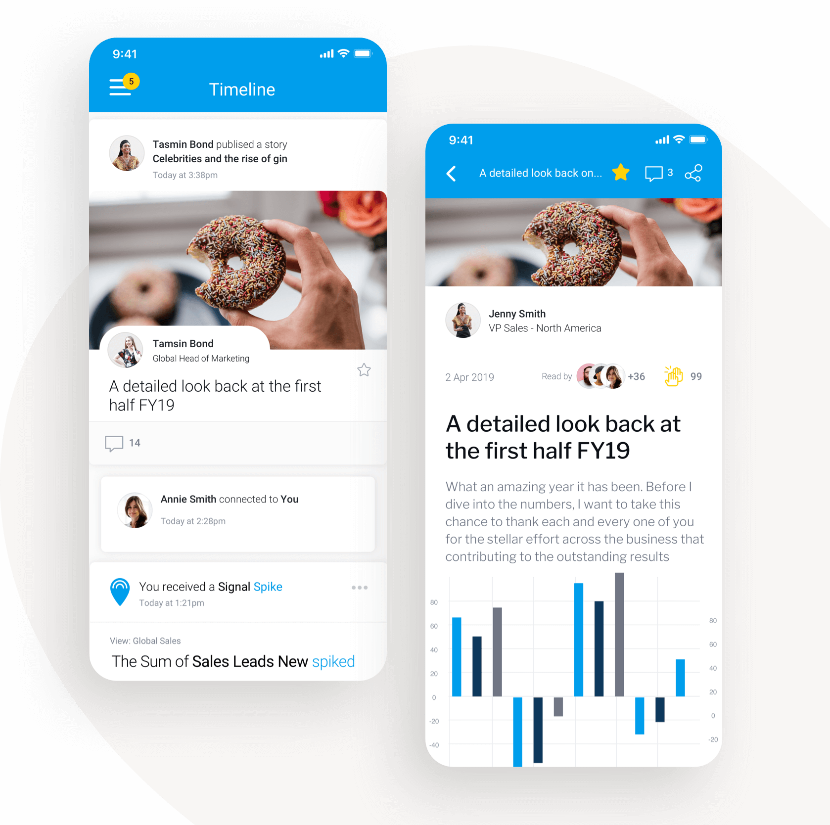 Sharing knowledge and insights in a news-like format that is built for mobile is a feature that should be expected from enterprise BI platforms today in order to drive higher analytics adoption and a data-driven culture within your organization.