

4 Key Features of a Modern BI Dashboard
The business intelligence dashboard, or BI dashboard, is a paradigm that’s well over 30 years old, and for many, it hasn’t evolved fast enough to address a fundamental limitation.
Context.
On its own, dashboards are a handy visualized report of key data pertaining to business performance, designed as a way to quickly consume important data at-a-glance.
The challenge organizations have come to realize over the years is that not everyone can glean insights or understand data without deeper context, limiting a dashboard's value.
If you’re new to a business, view a BI dashboard and see a change, you don’t necessarily understand what, why or how the change happened. For this, you often need additional human context, something a typical dashboard lacks. Thankfully, modern BI solutions now offer 4 key features that provide that deeper context and guidance to end-users.
Blog Contents
hide
The BI dashboard: 4 ways augmented analytics brings more guidance and context
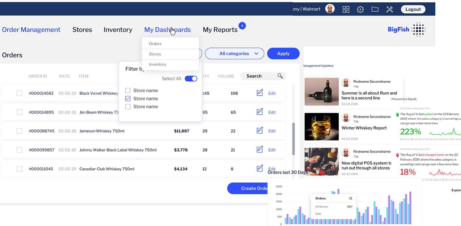
A dashboard, on its own, predominantly does not drive action. It is used to browse metrics for a summary overview. Most people cannot reliably act on such summarized data without added context behind the numbers they view, or guidance on where to look. Traditional dashboards tend to shift the bulk of the analytic workload onto the user, however - even when most aren’t data savvy enough to act without additional guidance. They also expect your end-users to manually uncover hidden changes in their data. The fact is most people lack time or aren't inclined to search for insights, so if dashboards aren't built for what the user wants to do, it's unlikely they will find what they need. What modern BI solutions aim to do is leverage augmented analytics to automate much of the dashboard analysis process, and make it as easy as possible for every person, regardless of their skill level or data knowledge, to be able to find, understand and act on actionable insights. Using augmented analytics lessens the effort required to analyze dashboards, while dynamically prompting the user with relevant information that explains each data point they view, giving them valuable context behind the wider numbers. There are four key developments in analytics that augment the dashboard experience:1. Automated analytics
Automated analytics, also called automated business monitoring, can automatically identify and surface critical changes in data faster than a typical user can so manually using a dashboard. A dashboard with automated analytics capabilities no longer demands users to find hidden changes in their data manually, as it uses artificial intelligence (AI), machine learning (ML) and natural language (NL) technologies to automate much of the process, mainly providing automatic alerts to assist the user’s discovery effort and helps reveal the ‘what’ behind the data. Read more: What is automated business monitoring? - Automated Analytics 1012. Assisted insights
The second is assisted insights. This allows people to use AI to run analysis algorithms to find the root cause of changes - or the "why". Rather than relying on asking a data analyst to do further analysis for you, the entire process is machine generated within your dashboard. This helps end-users be more independent when exploring data in a dashboard, and the AI-generated explanations and comparisons provides them the necessary guidance, context and confidence to be able to make a data-driven decision. Read more: What is Assisted Insights? - Dynamic contextual explanations3. Contextual analytics
The third is to guide the user to take action. This is achieved with data science models that can be embedded into your dashboard and trigger workflows to tell the user what the correct action to take is. An end-user can then take action directly from within the dashboard, updating their transactional applications via APIs. Most BI solutions call this integration of actions into dashboards a different name, but in Yellowfin, it is known as contextual analytics - the next evolution of embedded analytics. Read more: What is contextual analytics?4. Data storytelling
The final is the return of the long form narrative, via data stories or data led presentations. These data stories combine charts and data visualizations with contextual narrative that is authored by an expert in the business to explain what happened and why to an audience. A BI solution that provides a data storytelling component can enable your organization to better share and learn from key insights in their business intelligence dashboard data, and adapt their strategies to changing business conditions. Read more: What is data storytelling? - The value of context & narrative in BIWhat makes the insights from these new tools "deeper?"
These 4 augmented analytics tools transform the business intelligence dashboard experience by filling in things typical dashboards don’t provide - guidance and context. What makes these solutions better than using a typical business intelligence dashboard on its own is they’re all purpose-built to solve unique problems:- Automated analysis ensures you never miss a critical change in your data again.
- Assisted insights solves the discovery process of why something happened, the root cause analysis
- The data science integration of contextual analytics triggers actions that tell you what you should be doing based on changes in your data
- Data storytelling gives valuable human insight to what those changes mean to your business
 When used in combination, they provide a much deeper and cohesive analytical experience for all BI dashboard users, and ensure your analytics investment is effective.
How to modernize your business intelligence dashboard with augmented analytics
The primary consideration every business has to first agree to is what behaviors do they want to drive from their BI dashboards before adopting a BI solution with augmented analytics capabilities. Understanding this before you adopt a business intelligence dashboard solution determines the level of effort required by your IT team, and the training required, to use each tool effectively.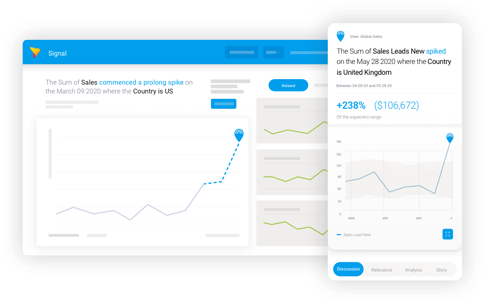 From an IT perspective, setting up automated analysis and assisted insights is relatively trivial. You do need to understand the data and the relative business importance of your fields. Implementing action-oriented dashboards can be much more significant (and we recommend buying, rather than building this functionality with a trusted BI vendor), but the payoff is huge. And data storytelling sits with the business, so the effort here is just enabling it for the enterprise.
From an end-user's perspective, there is some training involved to use and navigate the results of automated analysis and assisted insights effectively. A well-built, action-based BI dashboard powered by contextual analytics should be incredibly intuitive. People also like sharing stories, which makes data storytelling fairly straightforward to understand and take advantage of.
From an IT perspective, setting up automated analysis and assisted insights is relatively trivial. You do need to understand the data and the relative business importance of your fields. Implementing action-oriented dashboards can be much more significant (and we recommend buying, rather than building this functionality with a trusted BI vendor), but the payoff is huge. And data storytelling sits with the business, so the effort here is just enabling it for the enterprise.
From an end-user's perspective, there is some training involved to use and navigate the results of automated analysis and assisted insights effectively. A well-built, action-based BI dashboard powered by contextual analytics should be incredibly intuitive. People also like sharing stories, which makes data storytelling fairly straightforward to understand and take advantage of.