

How to become a pro data analyst if you’ve never done data analysis before
People feel more confident when their decisions are backed by numbers. That’s just human nature. Add a chart or a metric to a conversation, and suddenly an opinion feels more credible.
This is one reason companies invest heavily in analytics tools. They’re not just buying dashboards, they’re buying confidence. Confidence that decisions are grounded in reality, not gut feel.
But here’s the problem: having data doesn’t automatically make decisions easier.
For many people—product managers, marketers, founders, and aspiring analysts—data can create the opposite effect. You’re surrounded by numbers, charts, and metrics… yet you’re unsure what they actually mean or which ones to trust.
Good data analysis doesn’t start with formulas or technical expertise. It starts with curiosity.

Data Is a Story Waiting to Be Told
Numbers on their own are just raw material. Their real value comes from how you interpret and connect them into a narrative you can explain to others.
That’s harder than it sounds.
Whenever we look at data, we bring assumptions, expectations, and emotional reactions with us. It’s almost impossible to be perfectly neutral—but the goal of analysis isn’t perfection. It’s clarity.
Even with modern analytics tools, it’s easy to fall into analysis paralysis: too many charts, too many metrics, too many possible explanations.
When that happens, one simple idea can help.
Stop Overthinking: Occam’s Razor for Analytics
Occam’s Razor is a principle often used in science and everyday reasoning. It suggests that the simplest explanation that fits the data is usually the best.
In plain terms: don’t overthink it.
You can apply this mindset directly to analytics.
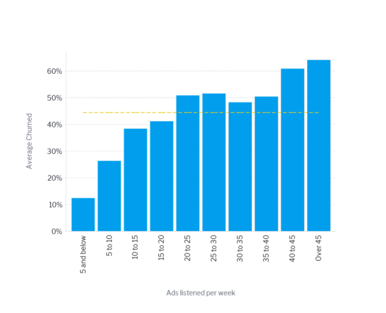
Imagine users start leaving your app in large numbers right after you introduce more advertising. The simplest explanation is probably the right one: users don’t like the volume of ads.
From there, you can explore options:
- Offer an ad-free trial to high-risk users
- Test different ad frequencies and placements
- Segment users to see who tolerates ads better than others
The key is that your analysis starts with a clear, simple question, not a complex model.
That’s the real job of an analyst: letting curiosity lead and continuously asking better questions.
Asking Better Questions Is the Skill That Matters Most
One of the biggest lessons modern analytics—and AI in particular—has taught us is this: the quality of your answers depends on the quality of your questions.
You don’t need to know how to write SQL or build statistical models to start. You just need to be curious enough to ask things like:
“Do different age groups churn at different rates?”
In tools like Yellowfin, you can ask that question directly using natural language—no technical setup required.
For example, you might ask:
“Show me churn rate by age group.”
And immediately see the result visualized as a heatmap.
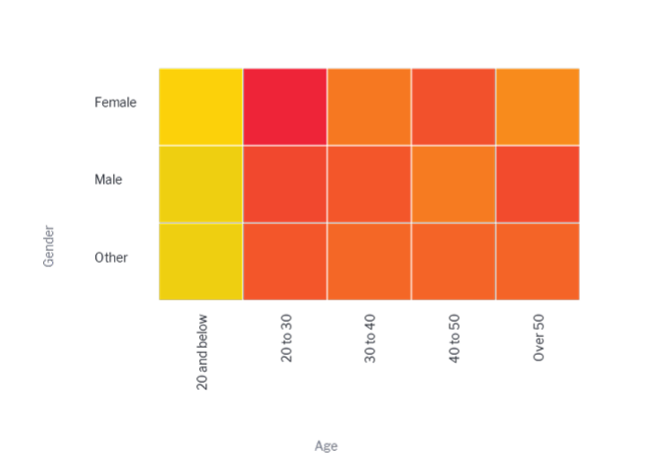
Brighter colors indicate higher churn, making patterns easy to spot at a glance. Multi-dimensional data like this can be difficult to understand in tables or basic charts, but visualizations help reduce cognitive load and highlight what matters.
At this point, many people have an important realization:
“I didn’t need to be an expert to learn something useful.”
From Answers to Insight: Building a Narrative
Seeing that younger users are more likely to stick with the platform is useful—but insight doesn’t stop there.
The real value comes from connecting related patterns into a story you can confidently explain.
Instead of saying:
“Younger users churn less,”
you might explore related data and find:
“Younger users churn less and are exposed to more ads.”
By surfacing correlations across the same dataset, Yellowfin helps you test whether factors like ad tolerance could explain the behavior you’re seeing. It doesn’t replace your judgment—it supports it.
This is where analytics shifts from reporting to storytelling.
You’re no longer just presenting numbers. You’re shaping a narrative grounded in evidence—one that others can question, build on, and act upon.
And importantly, you don’t need to have all the answers or recommendations. A clear, well-supported insight is often enough to move a conversation forward.
By combining data and narrative in one place, Yellowfin Stories helps teams move from insight to understanding faster by providing a simple place to have a secure conversation around the data you are looking at.
Analytics Isn’t About Being Right—It’s About Being Clear
You don’t need years of experience to do meaningful data analysis.
You need:
- Curiosity to ask simple, honest questions
- Tools that reduce overthinking instead of adding complexity
- Confidence to share and discuss what you see—even if it’s not the final answer
When analytics feels approachable, people stop avoiding data and start engaging with it. That’s the real shift.
If you’d like to see how this works in practice, you can schedule a live demo of Yellowfin and explore how natural language querying and visual storytelling come together.
And if your curiosity turns into “what could I build with this?”—especially if you’re a Delphi, Java, C++, Builder, or RAD Studio developer—there’s also a free Yellowfin playground with guides on embedding analytics directly into your own applications.
Good analysis doesn’t start with expertise.
It starts with a question.