How To Design a Dashboard in Yellowfin: Part Two
In our previous How to Design a Dashboard in Yellowfin: Part One article, we covered the the fundamental considerations to take when preparing your dataset, creating a concrete design and selecting the best types of data visualizations to represent dashboard data.
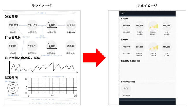
This time, we will create a completed image of the actual dashboard based on the rough sketch we created in the previous blog. When finishing creating charts and trying to place them on the dashboard, it's common for beginners to dwell on whether the texts should be bigger or the charts are too detailed, so it's more efficient to create charts after you have a concrete idea of the size of the charts on the dashboard and the size of the dashboard as a whole by actually placing objects on it. Read on for more.
How to Design a Dashboard in Yellowfin: Creating a Completed Image of the Dashboard
When creating a dashboard with a canvas layout, it is useful to display grid lines and rulers on the canvas to help align the contents. First, set the dashboard properties to display them. Enabling the ‘Snap to Grid’ setting will make it easier to align the charts.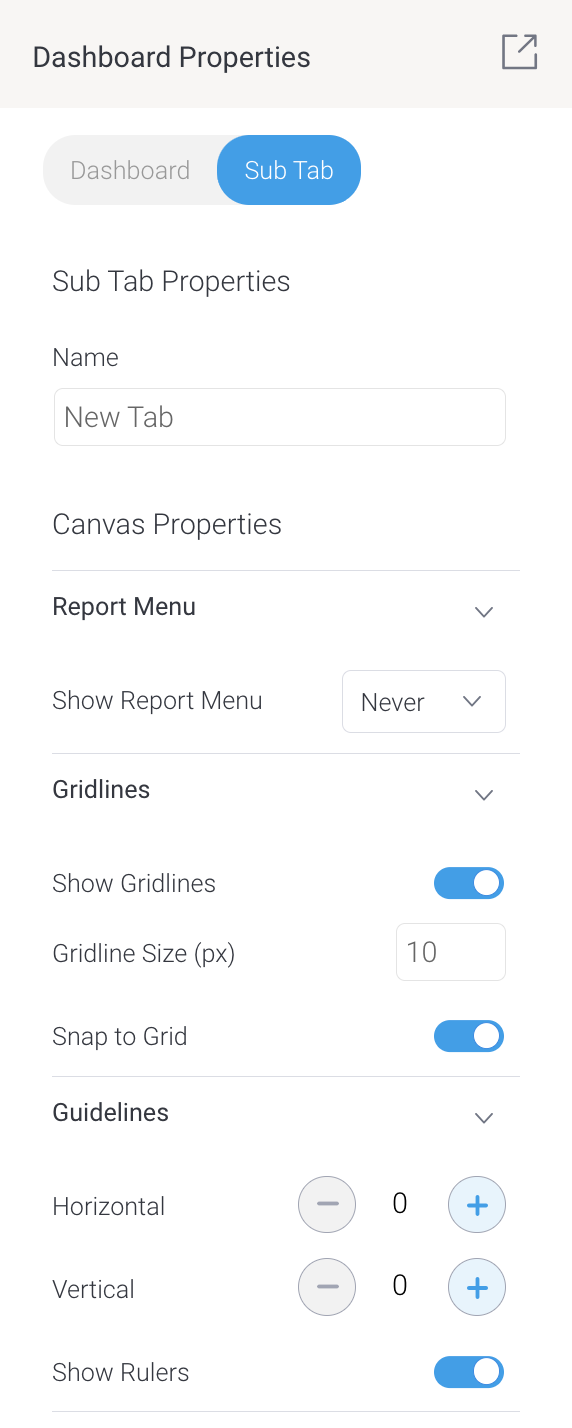 You can also try changing the ‘Gridline Size (px)’.
Following the rough sketch and placing objects on the dashboard, look at the overall balance as you arrange shapes and texts.
You can also try changing the ‘Gridline Size (px)’.
Following the rough sketch and placing objects on the dashboard, look at the overall balance as you arrange shapes and texts.
 As for the text, it is better to use one that is close in size because it is prepared for each size and typeface.
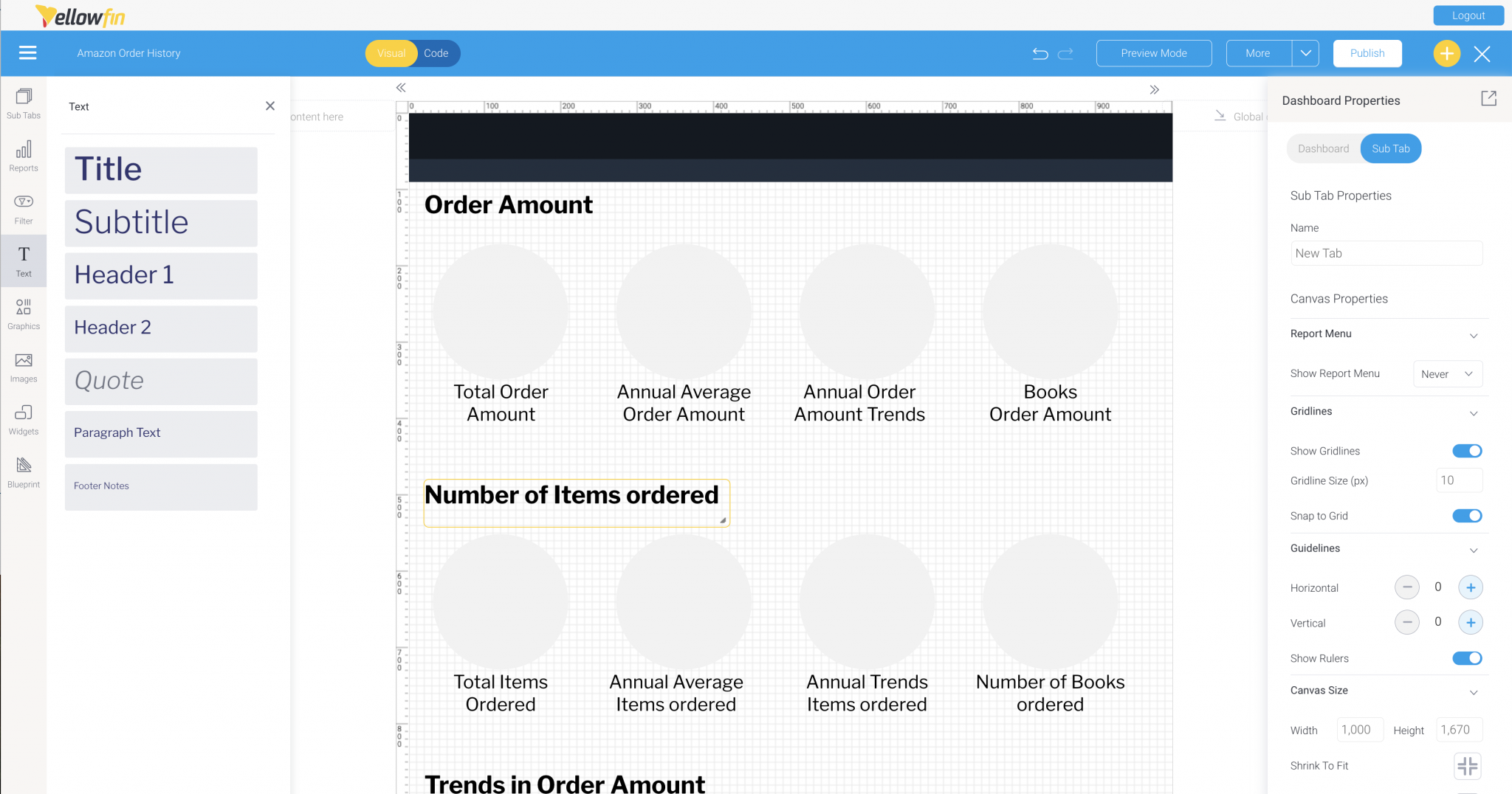
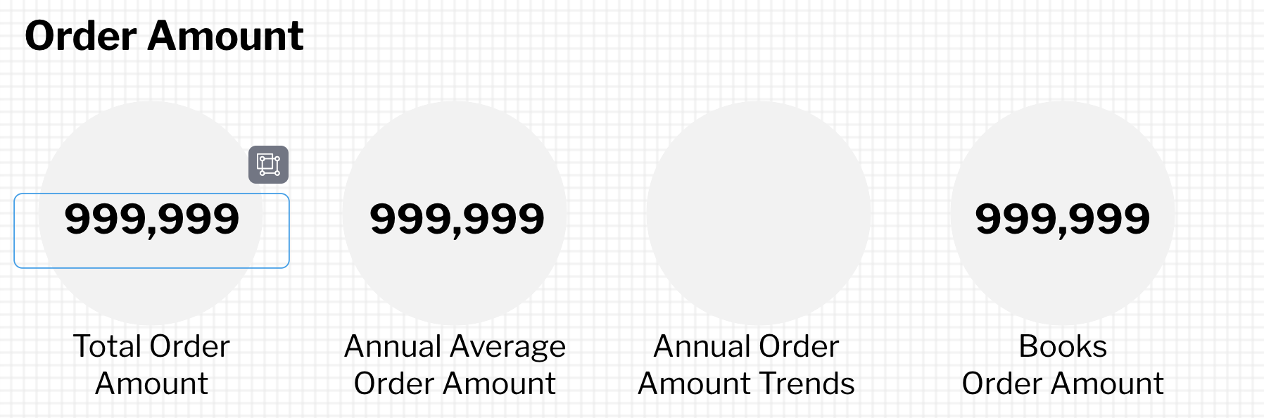
Once you have the headers, backgrounds and texts in place, it is time to put charts in a temporary position. For a big number chart, we just want to check how many digits and how large the chart should be, so it is a good idea to place the actual text with the numerical values entered.
As for the text, it is better to use one that is close in size because it is prepared for each size and typeface.
Once you have the headers, backgrounds and texts in place, it is time to put charts in a temporary position. For a big number chart, we just want to check how many digits and how large the chart should be, so it is a good idea to place the actual text with the numerical values entered.
 It looks like the size of the header 1 is just right.
For a column chart, it may be a good idea to use the bar-chart from Icons in Graphics or the Yellow Lines from Images to make it look like that. When using an image, it would be best to disable the aspect ratio in the image's properties.
It looks like the size of the header 1 is just right.
For a column chart, it may be a good idea to use the bar-chart from Icons in Graphics or the Yellow Lines from Images to make it look like that. When using an image, it would be best to disable the aspect ratio in the image's properties.
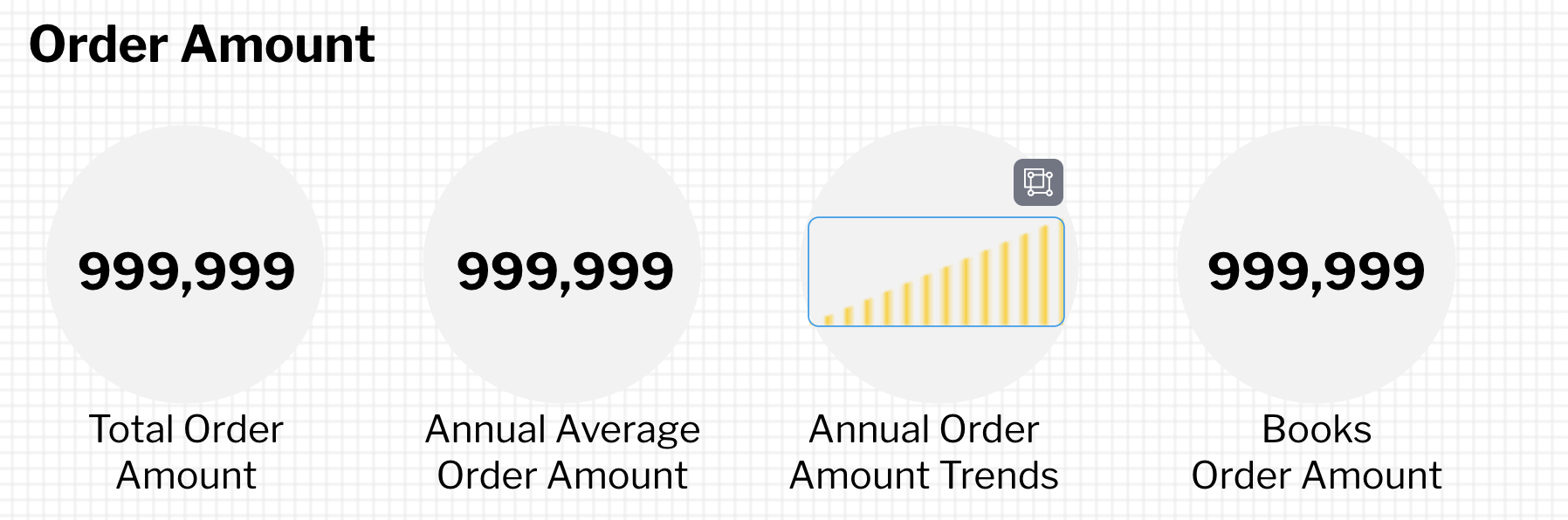 Adjust the size of the image to just barely fit in the background circle.
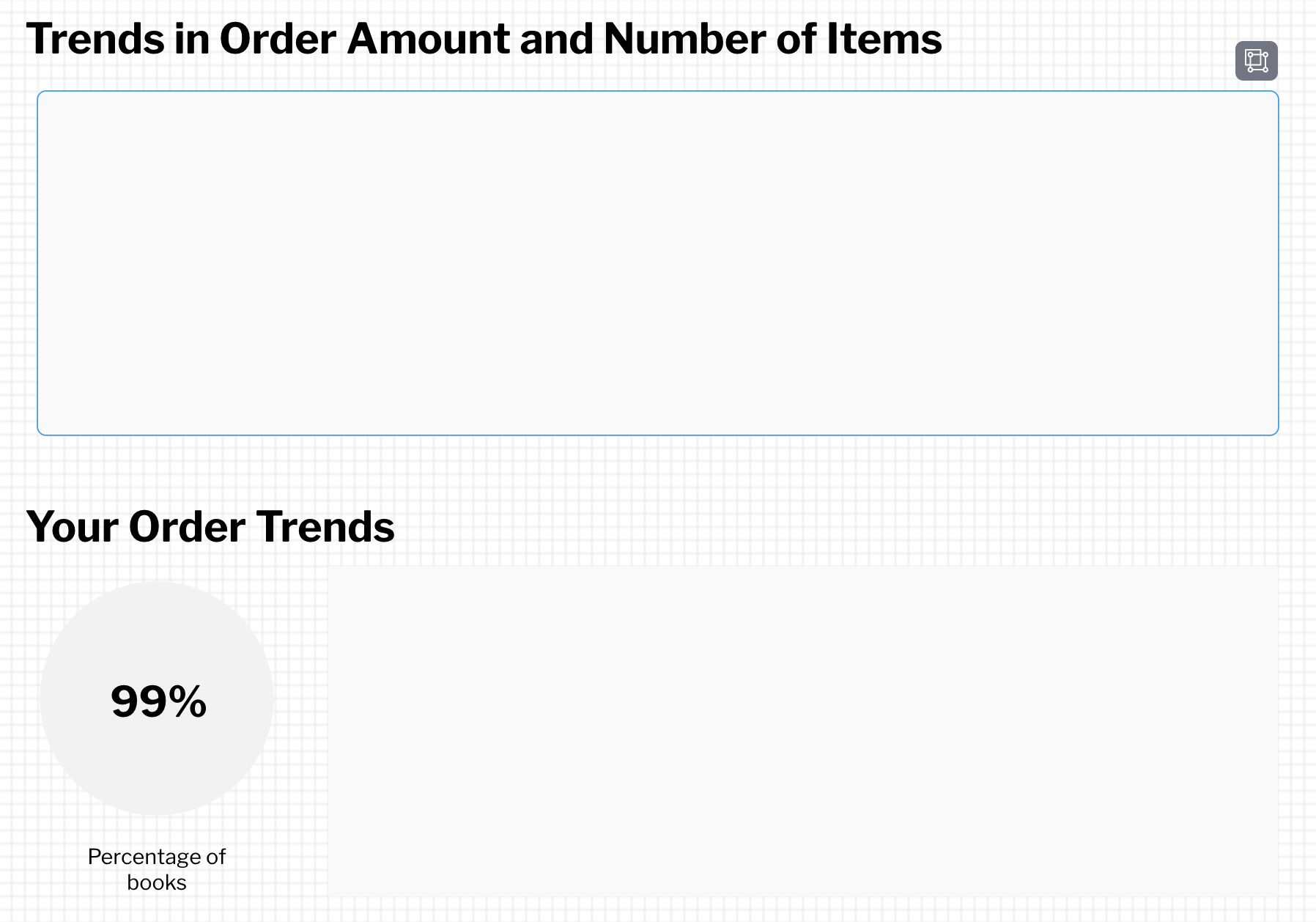 For a pie chart, you can just use a circle from Shapes in Graphics.
So far, we created a completed image based on the rough sketch. I believe that the design has become quite concrete. Eventually, we will replace those objects placed in the completed image with actual charts to be created in #5 and thereafter blogs to create the dashboard, so not to delete this completed image of the dashboard but save it.
For a pie chart, you can just use a circle from Shapes in Graphics.
So far, we created a completed image based on the rough sketch. I believe that the design has become quite concrete. Eventually, we will replace those objects placed in the completed image with actual charts to be created in #5 and thereafter blogs to create the dashboard, so not to delete this completed image of the dashboard but save it.
 Through the above process, 80% of the dashboard creation is already completed.
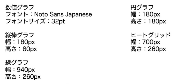
The points you notice when creating the completed image and the display size of the charts should be summarized, as they will be needed when creating the charts.
Through the above process, 80% of the dashboard creation is already completed.
The points you notice when creating the completed image and the display size of the charts should be summarized, as they will be needed when creating the charts.