

How To Design a Dashboard in Yellowfin: Part One
Designing a dashboard comprises many different considerations. Whether it's the business-user, data expert or business unit building the dashboard, our team aims to create a guide that will be useful for everyone who wants to (or needs to) create a dashboard, but is having some troubles figuring out how to do it.
In this latest series of blogs, the Yellowfin Japan team takes the lead in introducing the process of creating a new dashboard in Yellowfin.
How to Design a Dashboard in Yellowfin: Our Dataset
For the first part in this series, Yellowfin Japan selected a dataset from Amazon to populate its example dashboard and the build process, as you can see in the image below.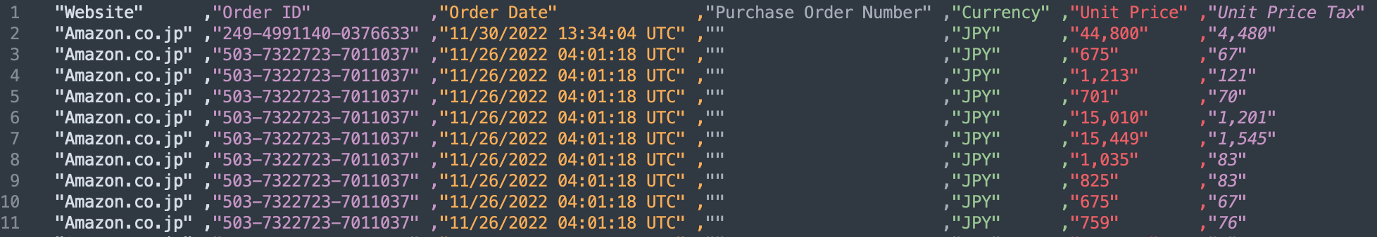 This is a personal Amazon order history. You can get your own past order history by requesting it from your Amazon Account Services page. If you are interested, why don’t you request your own order history and join the team in creating a dashboard through this series?
To begin with, let’s answer 4 fundamental considerations of what you need to create a dashboard.
This is a personal Amazon order history. You can get your own past order history by requesting it from your Amazon Account Services page. If you are interested, why don’t you request your own order history and join the team in creating a dashboard through this series?
To begin with, let’s answer 4 fundamental considerations of what you need to create a dashboard.
1. Who will use it?
If you create a dashboard for internal use, it is always most important to design it with the users in mind, such as for executives, managers, and all employees, etc. If you have already defined the requirements for the dashboard, you can design it based on those requirements, but if you do not have a set of requirements, you should start by summarizing them. This time, we will create a dashboard for personal use, so the Yellowfin Japan team asked their members to summarize the requirements.2. What are you analyzing with it?
The purpose of the analysis must be clear in order to create an effective dashboard that conveys insights. In this instance, the purpose of the analysis is to capture the team’s own personal Amazon usage trends. Originally, we wanted to analyze what categories of products were purchased and how often they were bought. We have a general idea that books, comics, and magazines are the most common categories, but we wanted to know what the other categories are like. However, the order history data did not include category information, so we want to analyze trends in other areas. Fortunately, the order date and time are time-stamped, so we are thinking that it would be possible to analyze not only by day of the week, but also by time of the day.3. What data is needed?
This time, it is the Amazon order history. The order history data includes the order number, order date and time, amount, and product name - all integral information to include in the eventual dashboard we build.4. What is needed to make it useful in your everyday operation?
Usually, when creating a dashboard, it is necessary to create one that links data visualizations and business operations, such as visualizing attendance information to improve the working environment, or visualizing sales data and inventory data to place orders. The dashboard we will create is for personal use, so it will not be directly useful in any way.How to Design a Dashboard in Yellowfin - Creating a Concrete Design
The next step is to look at the data and break it down into what can be analyzed on the dashboard. The order history data includes Amazon's product identification number (ASIN), which is a 10-digit ISBN code for books and starts with B0 for other items. If we can categorize them according to this rule, we should be able to analyze what we are ordering and how much we are ordering. It would have been better if we could have categorized the products in more detail, but it seems that it is not possible to extract product categories from ASIN, so in this series, we would like to compare the number of products ordered for books and for other items. In order to analyze when the orders are placed, we have the order date and time (Order Date), which seems to be available for analysis. With the Order Date data, it is possible to extract the time of day and day of the week, so we might be able to analyze what day of the week and what time of the day our team most often orders from Amazon. Our team member who we have sourced the data-set from has been using Amazon since 2009, and is also interested in learning how much money they have spent on Amazon over the past 13 years.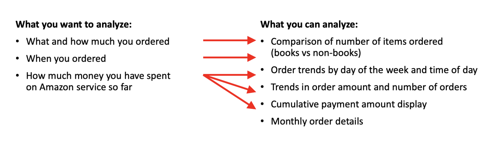
Optimizing Data Visualizations
Once you have determined what you can analyze, consider what kind of data visualization is the best to describe this data. If you are wondering what kind of chart is the best for your needs, this chart selector guide can help.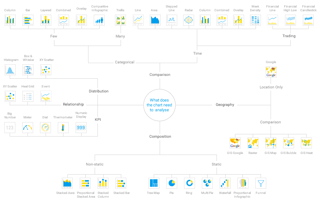 Referring to the above chart selector guide, it would be better to create a line chart for the amount of money to compare over time, and a heat grid for the order trends to see relationships. The comparison of the number of products ordered seems to be better made with a small number of category bar charts, but since there are only a few books or other items to compare, a pie chart might also be good.
Let's start with a drawing
Once you have got some idea of the charts you would like to represent on the dashboard, prepare a pen and paper and start drawing the dashboard design. It's okay to draw something rough here. If you intend to make a design document, you should try to make a clean drawing later.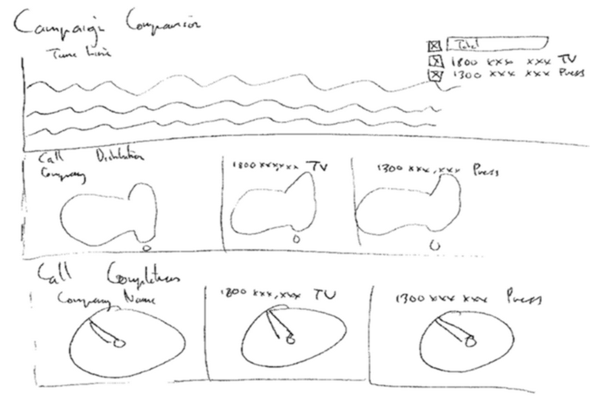
Reflecting Importance in Design
However, many people are not sure how to place data visualizations in the dashboard. If that is the case, consider the following points in your design.- Small and simple, from whole to detailed
- Important information from top to bottom, left to right
- The more important it is, the larger the area is
- Make reports related to each other
- Minimize scrolling
Small and simple, from whole to detail
Not every report you create needs to be displayed on a dashboard. Too much information can make it difficult to know where to look. Also, avoid placing large reports on the dashboard.Important information from top to bottom, left to right
When people read something, they usually look at things from top to bottom and left to right, so try to place important items first, from top to bottom. If you are placing them side by side, it is better to place them from left to right.The more important it is, the larger the area is
The more important something is, the larger the area should be to make it look bigger. Don't try to cram in other information just because there is a gap in the dashboard.To make it easy to see at a glance that reports are related, place them side by side, or arrange them in a way that visually identifies them as a group, such as by matching background colors and spacing.
Minimize scrolling
If possible, design your dashboard so that you do not have to scroll. Ideally, you should be able to see the information without scrolling. If you have to scroll through several pages to fit on the screen, consider separating entire groups of related reports into separate sub tabs. Here is a rough draft created based on the above points.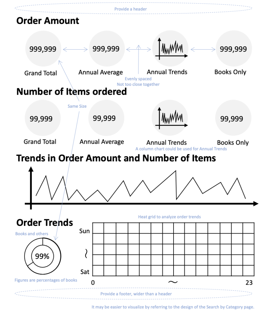 If you can't think of a good design, one way is to refer to a design that users can easily visualize the theme of the analysis. For internal data analysis, the design of your company's website, internal portal or templates for presentation materials may be a good reference.
If the data analysis is for a specific product or service, it is also a good idea to refer to the design of those products or services. A unified design can also make the dashboard look like a feature that comes with that product or service.
Through the above process, the dashboard design is now nearly completed.
If you can't think of a good design, one way is to refer to a design that users can easily visualize the theme of the analysis. For internal data analysis, the design of your company's website, internal portal or templates for presentation materials may be a good reference.
If the data analysis is for a specific product or service, it is also a good idea to refer to the design of those products or services. A unified design can also make the dashboard look like a feature that comes with that product or service.
Through the above process, the dashboard design is now nearly completed.