

Yellowfin Cool Features Part 1: Making Reports Pop
In this blog series, Yellowfin Chief Technology Officer (CTO) Brad Scarff breaks down some of the coolest and most unique features of the Yellowfin embedded analytics suite.
Despite all the new developments in business intelligence (BI) tools, such as artificial intelligence (AI), automation, and natural language query, the report is still the mainstay of information delivery in most organizations.
Yellowfin started life as a reporting tool and over the two decades of its life, it has continued to invest in and enhance the functionality of its core reporting. The flexibility to create useful, visually interesting, informative reports is unmatched in the industry.
Of course, all the basics of report building are covered in Yellowfin. You can build virtually any query against virtually any data source using the Advanced Report Builder, and if you choose, you can start these reports off using a Natural Language Query (NLQ) or with assistance from AI-generated Assisted Insights. Standard tabular and cross-tab reports can be generated, and complex queries constructed with advanced sub-queries, even combining data from different databases live into a single consolidated report.
Here are some cool features you may not know about, rarely seen in other BI tools.
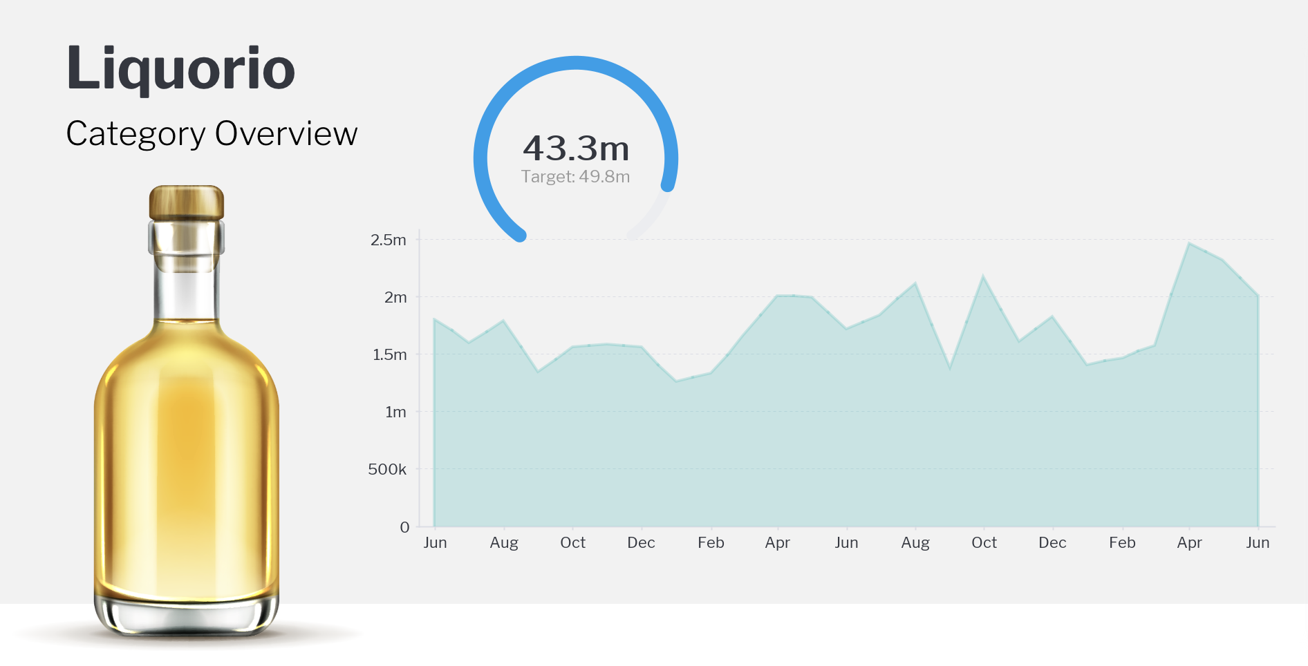
1. Sparklines
Communicate more with your reports by including mini-charts known as sparklines, within a cell in the report. Sparklines consolidate time series data in your report as an array, and then convert this to a mini-chart, either a line chart or a column chart. Sparklines are easy to create using Yellowfin analytic functions and column formatters, and these mini-charts can be used to quickly and intuitively communicate a trend for a particular metric value, such as sales over time as shown in the below example.


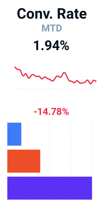
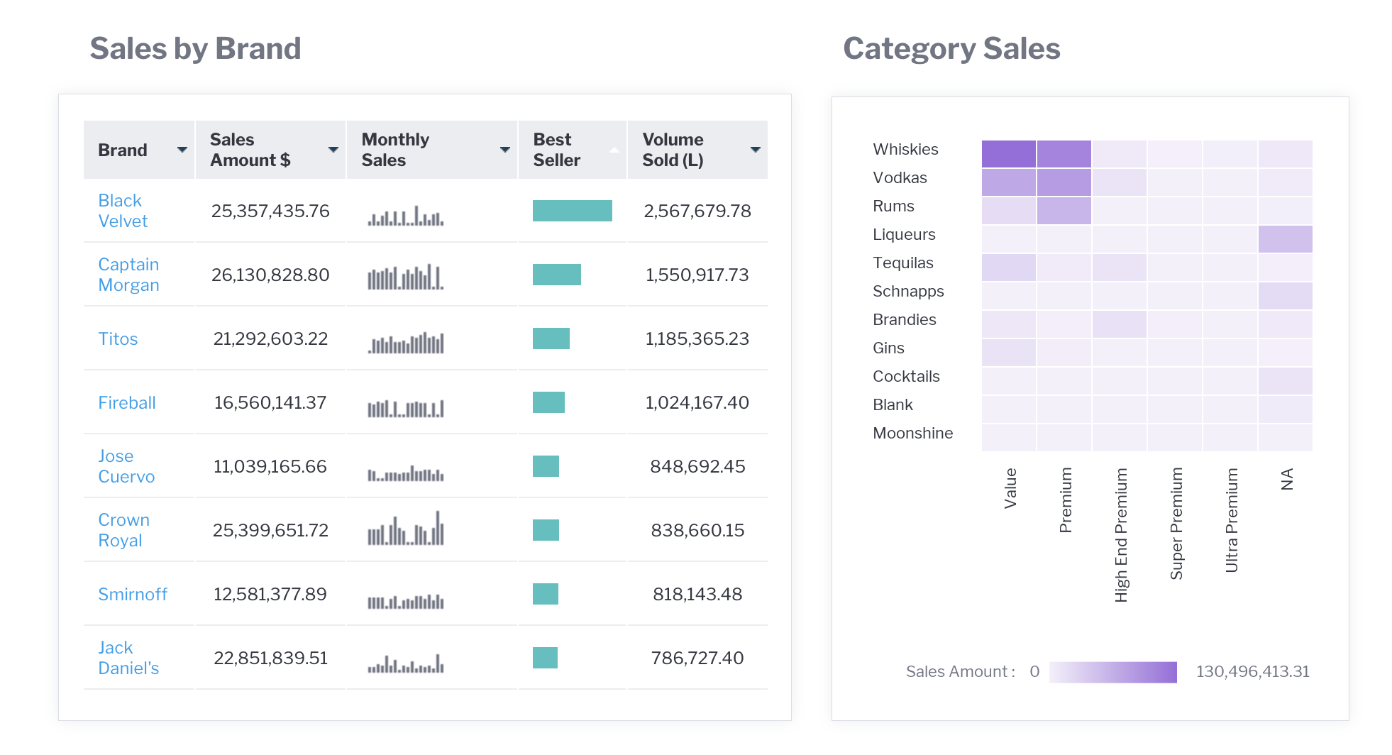
2. Conditional formatting
Like sparklines, conditional formatting is designed to communicate insights in your tabular data faster, by allowing the user to quickly identify and focus on the most important data outliers.
In the below simple example, the Change from Previous Year metric has had a conditional format applied, which shows the metric in red if it is unfavorable, and green if the change is favorable.


More advanced rules and formats are also possible. For example, any number of rules can be created using greater than, less than, equals, in list, is null, and so on. Both the font and background colors can be set, or the cell can be configured to show a colored bar or icon.
In the example below, the camp rating has been configured to show a bar depicting the cell value as a percentage of the maximum value in the report, and color coded based on the percentage that cell represents of the max value. This gives users an instant appreciation for camps that are rating well, average or below average.


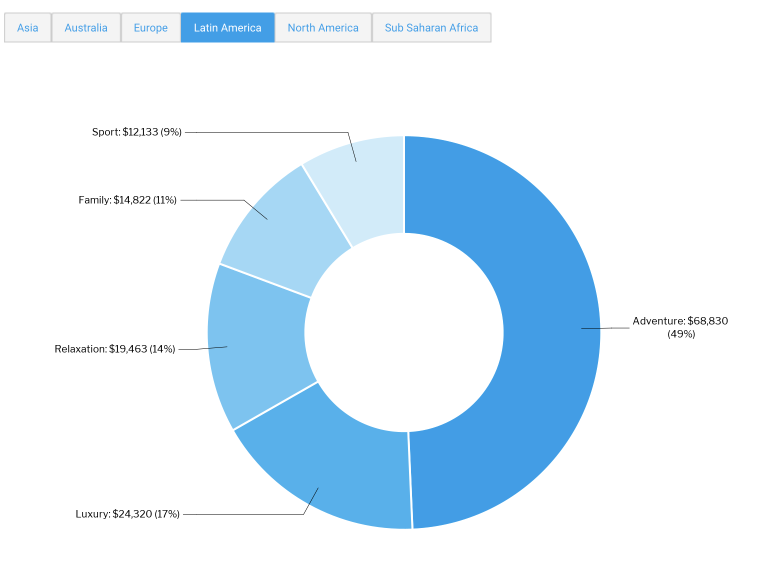
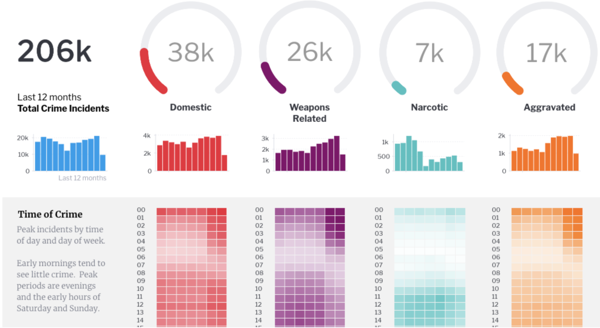
3. Sections
Dividing a report into sections using section breaks is nothing new. Yellowfin has a lot of flexibility when it comes to defining and formatting sections. Sections allow a user to break otherwise very large tables into a series of smaller tables - making the information easier to navigate and digest.
Yellowfin takes this a step further with tabbed sections. Tabbed sections take each value in the column defining the section, and creates a clickable tab control at the top of the report. The user can easily tab between sections of the report without having to scroll to the next section.
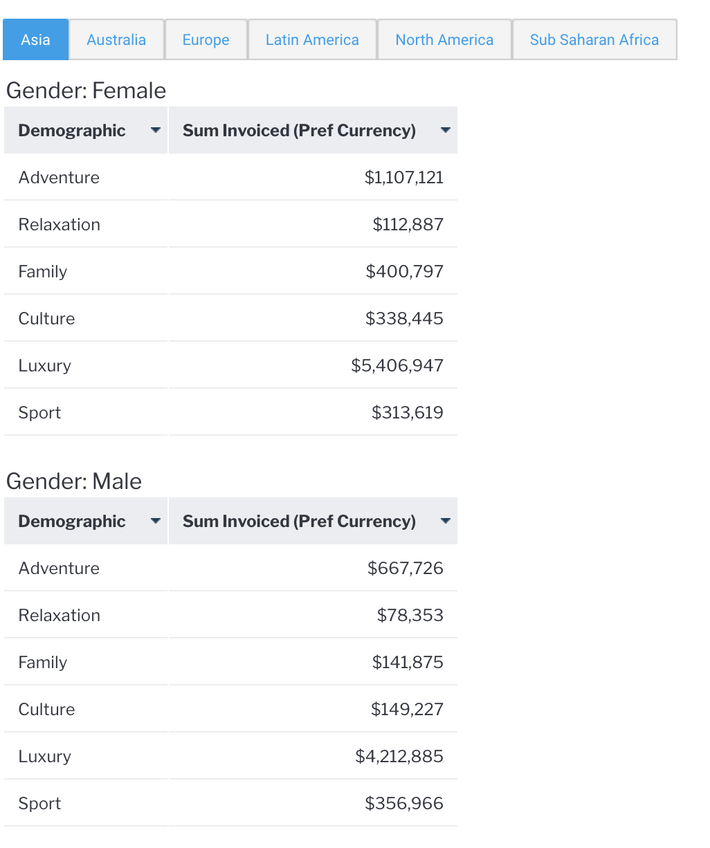
Further, when charts are created in the report, the charts themselves are displayed in each section, and only contain data for that particular section. Charts can also be used with tabbed sections, and displayed alongside the tabular data.
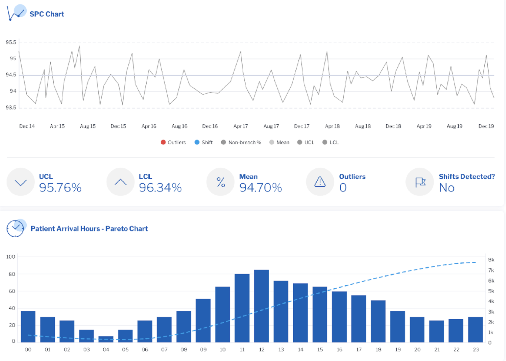
4. Fine grained formatting
Many customers have very specific requirements in terms of how they would like their reports and charts to look. Yellowfin has an extensive range of formatting options for report and chart content, including fonts, colors, alignment, various field formatting options for dates, numeric fields and even the ability to create your own custom formatters. Here are some small examples of types of content you can build.
Learn more about report formatting and chart formatting by following our links to the Yellowfin Wiki.
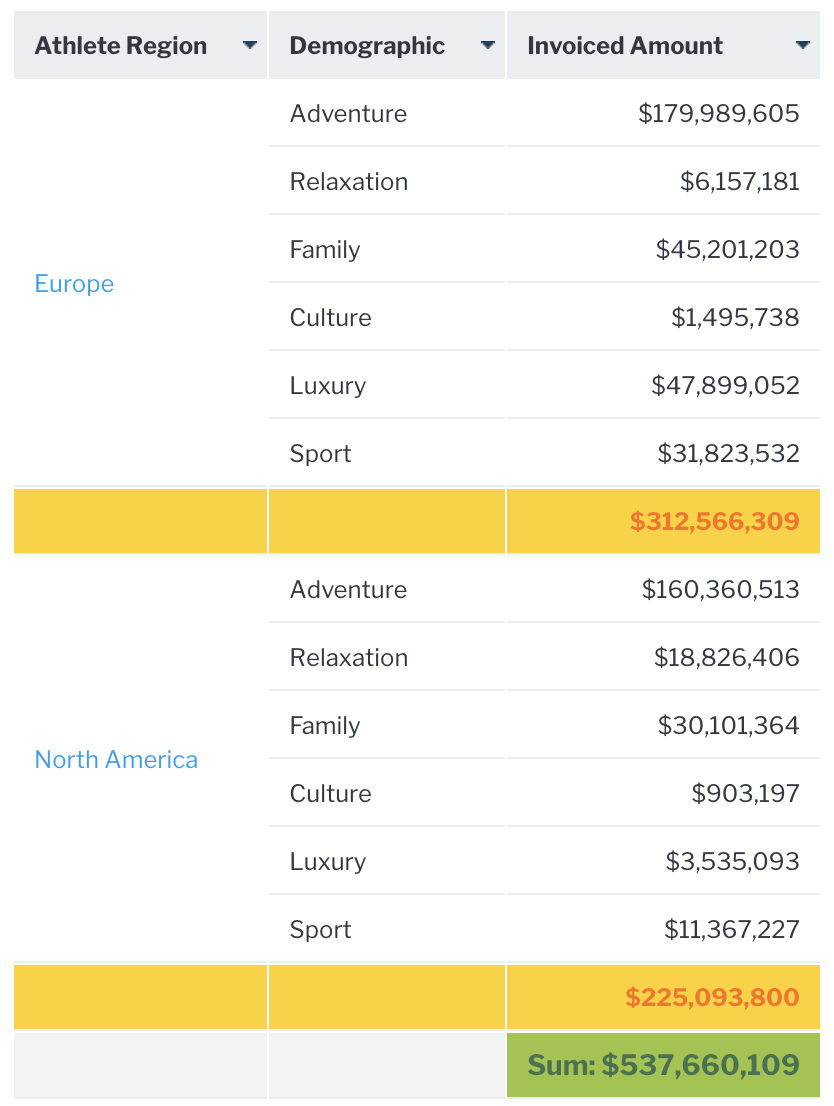
In addition, a number of options exist to create and format total fields. Standard report totals can be created on any field, and the aggregation can be defined including sum, average, count and count distinct. Sub-totals can be defined, as well as totals for sections, known as section summaries. Totals and subtotals can be defined to appear at the end (default) or the start of the report or relevant section.
Individual formats can be applied to totals and subtotals as well. These formats can allow a report designer to create total lines that stand out visually, with a different font (type, color, size, style) and different background color.
Learn more about defining and formatting totals in our technical guide in the YF Wiki.
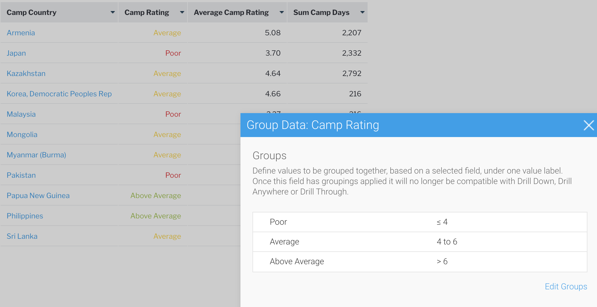
5. Grouped variables
Our final topic is grouped variables, sometimes known as “bucketing” or grouping. Grouping data together is often useful with a continuous variable, such as a score or the age of a person or perhaps a request. In the below example, we have grouped the average camp rating score (which is a continuous variable between 0 and 10) into three buckets or groups. We’ve then used conditional formatting, discussed above, to color code the group value. This makes interpretation of the data more intuitive and efficient for users.
Try Yellowfin For Free
Discover the business benefits of Yellowfin's many in-built features for your unique business case and analytics deployment. Try our demo today.