
Display average value as Average line in charts
1 December, 2015
Hi,
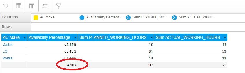
We have one Yellowfin report in which we are calculating the average for particular column using the formula Totals-> f(x) Calculated Total and now we want to display that value (Shown in the screenshot below) as an average line in our Bar charts.

And also we want display that value as a separate column in our Report as shown below:
Kindly let us known how to achieve the same.
Thanks and regards,
Prateek Arora
We have one Yellowfin report in which we are calculating the average for particular column using the formula Totals-> f(x) Calculated Total and now we want to display that value (Shown in the screenshot below) as an average line in our Bar charts.
And also we want display that value as a separate column in our Report as shown below:
Kindly let us known how to achieve the same.
Thanks and regards,
Prateek Arora
Hi Prateek,
Thanks for sending in the question and apologies for the delay in responding! Unfortunately, you cannot pass column sub totals to a new column. You would have to either use an advanced function or calculated field to accomplish what you are after.
Here is an example using the statistical advanced function 'Mean':
1. Drag in your Availability Percentage field onto your report a second time
2. Apply the statistical advanced function mean to the duplicate column
3. You could then hide the field from the report and use it as normal in your chart
Would this option work for you? Please let us know if not and we can look for other alternatives.
I look forward to hearing back, and apologies again for the delayed response!
Kind Regards,
Dustin
Thanks for sending in the question and apologies for the delay in responding! Unfortunately, you cannot pass column sub totals to a new column. You would have to either use an advanced function or calculated field to accomplish what you are after.
Here is an example using the statistical advanced function 'Mean':
1. Drag in your Availability Percentage field onto your report a second time

2. Apply the statistical advanced function mean to the duplicate column


3. You could then hide the field from the report and use it as normal in your chart


Would this option work for you? Please let us know if not and we can look for other alternatives.
I look forward to hearing back, and apologies again for the delayed response!
Kind Regards,
Dustin