
How do I make a stacked bar chart that compares two different time periods?
11 March, 2014
Hi,
I apologies in advance if this question has already been asked and I failed to find it in my search through your support forum.
I'm trying to replicate the following chart in Yellowfin (the image shown is from excel)
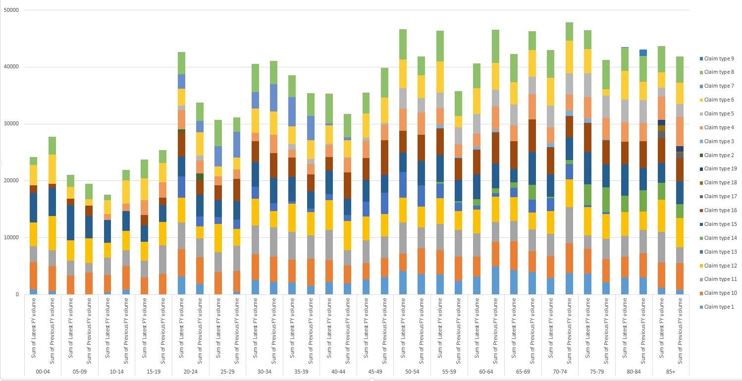
As you can see this is a stacked bar chart that shows the volume of claim types over different age cohorts and compares the latest FY against the previous FY.
It's easy to create a stacked bar chart of just a single FY view in yellowfin, but how do I create one that shows both like in the image above?
I look forward to your reply.
Cheers,
Nathan.
I apologies in advance if this question has already been asked and I failed to find it in my search through your support forum.
I'm trying to replicate the following chart in Yellowfin (the image shown is from excel)
As you can see this is a stacked bar chart that shows the volume of claim types over different age cohorts and compares the latest FY against the previous FY.
It's easy to create a stacked bar chart of just a single FY view in yellowfin, but how do I create one that shows both like in the image above?
I look forward to your reply.
Cheers,
Nathan.
Hi Nathan,
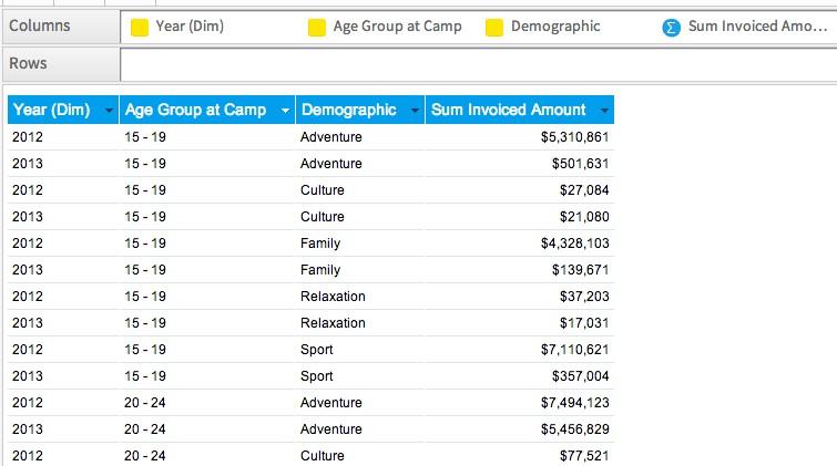
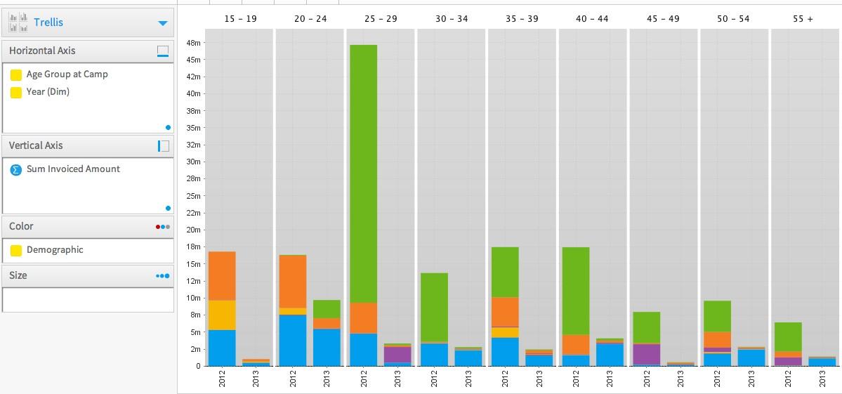
the trellis chart should work for you. Please see below a couple of snapshots illustrating the idea. Make sure that the Year column you're going to use is not a formatted timestamp, but is rather text or numeric value.
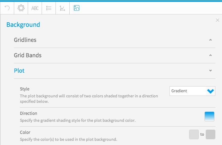
You can shade the plot area in order to make the chart more readable.
Kind Regards,
Artem
the trellis chart should work for you. Please see below a couple of snapshots illustrating the idea. Make sure that the Year column you're going to use is not a formatted timestamp, but is rather text or numeric value.
You can shade the plot area in order to make the chart more readable.
Kind Regards,
Artem