

Bringing empathy to numbers with data storytelling
When I started out in my career, it was very much all about the numbers, and thinking, not feeling, when it came to communicating important results found in business data.
For many years, there was a larger value placed on IQ, or how smart someone is, extending to the way people did their reporting, which was presenting data as is.
Emotional intelligence (EQ) on the other-hand, was thought of as a soft skill in relation to analytics. Empathy was not considered relevant when sharing key findings in data.
However, with the rise of data storytelling in modern analytics, there's now awareness of the importance of providing people more context to the numbers through data-led narrative, and empathy has found its way into analytics in ways it never could before.
EQ, and empathy, is finally having its day.
It’s not just about the data, it’s what you say with it
Using emotion in our analysis and reporting is not simply about warm, fuzzy feelings.
Emotions like empathy are about showing understanding, and taking the point of view of other people, or, in the context of analytics, your audiences’ needs, pain-points, and understanding into consideration. It plays a part in communications, mar-comms, and product design, and because of data storytelling, it can now be used in analytics, too.
When it is properly applied to how we convey important findings in our business data, empathy is not just an emotion, but an extremely useful skill that can better help us:
- Grab the audience’s attention on an important data discovery
- Assist them in understanding the context, and meaning behind it
- Inspire them to care about your findings, and act on them

The reality is data on its own is very black and white, or yes and no. When we only had solutions such as dashboards to communicate important findings or results in our data, it made sense for the focus to be more placed on IQ, and having it as a predominant skill.
But historically, many dashboards and business reporting formats have failed to deliver meaning, or help compel the people who consume them care, limiting their value.
Data storytelling means more people can easily bring more dimensions when sharing their data; whether it’s shedding light on the results with additional context, personal interpretation or how they feel on an event to show an understanding of the audience, or leveraging expert knowledge that can help non-experts make more sense of the figures.
The limits of showing just data, without empathy
The traditional focus on IQ, or focusing on the numbers, makes it harder to show someone a dashboard and make them feel something, or resonate with their understanding of the data.
Showing a sales team the results of their quarterly spending exceeding their allocated budget in a dashboard doesn’t help the audience resonate positively with what the data is saying. However, sharing a more personalized data story that uses empathy to take the sales team through the many possible reasons why they’re not performing, and options on how they can improve their performance can more effectively reveal positive layers.
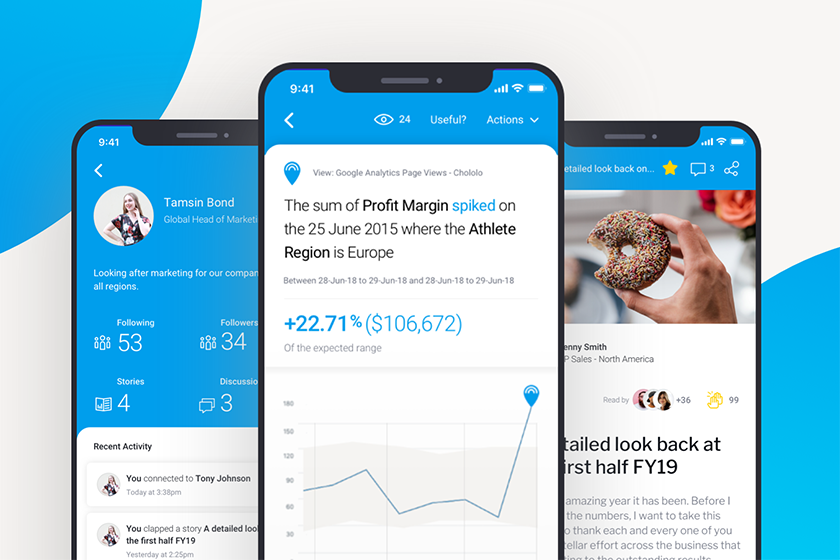
Similarly, marketing can share the raw numbers around traffic and engagement numbers throughout the year, while taking the audience through what each and every type of lead (organic, direct, paid, social, etc) means and why the growth is a big deal, rather than just present a static dashboard and expect their audience to know what each figure means.
What may have started as a row of tables can turn into a detailed narrative that helps the audience connect with the numbers and understand it better, as they can read what the report creator’s thought process around the figures are, and empathize with their view.
Empathy, and narrative, better ties in with the audience’s journey
When it comes to insights, it’s not, and never has been, just about the numbers (data).
People need a connection, and an understanding of what you’re trying to say. Without this, your dashboard is like any other, filled with figures they may or may not understand.
Still to this day, people still focus too much on the numbers, or an IQ approach to reporting. But ultimately, what will close that deal and get your point across is a way to share your interpretation, opinion, and understanding of their problem you’re going to help them with.
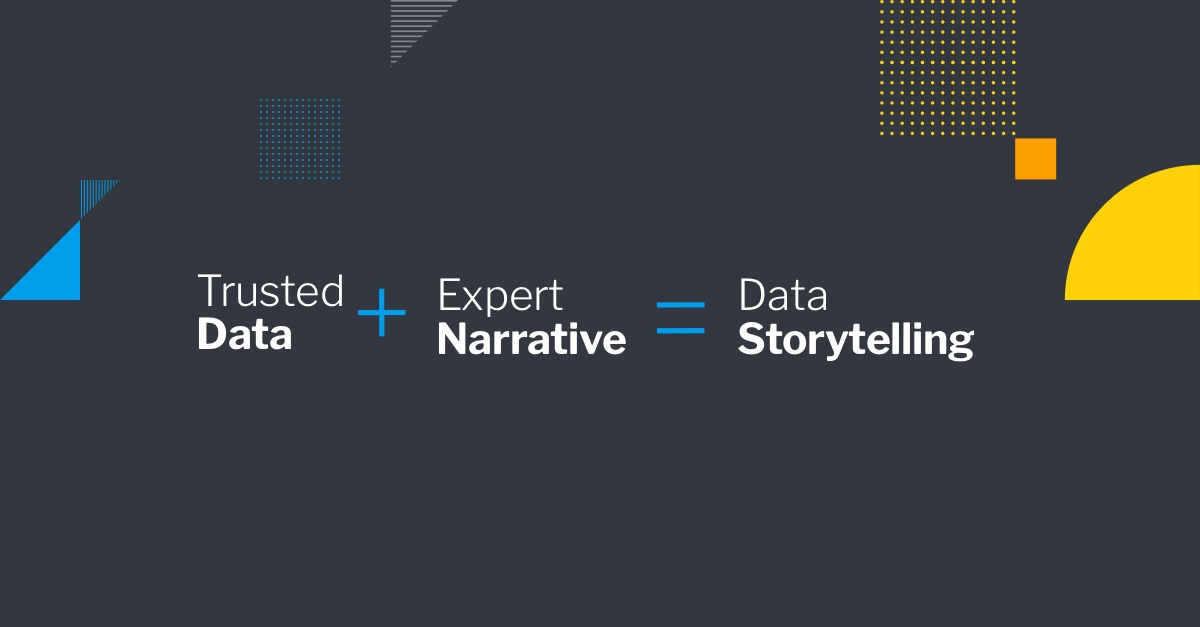
Your audience is more likely to pay attention if they believe you understand their pain points. That’s the power of empathy, and when combined with expert narrative, you can ensure you connect with your audience, and with what you have to share - still backed by data, of course. The numbers are always going to be there to support your findings, interpretation, or reasoning, but they’re not the ‘hook’ that helps people care, understand, or be inspired to act.
In short, every cloud has a silver lining; there’s always something good in bad numbers. It’s never just all bad such as sales are not selling. There’s always some reason for those numbers, and using empathetic narrative helps explain it’s not just a matter of black and white metrics.
Read: Data doesn't speak for itself - Why data storytelling is so important
Discover 7 reasons why data storytelling is a critical analytics practice today.