

Dashboard vs Report: Which is Better for BI?
Dashboards and reports are two common terms used interchangeably in discussions around business intelligence (BI) and data analytics platforms. Both are analysis tools used to present operational information graphically, provide visibility into organizational performance, and enable informed decision-making based on hard-tracked metrics.
But what is the actual difference between BI dashboards vs a report?
Because both terms are used together so often, it’s important to be able to distinguish their purpose as two distinct tools so you can ensure your end-users get the most out of their data. This blog breaks down what a BI dashboard vs report are in the context of data analytics, what their core differences are, and what option is better for your reporting. It will also help you understand the many ways a reporting dashboard blends live data with systematic reports, and how it ultimately can help boost your company’s analytical skills.
The role of a dashboard vs report in business intelligence
Modern business intelligence solutions offer the ability to create both business intelligence dashboards and reports. When your users need to consume or share data, help them decide by sharing this summary.
BI dashboard: Overview
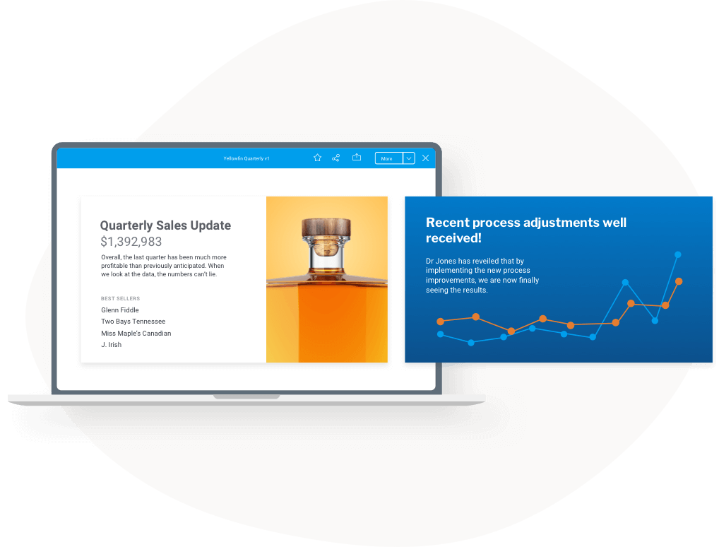
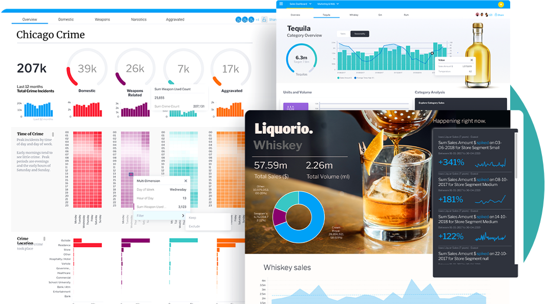
A business intelligence dashboard is a real-time graphical overview of business-critical data on a single screen, such as key performance indicators (KPIs) or operational performance, making it suited for monitoring and tracking what is going on in the business at the moment of analysis.
BI dashboards are designed to aggregate, communicate and display the most important data in a particular area in a single view, so the intended audience can examine that slice of information at a glance. Dashboards offer a helpful summary of business metrics, changes, and trends overall, which can be used to highlight areas of improvement, pin-point interesting patterns, or discover unexpected outliers. Because it is real-time, data on dashboards are typically up-to-date and refreshed with live data constantly.
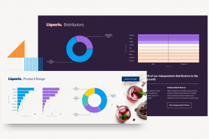
A single BI dashboard contains several elements: Metrics, tables, and data visualizations, such as charts, graphs, and maps. Depending on the exact BI solution used, these dashboards and their elements can be interacted with to lead the user toward more in-depth information and guide further action, such as a table of regional data supporting drill down or a graph linking to a more detailed report.
A well-structured reporting dashboard effectively combines real-time data visualization with customizable filters, enabling users to interact with insights dynamically and tailor the data to their specific needs.
Related: 4 Key Features of a Modern BI Dashboard
BI report: Overview
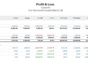
A report is a static snapshot of business performance at a particular time within a certain segment or area of the business. Reports typically provide a collection of charts, graphs, tables and text to offer a more in-depth view of data (compared to dashboards) that is already cleaned and curated for accuracy and relevancy. To simplify complex reports and make them easier for stakeholders to consume, teams can use an executive summary generator to quickly turn detailed data into clear, concise insights. Data in a report is also grouped, filtered and organized to highlight key metrics for the intended end-user, making it best suited for a more comprehensive analysis of specific data.
A report is a helpful source of detailed data, particularly for users who may not have access to analytics and dashboards, and it helps inform professionals with where to spend time and resources and how to drive actionable decision-making. However, because it is static, it is not updated in real-time, and it cannot be interacted with in the same way as dashboards. Integrating a data dashboard alongside reports is recommended to enhance static information contained within with real-time update and more interactive ways to explore the same data - should your audience require it.
Reports under the operational reporting model are slightly different; they are parameter-driven, tightly formatted, and source data from transactional or machine-based sources, are shared in real-time and require an additional level of curation to maintain compliance and privacy requirements (such as healthcare or banking). They best suit use cases where requirements are understood in advance but demand a significant amount of expertise, time, and effort to produce compared to normal reporting dashboard.
Related reading: Why Analytics and Reporting Tools Are Essential
Differences between dashboard and report
The main difference between BI dashboards and reports that every analytics user needs to understand comes down to the way they are designed and consumed, and their level of granularity.
Design: BI dashboard design displays visual information such as KPIs in a single pane, while a report can be just as brief and high-level, or include detailed levels of information across multiple pages or screens, making it less suited for at-a-glance information consumption. Reports may also collate and connect to several dashboards to convey the broader story behind a particular set of data - which is probably why it is seen and used interchangeably with dashboards when discussing analytics.
Interactivity: Dashboards are web-based and thus accessed and consumed digitally, whereas reports, being static snapshots of specific data-sets, can be consumed online or in PDF (though data in dashboards can also be exported depending on the BI solution’s level of export support - for example, Yellowfin Export). Dashboards can be interacted with by users far more dynamically, as they can click on metrics and visualizations to drill down or filter a data set further, while reports are only a view of the picture as of the time of the report's creation.
Granularity: A data dashboard provides a broad overview of data within its visualization and tables, while reports may only cover a specific segment of a data-set - making dashboards better for summary overview of performance, and reports for a more detailed focus - for example, of marketing metrics for the quarter per region.
Timeliness: Data on a dashboard vs report is updated live, helping business users keep up-to-date on how everything is performing or how KPIs are tracking, and is refreshed at regular intervals. Because reports offer a more static snapshot and are often consumed in non-digital formats (PDFs, etc) they don’t offer a moment-to-moment reflection of data. This makes dashboards better for monitoring and tracking data constantly (for example, using a KPI dashboard with live updated KPI metrics), while reports are better for consumption of data-sets that do not change as quickly.
What should a dashboard and report contain?
Both reports and dashboards share multiple features in common for data analysis, and while the way they are presented or customized varies between self-service BI solutions, they always contain these same elements to analyze data:
- Data (numeric, text)
- Export options (printing, PDF, sharing)
- Filters and grouping
- Images
- Hyperlinks
- Tables
- Data Visualizations (chart, graph, map, sparklines, etc)
One of the best ways to understand the dashboards vs reports debate for yourself is to try Yellowfin’s Interactive Dashboard Gallery, which contains several self service BI dashboard, report and data visualization examples based on best practices that can be clicked and tested by users on desktop and mobile devices.
See more: Yellowfin Interactive Dashboard Gallery
How to create a BI dashboard
Before building a BI dashboard, it is important to understand its role and align it with your unique business goals. Identify key metrics and KPIs to ensure relevant insights. Select the most suitable BI tool, like Yellowfin, Power BI, or Tableau, that helps with data integration. Build a user-friendly design that helps users with easy navigation and helps them get real-time updates. Set automated alerts to detect patterns. Enable interactive features for detailed data exploration. Make sure that it is an independent platform that can keep up with evolving business needs and technological advancements.
See more: How to Create a Dashboard in Yellowfin: Step-by-Step Guide
Dashboard examples
Businesses can start with reporting dashboard templates to easily track performance and make precise decisions that help the organization grow. Different types of dashboards are built specifically for business needs. Here is the list of the dashboards:
- Financial dashboards: Financial dashboards help in managing the business's financial records and keep the revenue track updated.
- Sales dashboards: Sales dashboards help in tracking the overall performance of sales, customer satisfaction, and overall conversion of sales.
- Marketing dashboards: Marketing dashboards help in Analyzing the overall performance of the campaign, website traffic, and audience engagement.
How to create BI reports
A BI report helps make business data more accurate and present it with a clear structure, which helps for easier interpretation of critical business information. Ensure your reports are effective by spending time on the fundamentals - first, define its purpose, validate your data, and use visuals like charts to highlight key insights. Choose the most suitable format for distribution, whether it’s PDF, Excel, or a web-based report, based on user preferences and convenience. After selection, find the best and most suitable format for distribution and automatic updates for the understanding. Ensure data security with access controls and encryption to maintain compliance and protect information.
See more: How To Define a View and Create Reports using Yellowfin View
Reports examples
- Marketing reports: This report helps in tracking ad campaign performance, customer engagement, and return on investment (ROI).
- Financial reports: Helps in analyzing revenue, expenses and financial growth.
- Operational reports: Monitoring efficiency of the supply chain, inventory levels, and how much time it takes in production.
- Sales reports: Sales report helps in evaluating the latest sales trends & growth in revenue.
Dashboard vs report: Which is the better option to use?
This comes down to the business use case, and the BI solution in question - Power BI vs Yellowfin, for instance, poses different possibilities for its reports and dashboards, and report and dashboard design.
Data dashboards are great for an everyday overview of what’s going on in the business thanks to its interactivity and timeliness of real-time updated data, while reports are best for a more in-depth look at a particular data-set, which can provide deeper insight than an at-a-glance summary. Both ultimately utilize and provide rich, helpful data visualization for deeper understanding of a topic.
Modern BI solutions such as Yellowfin offer both business intelligence dashboard software and BI reports that are highly interactive, customizable and suitable for a broad range of use cases, so you never have to choose one or the other - you can use both depending on the audience or use case, and imbue them with interactivity (alerts, drill down, automation) with ease. Additionally, a data visualization dashboard enhances data interpretation, by presenting insights in an easily digestible format, improving decision-making processes.
Frequently Asked Questions (FAQs)
Can a dashboard be a report?
The dashboard and report are not interchangeable in function; rather, they complement each other in such a way that the dashboard provides a visual summary of key metrics, in spite of a detailed document, whereas the report delivers in-depth structural analysis.
When should I use a dashboard instead of a report?
You should use a dashboard when you need to view critical business data at-a-glance for real-time insights and quick decision-making, whereas a report is best used for more in-depth analysis of historical data.
Can dashboards and reports be used together?
Yes, dashboards and reports can be used together. Dashboards offer real-time snapshots of available information, and reports provide detailed context and analysis on the same data to generate more accurate and actionable insights.
What is the difference between a dashboard and a report in business intelligence?
A dashboard shows real-time business metrics and KPIs in a visual, interactive format, while a report provides a detailed, static analysis of data from a specific time period for deeper evaluation.
Is a BI dashboard real-time or static?
A BI dashboard is typically real-time or near real-time, automatically refreshing data to reflect current performance, whereas reports remain static once generated.
When should I use a dashboard instead of a report?
You should use a dashboard when you need quick, at-a-glance insights and continuous monitoring of KPIs. Reports are better suited for detailed analysis and historical reviews.
What is a BI report used for?
A BI report is used to analyze structured data in detail, track historical performance, support compliance needs, and share insights through formats like PDF or Excel.
Can dashboards replace reports in business intelligence?
No, dashboards cannot fully replace reports. Dashboards are ideal for monitoring live data, while reports are essential for in-depth analysis, documentation, and record-keeping.
Are dashboards more interactive than reports?
Yes, dashboards are highly interactive and allow users to filter data, drill down into metrics, and explore trends. Reports usually present fixed data with limited interaction.
What type of data is best suited for dashboards?
Dashboards work best with frequently changing data such as sales performance, website traffic, operational KPIs, and marketing metrics that require constant tracking.
What type of data should be included in BI reports?
BI reports are best for validated and structured data like financial results, operational summaries, compliance data, and historical performance metrics.
Can dashboards and reports use the same data source?
Yes, dashboards and reports often use the same data sources. The difference lies in how the data is updated, visualized, and consumed by users.
Which is better for decision-making: dashboards or reports?
Both support decision-making differently. Dashboards help with fast, operational decisions using real-time data, while reports support strategic decisions through detailed analysis.
Conclusion
Dashboards and reports are both necessary for effective business intelligence. Dashboards help provide real-time monitoring and analytics, which helps individual professionals and their teams make better informed decisions for the organization. On the other hand, reports provide a detailed analysis of historical data or specific metrics at a particular point-in-time. The best option depends on your unique business use case, and whether you need consistently updated metrics and a convenient way to track them, or a brief report of the past performance.
Try Yellowfin BI Dashboard Software
Learn how Yellowfin BI's modern embedded analytics solution can bring action-based business intelligence dashboards and beautiful data visualization to your software.