

Explainable AI in Customer-Facing Analytics: How Yellowfin Turns Predictions into Action
Why Explainable AI Is Becoming Essential in Customer-Facing Analytics
Predictions alone are no longer enough. A churn score is not useful if no one trusts it, and a risk score does not help if the next step is unclear. The same goes for a recommendation engine. People need to know why a model made a call, and what action comes next. That is the core shift in explainable AI for analytics. The work has moved from "what happened?" to "why did it happen, and what should I do now?" Customer-facing analytics depends on that shift. Users want answers they can trust, inside the workflow they already use.
What this article will cover
This article covers three parts of explainable machine learning in customer-facing analytics. First, multi-level explanation architectures that support executives, analysts, and frontline teams. Second, scenario analysis and actionable levers that turn a score into a plan. Third, SHAP and LIME methods that add real-time transparency to AI-powered BI. Yellowfin embedded analytics fits this model well because it brings explanations into the app, not a separate data science tool. Features like Tell Me About My Data, Signals, and Ask Yellowfin give users a simple way to ask, inspect, and act.
Why Does Explainable AI Matter for Business Decisions and Embedded Analytics?
There is a trust gap in black-box analytics
Black-box models create friction fast. A “churn prevention score” may be accurate, but if a customer success manager cannot explain it, the score loses value. The same problem shows up in customer health scoring and personalized recommendations. Business leaders need defensible decisions, not just strong prediction metrics. They need to know which factors drove the result, which ones matter most, and which actions can change the outcome. That is where explainable AI for analytics becomes practical, not some kind of purely academic theory.
Why do embedded analytics amplify the need for transparency?
Embedded analytics raises the stakes. When insights live inside a customer portal, sales app, or service console, users expect them to be fast to use and clearly understandable. They do not want to leave the screen and have to open another tool simply to decode what they are seeing. They want the answer in context. Google's AI Explainability overview explains the value of interpretable output, while the NIST AI Risk Management Framework treats trust and risk as core parts of AI use. For customer-facing analytics, that close interconnection matters. If people cannot see the logic behind the information presented, they hesitate to act.
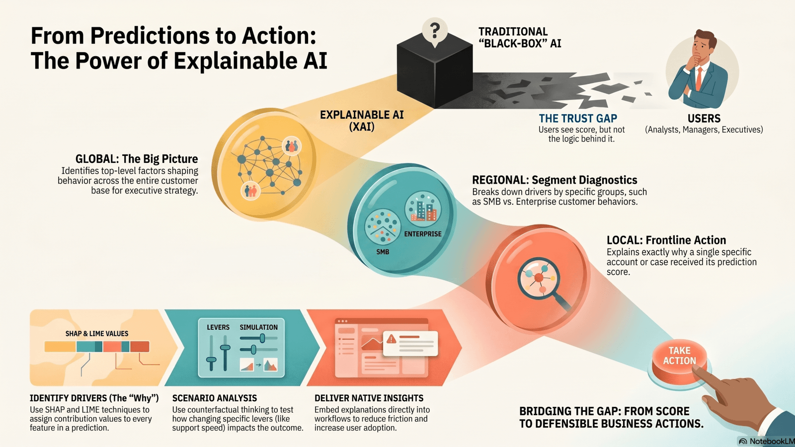
Multi-Level Explanation Architectures: Global, Regional, and Local Views
Global explanations answer one question: what drives outcomes overall? They show the top factors shaping behavior across the full customer base. In churn models, the contributing factors might include service quality, pricing changes, product usage frequency, and response times. That kind of very specific and meaningful view helps executives see patterns that could be directly affecting the entire customer portfolio, not just one account. It also helps teams decide where to spend time and budget. If pricing and support delays show up everywhere, the fix sits at the strategy level, not the account level.
Regional and local explanations can make BI insight actionable by role
Regional explanations break the picture by segment. Enterprise and SMB customers often churn for different reasons. SMB churn may track with usage. Enterprise churn may link to support resolution times or contract friction. Local explanations can go one step further. They help explain why one account, one case, or one customer received a score. That is the level of detail frontline teams need.
| Explanation Layer | Question Answered | Best Audience | Example Insight | Business Value |
| Global | What drives outcomes overall? | Executives, strategy teams | Pricing and service quality are the top churn drivers | Prioritizes enterprise-wide initiatives |
| Regional | How do segments differ? | Business analysts, managers | SMB churn is usage-driven; enterprise churn is support-driven | Shapes actions by segment |
| Local | Why this customer? | Customer success, sales, ops | This account is at risk due to low engagement and delayed support resolution | Supports targeted intervention |
This layered view fits role-based decision-making. C-level teams need strategic patterns. Analysts need segment diagnostics. Frontline teams need clear, actionable, customer-specific next steps. Yellowfin helps surface those layers inside embedded dashboards, with AI-written explanations that sit next to the chart, not outside the workflow.
Scenario Analysis and Actionable Levers: From Prediction to Intervention
A prediction is only half the story. The better question is, "What would need to change to reduce churn risk?" That is counterfactual thinking. It separates immutable factors, like customer type or region, from changeable levers, like onboarding speed, call frequency, or support response time. That distinction matters because it keeps teams focused on action. IBM's overview of explainable AI describes how counterfactual explanations help users see what would shift a model output. In customer-facing analytics, that means teams can test options before they spend time or budget.
How can I turn analytics into operational action?
Scenario analysis turns a score into a plan. Retention teams can test outreach timing. Sales teams can rank candidates for upselling activities. Support teams can run service recovery playbooks. Product teams can push adoption nudges to accounts that stall after onboarding. Each case starts with a prediction, then checks what move changes the result.
| Step | Question | Output | Example in a Customer-Facing BI Workflow |
| 1 | What is the risk or opportunity? | Prediction or score | Churn risk = high |
| 2 | Why is it happening? | Key drivers | Low usage, delayed support response |
| 3 | What can change? | Actionable levers | Increase onboarding, trigger outreach |
| 4 | What is the likely impact? | Scenario analysis | Risk drops if engagement improves |
| 5 | Who should act? | Role-based recommendation | CSM follows up, manager reviews segment |
Yellowfin fits this flow well. Interactive dashboards let teams inspect drivers. Signals can flag positive or negative shifts early so you can act on them in a timely manner. Stories help teams share and illustrate the decision path, not just the result. That shortens the gap between insight and action.
SHAP and LIME for Real-Time Transparency in Customer Analytics
SHAP stands for Shapley Additive Explanations. In plain terms, it assigns a contribution value to each feature in a prediction. It tells users how much each factor pushed the result up or down. SHAP documentation shows how this works across many model types.
LIME stands for Local Interpretable Model-agnostic Explanations. It builds a simple local view around one prediction so humans can read it. The LIME GitHub project explains the approach clearly. Both methods work without exposing model internals. That matters for business users who need clarity, not code.
Why these methods matter in customer-facing products
SHAP and LIME raise trust, auditability, and confidence in AI recommendations. They help teams explain survey results, show why a recommendation appeared, support personalized marketing, and check model output against human judgment. The IJERET article also points to the value of explainability in consumer insight and transparency.
| Technique | Best For | Strengths | Limitations |
| SHAP | Global and local feature attribution | Strong theory, consistent explanations | Can take more compute resources |
| LIME | One local prediction | Fast, easy to read, model-agnostic | Can vary across nearby cases |
For customer-facing analytics, timing matters. Explanations need to appear inside dashboards and portals, not in a notebook or model lab. That is where Yellowfin embedded analytics fits well. It places the result and the reason in the same place, so users can act right away.
How Yellowfin Helps Deliver Explainable, Embedded Analytics at Scale
Yellowfin brings several AI-powered BI features into the same workflow. AI NLQ lets users ask questions in plain language. Assisted Insights writes contextual explanation text around the chart. Signals watches for unusual shifts and alerts teams fast. Stories lets teams wrap charts in a clear narrative. Together, these features support explainable analytics in action. Users ask. The system answers. Teams share the result and the next move.
Why Yellowfin fits customer-facing and embedded use cases
Yellowfin works particularly well in situations where analytics must feel native to a product. The experience can be entirely white-labeled so you can truly make it your own. The dashboards feel part of your app or website. Deployment moves faster than building a full BI stack from scratch. That matters when customer trust and adoption are on the line. Yellowfin also supports collaborative decision-making, which helps teams compare notes and keep context in one place. The Yellowfin 9.17 release adds more AI-powered support for conversational analytics, which fits the push toward natural language exploration and guided insight.
If an analytics layer cannot explain itself, users stop there. Yellowfin gives teams a cleaner path from data to decision.
Best Practices for Implementing Explainable AI in Customer-Facing Analytics
Executives need summary drivers. Analysts need segment diagnostics. Customer-facing teams need action cues. The same explanation should not serve all three groups. Keep the language business-first. Use short labels. Show only the drivers that matter. Avoid technical clutter. A clean explanation wins more trust than a dense one.
Ensure explanations lead to action and measurement
Every explanation should point to a next step. That next step can be outreach, escalation, a pricing review, or a product nudge. Then track what happened after the action. Did churn fall? Did adoption rise? Did the score change in the next cycle? Explanations need feedback loops. Yellowfin Stories and collaboration features help teams record the decision, share the context, and check results later. That turns analytics from a static display into a working process.
Conclusion - Make AI Insightful, Trustworthy, and Actionable
Explainable AI for analytics works best when it matches the user's role. Global, regional, and local explanations give each group the view it needs. Scenario analysis turns prediction into action by showing what can change. SHAP and LIME make real-time AI readable and auditable. That mix matters most in customer-facing analytics, where trust decides adoption.
What Next?
Take a hard look at your current analytics stack. Does it explain outcomes well enough for business users and customers? Does it help them act, or only observe? Yellowfin embedded analytics, AI-powered insights, and storytelling tools give teams a practical way to work with live data and clear context. Request a demo, try the platform, or review the latest release and webinar resources, including the data sovereignty webinar and the Analytics Coffee Club webinar.