

Why data visualization alone is not data storytelling
For a long time, many in the analytics and business intelligence (BI) industry, including most of our competitors, have loosely labelled data visualization in the form of charts and dashboards as ‘data storytelling’.
In doing this, vendors have set an expectation within the industry that this is what ‘data storytelling’, as both a practice and a feature of a BI tool is. To be fair, yes, data visualization tells a story with data. But is it really data storytelling? Ask yourself:
- Does it provide context?
- Does it explain what is happening or has happened in the numbers and why?
- Can someone new to the dataset and business clearly understand the changes and implications, and then make informed decisions from a visualization on its own?
- Could that ‘story’ or insight in the data be open to interpretation, infused with bias or misread by someone lacking the right expertise?
With these important questions in mind, I would argue that charts, dashboards and data visualizations on their own are not ‘data storytelling’ in its true form. A chart or dashboard is just a visualization. It tells a story, but that story is open to interpretation.
Like a picture book without words, even the simplest of charts without context can, and often will, be misinterpreted as viewers inject their own world view, bias or perception into the data. Consider the last couple of decades of economic prosperity. Many companies were doing well despite themselves. A company dashboard would quite often show nothing but growth. And no doubt everyone who looked at the numbers could stake a claim on that growth.
“It’s the advertising!” says the Marketing team.
“It’s the exceptional selling process!” says the Sales team.
“It’s the new features!” says the Product team.
When in fact, demand may have been created by some entirely external factors - or a combination of all of the above.
Without context or narrative, charts are really just a pretty picture to everyone who doesn’t fully understand what went into making the line go up, down or stay the same
But when combined with both, your charts can take on new, valuable meaning.

Trusted data and expert narrative = data storytelling
Let’s step away from the business analytics and BI world for a moment and consider some of the great storytellers of our time.
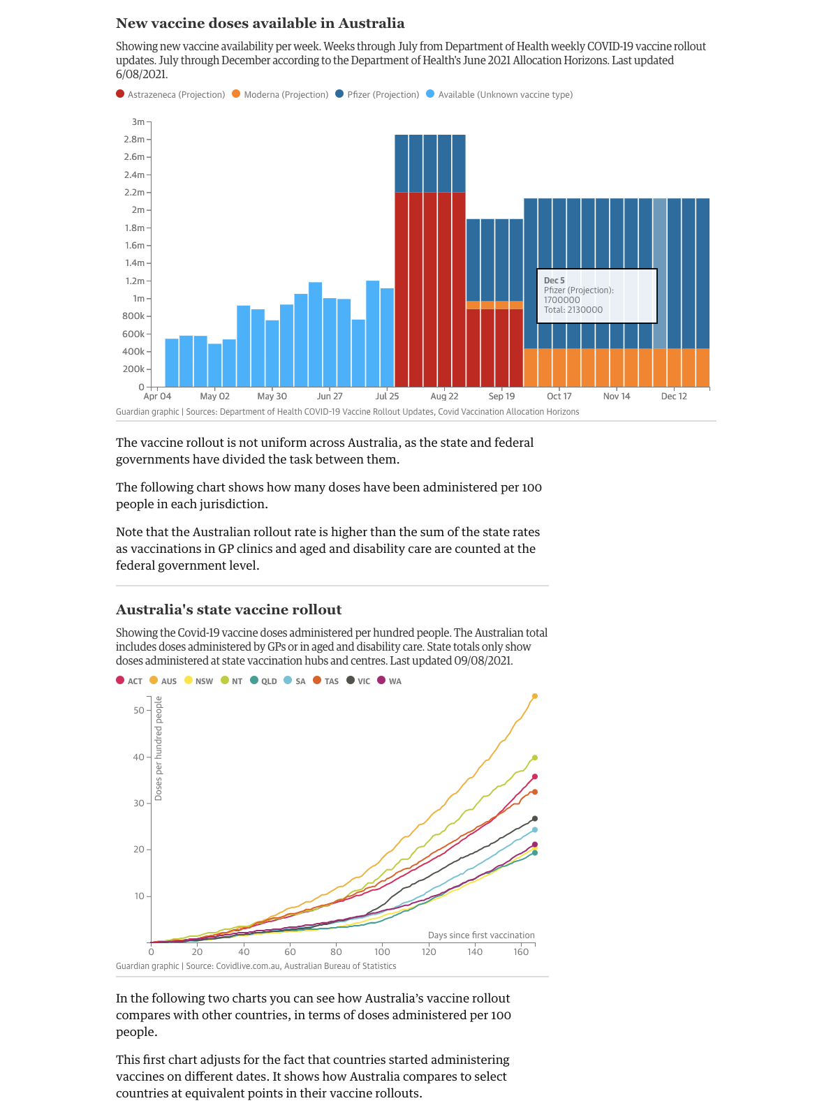
Publications such as The New York Times, The Guardian and many experts in their field do a great job of communicating complex stories or insights through a combination of words and data. As readers, we are taken on a journey on a huge range of topics, from the COVID-19 Vaccine Rollout in Australia to Drug Overdose Deaths in the US or Whether a band should stay together or go solo and everything in between.
This transparent data analysis, supported by written explanation by an industry or topic expert, enables their audiences to easily absorb and learn something new, see a different perspective and make a more informed decision if required. Put simply, effective data storytelling is the combination of both trusted data visualizations and expert narrative.
As a proven method in the journalistic world, when these two components come together in the business world, the effect can be transformational in terms of organizational data adoption. The benefits have not gone unnoticed, and it’s the reason there is increasing attention on data storytelling as both a BI feature and business practice. In fact, Gartner predicts by 2025, data stories will be the way most business users will consume data.
Why? Because we all absorb information in different ways, and data storytelling helps anyone understand data complexity by putting it in a format that is easy to consume. Sophisticated charts and visualizations can actually alienate many but the few data analysts that know how to interrogate and interpret the data.
Our personal experience, bias and level of understanding mean that without narrative, we may miss, misinterpret or misunderstand the insights visualized. But presenting data in a format that is open to more people democratizes the sharing of valuable insights and plays a significant role in putting data at the heart of your organization - as long as that data can be trusted and the story is delivered by those in the know.
Show what data storytelling looks like, then!
We believe people will make better decisions, and organizations will be far more successful when data is at the heart of their decision making. For this reason, Yellowfin have long been focused on data storytelling. It’s why we made Stories and Present.
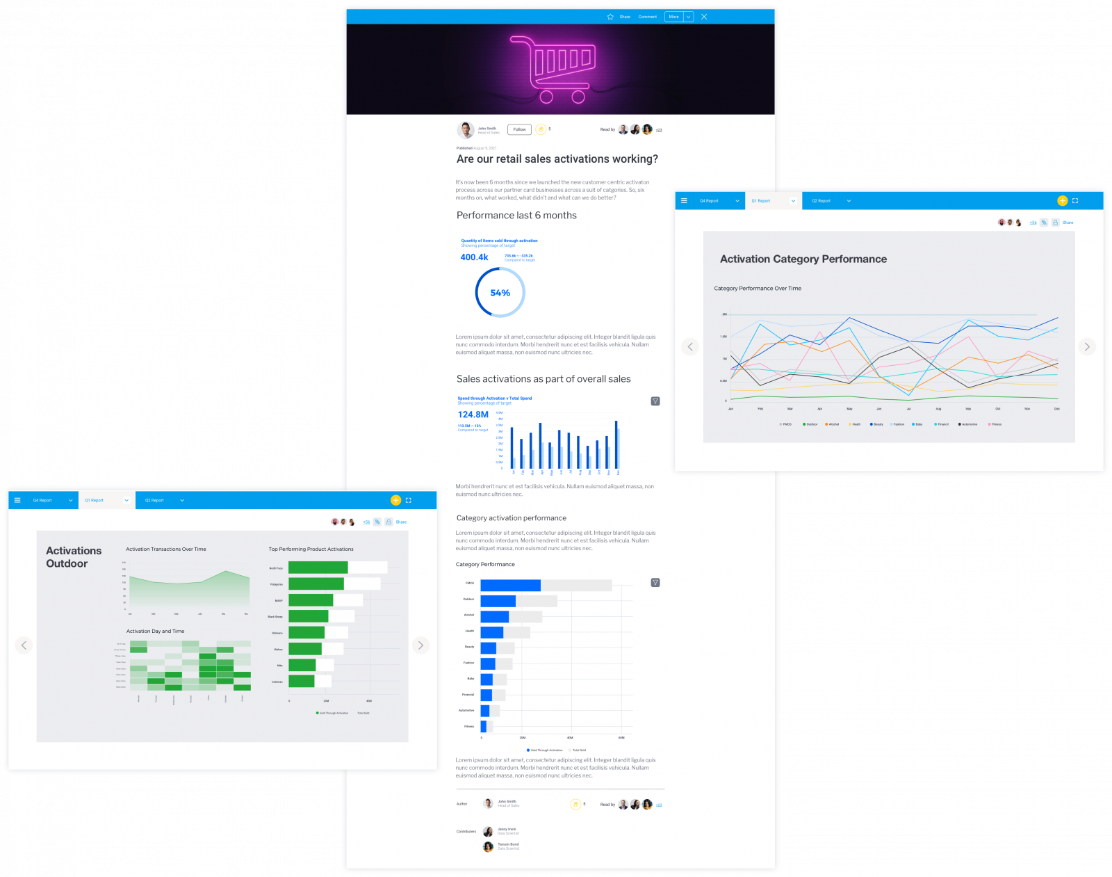
Stories and Present are our dedicated data storytelling modules that enable regular professionals and experienced analysts to share their insightful narratives with trusted data, opening up the data discovery and insight sharing process for everyone. On top of dashboards and charts, Yellowfin users get context, too. See for yourself in our gallery.
Challenging what data storytelling is and why it’s so important as a practice and a BI capability, Stories allows for data storytelling in the form of a written story, while Present enables narrative to be put into slide presentations. Both are supported by embedded data visualizations, and are quickly becoming the best way for organizations to share critical information, from sales and performance reports to department updates.
From visualizations to narrative-led data stories
To ensure you are ready to intercept the imminent ‘data storytelling’ movement, your BI solution needs to contain the right types of narrative-based tools as part of the platform that truly let you combine rich media, data visualization and written narrative analysis.
Before you embark on adopting an analytics platform to bring data stories to your end-users, consider the following criteria:
- Can you easily create and share a data story in a way that the data can be trusted?
- Can the subject matter experts throughout your organization contribute and collaborate on changes in your data, to provide narrative in a way that can be delivered throughout the organization such that everyone can learn from the insights?
- And finally, can readers of these data stories dig deeper within the data to further add alternative views or explanations?
If the answer is ‘no’ to the above, chances are, a large part of your business could be missing out on valuable learnings and insights that could transform the way they work.
Read: Yellowfin Stories - 5 Features That Change How Data Flows Through Your Business
Learn how data storytelling can enhance the way your end-users and leadership communicate and share insights throughout the organization. Read for yourself how Yellowfin Stories has been built just for that need.