

How to use Conditional Formatting on Charts in Yellowfin
Welcome to the latest entry in Yellowfin Japan’s long-running ‘How to?’ blog series.
This series of blogs aims to provide a step-by-step guide of how to get the most out of your Yellowfin BI experience, such as how to create your own Yellowfin dashboard, and how to use Yellowfin's rich data visualization tools. Catch up on the series below:
1. How To Design a Dashboard in Yellowfin: Part One
2. How To Design a Dashboard in Yellowfin: Part Two
3. How To Capture Data using Yellowfin Data Transformation Flow
4. How to Add a ‘Back to Top’ Button to Your Yellowfin Dashboard
5. How to Create Big Number and Vertical Column Charts in Yellowfin
6. How to Create a Pie Chart in Yellowfin Dashboards
7. How to Create a Heat Grid in Yellowfin Dashboards
8. How to Create a Line Chart in Yellowfin Dashboards
9. How to Drill Through in Yellowfin Dashboards
This latest article will show you how conditional formatting works in Yellowfin BI. Yellowfin has the same feature that Microsoft Excel and Power BI has - and Yellowfin conditional formatting can be set for report tables and charts, as well as widgets on the canvas.
Note: Throughout this series, field names will be written in [square brackets], Yellowfin settings and selections will be written in "double quotations", and parameters that must be entered manually will be written in enclosing lines and shadings. No specific rules are defined for (rounded brackets) or ‘single quotations’, so please read them as normal punctuation marks.
Before we dive into how to use conditional formatting in Yellowfin BI, we will take some time to answer a common question we get - what is conditional formatting?
What is conditional formatting?
Ever looked at a spreadsheet full of numbers and wished it could tell you a story at a glance? Then you're ready to understand what conditional formatting is about.
Simply put, conditional formatting is a powerful feature in data tools that allows you to automatically change the look (or "format") of your data based on specific rules or "conditions" you set.
Consider this; you have a list of sales figures. Instead of manually looking for every sale above a certain amount, you could set up a condition in your data tool of choice to make accessing that information, and interpreting and representing it in a chart, much easier.

For instance, if a sales number is greater than $1,000, then you can set a condition that automatically turns that cell green. You could also apply data bars to visualize values with proportional bars inside cells, use color scales to create color-coded charts that show value distribution, or even add icon sets like arrows or traffic lights to indicate performance. This kind of formatting can instantly highlight important metrics, and help improve the overall reporting experience for the individual user or intended audience.
Learn more: Conditional Formatting in Yellowfin
What is the purpose of conditional formatting?
The primary purpose of conditional formatting is to facilitate better data interpretation for the end-user. By establishing rules, this feature enables the highlighting or alteration of data appearance directly within reports and charts.
It is important to employ conditional formatting whenever your report consumers must be directed to specific data points for action or interpretation, based on predefined criteria. This functionality transforms raw data into visually digestible information, helping enhance the efficiency of analyzing data and using it for strategic decision-making.
So, how does Yellowfin handle conditional formatting, and what options are available for charts? Let's find out in the next section.
How to use conditional formattings for a table
In Yellowfin, you can do the following three things with table conditional formatting, based on rules that you specify:
- Change a background color or a text color for a cell
- Show an icon in a cell
- Show a bar chart in a cell
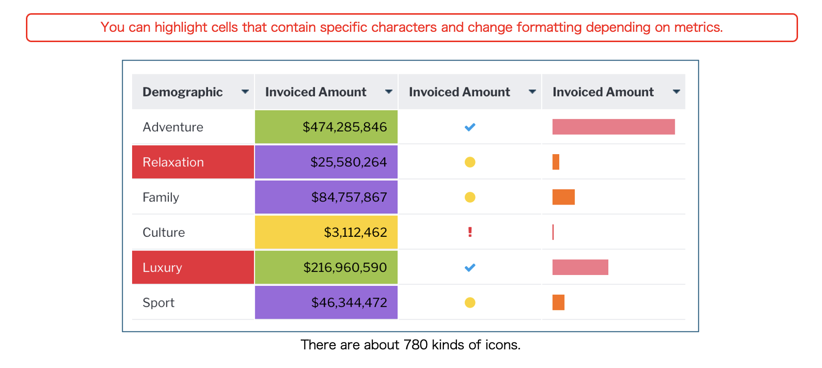
In addition to specifying cell values, conditional formatting rules can also specify the total value of a column, a percentage of the maximum value, and comparisons with other numbers. For example, you can set up rules such as changing the color of a cell if sales are more than 30% off the best-selling product, or changing the icon to display according to the percentage of the budget that has been completed.
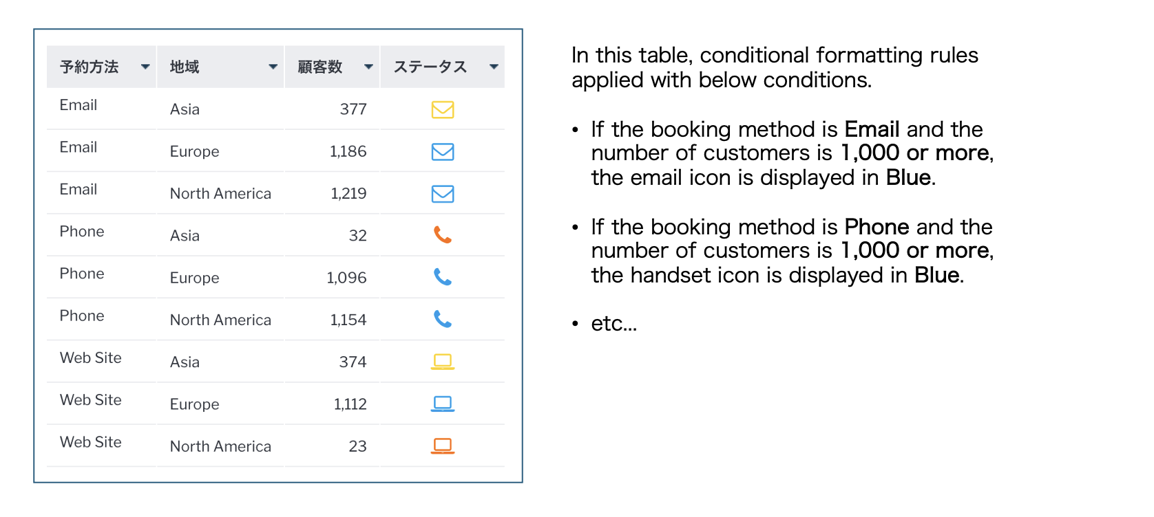
Advanced conditional formatting alert types also allow you to specify conditional formatting rules with multiple conditions. For example, you can set a rule to make the cells red for products whose sales total is more than x yen(¥) and whose profit margin is more than x%. In the example below, the icons are different depending on the booking method, and the color of the icons changes depending on the number of customers.
Use conditional formatting in a chart
The conditional formatting that you set in a Yellowfin table can also be used in a data visualization chart, but only if the alert type is set to Basic. Note that if the alert type is set to advanced, it cannot be used in a chart. You can set conditional formatting for metric fields, such as column, bar, area, and radar charts. Conditional formattings that you set for dimension fields are available for radar charts and pie charts.
Set conditional formatting for a table
Now, let's use the Ski Team sample data, available in every Yellowfin deployment, to use the conditional formatting set on a table in a chart.
- In this blog, I will use【Age Group at Camp】and【Invoiced Amount】to create a table of charges by customer age.
- For【Sum Invoiced Amount】, set the conditional formatting as follows: If the value is less than 100 million, the text color is yellow.
- Open the Conditional Formatting Settings menu for【Sum Invoiced Amount】, set the ‘Alert Type’ to ‘Basic’, the ‘Style’ to ‘Cell’, and the ‘Type’ to ‘Value’.
- For ‘Rules’, select ‘Less Than (<)’ and set the text color to ‘Yellow’ in ‘Style’.
Now, let's take a look at what the table looks like with the new formatting rules in place: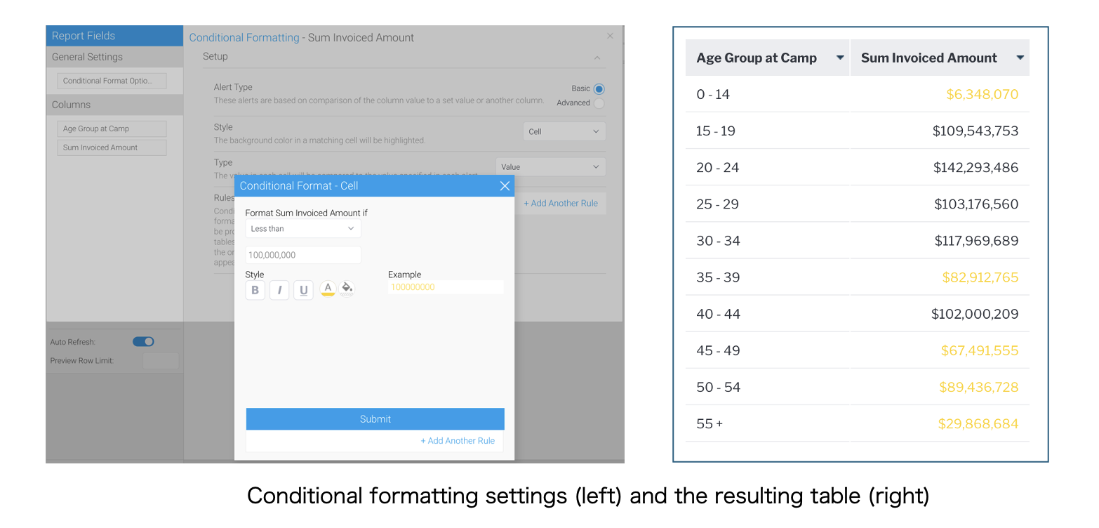
The conditional formatting have been successfully applied to the table.
Next, let's create a chart and use conditional formatting with it. The setup step varies depending on the type of chart. The following sections will describe how to set them up with each chart type.
Use conditional formatting in a column chart
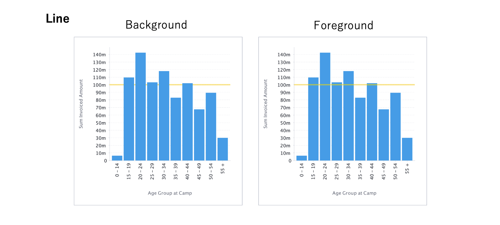
It's time to create a column chart by setting【Age Group at Camp】for ‘Horizontal axis’ and【Sum Invoiced Amount】for ‘Vertical axis’. If the metric field you are using on the vertical axis has conditional formatting, ‘Conditional’ section will appear in the ‘Series Settings’ menu, so set the ‘Style’ and ‘Position’.
For column charts, you can choose from three types of charts: Area Chart, Bar Chart, and Line Chart. There are two types of Position: Background and Foreground.
First up is area, which displays the color as a band, as defined by the conditional formatting rules. Here is a visual example to compare against other BI vendor options, such as Power BI area chart conditional formatting.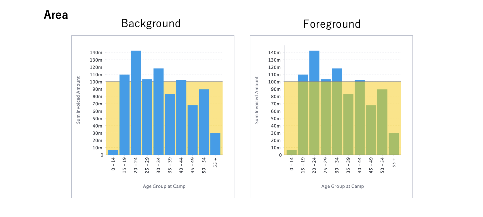
Bar charts applies conditional formatting rules to bars in a chart. There is no Position setting (background/foreground) available because the bars themselves change color, as shown below (so you can compare against bar chart conditional formatting Power BI).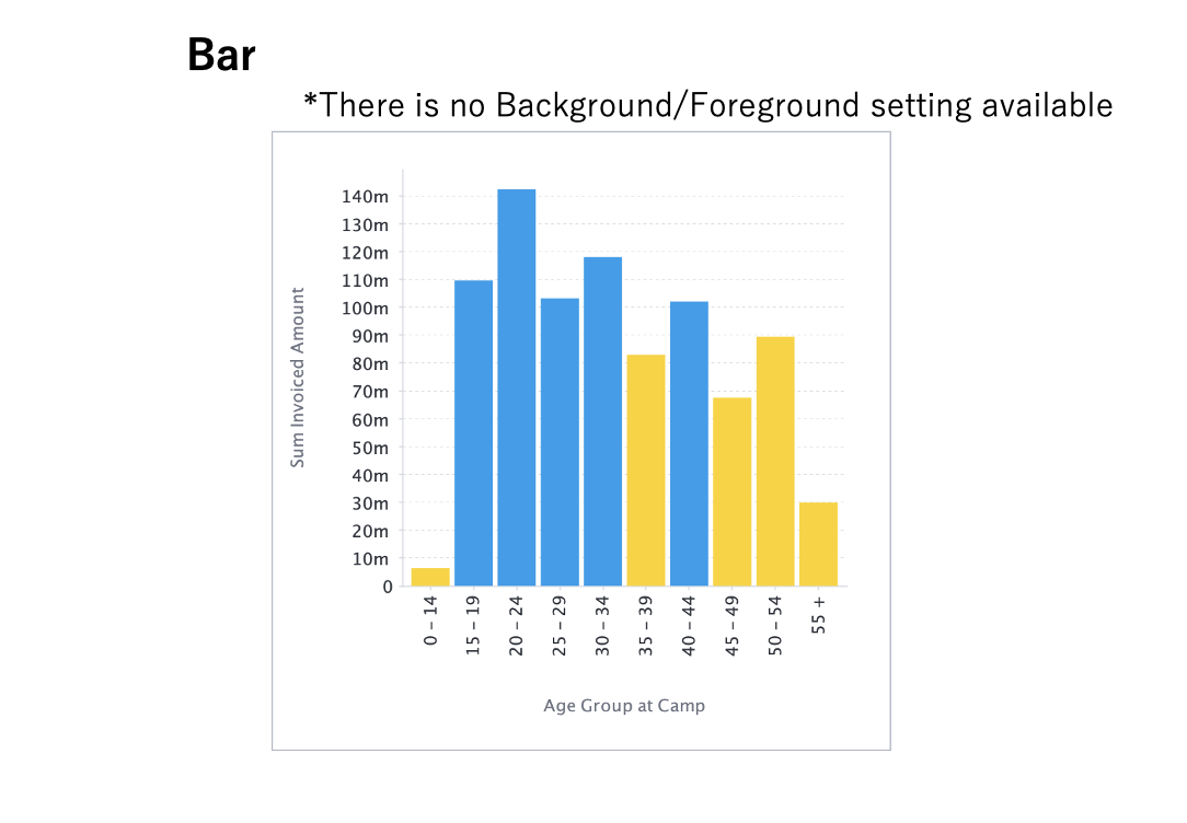
The line chart option draws a line at the value set in the conditional formatting rules.
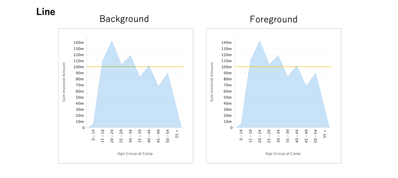
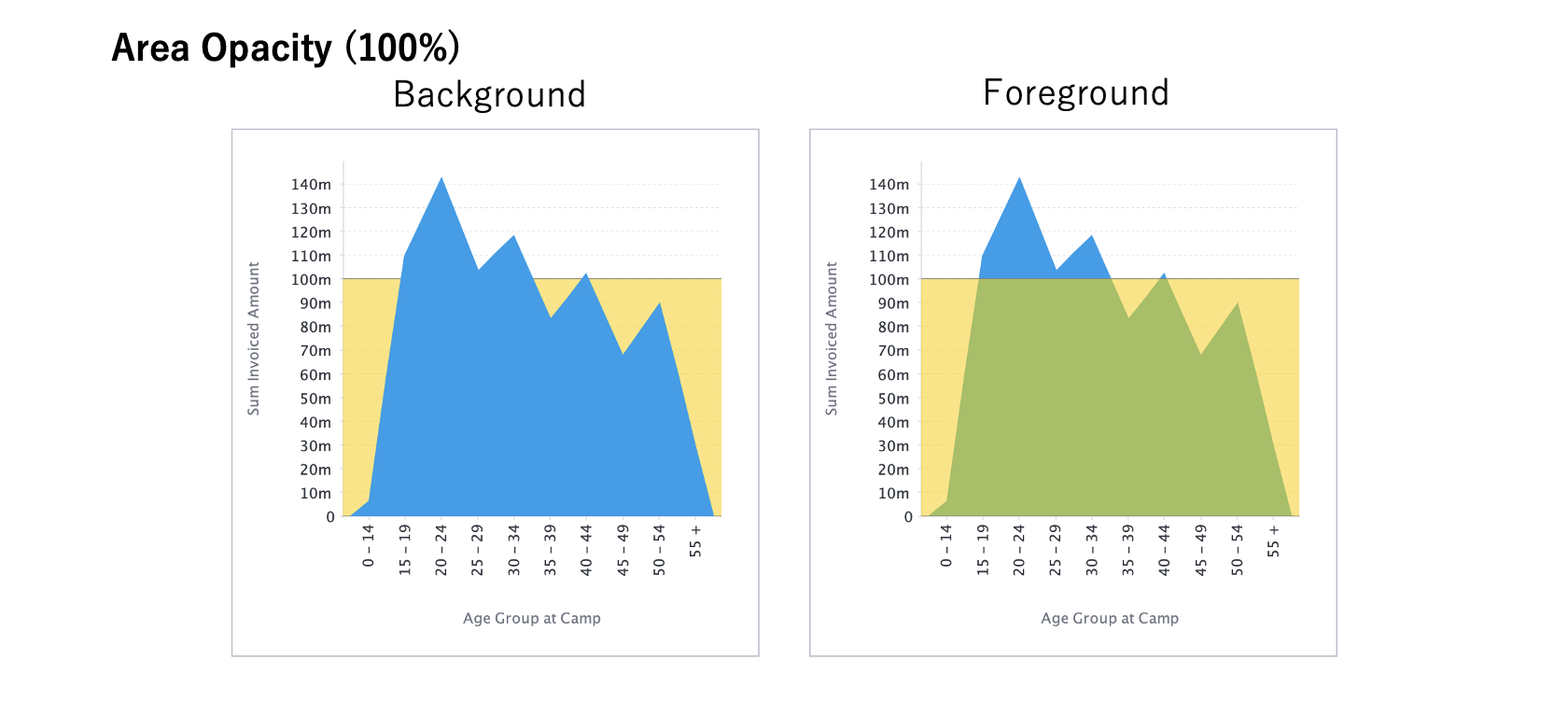
Use conditional formatting in an area chart
The setting procedure is the same as for a column chart, but in the case of an area chart, you can select ‘Area’ and ‘Line’ for ‘Style’.
Both the Area and Line styles have the same visual appearance as a column chart, but an area chart is transparent and the conditional formatting colors show through even when set to ‘Background’, as shown in the example visuals below: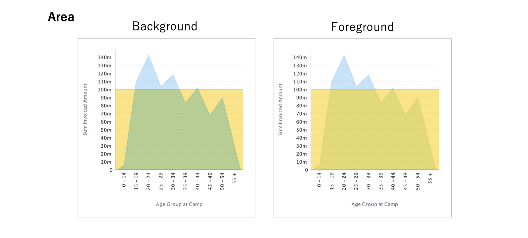
If you want to display a chart without making it transparent like a column chart, set ‘Opacity’ in ‘Series Settings’ menu to ‘100%’, so that the chart will not be transparent.
Use conditional formatting in a radar chart
Next up is a radar chart. While less used than the three column charts, it is a good type of data visualization to showcase the benefits of conditional formatting in action.
Let's create a radar chart with【Age Group at Camp】as the ‘Radar’ and【Sum Invoiced Amount】as the ‘Size’. For Radar charts, if a field used in either Radar or Size has a conditional formatting applied, the ‘Style’ section in the ‘Chart Settings’ menu displays ‘Radar Grouping Field’. When you select a field with conditional formatting (in this example,【Sum Invoiced Amount】), the color set by the conditional formatting rules appears in a ring around the radar chart.
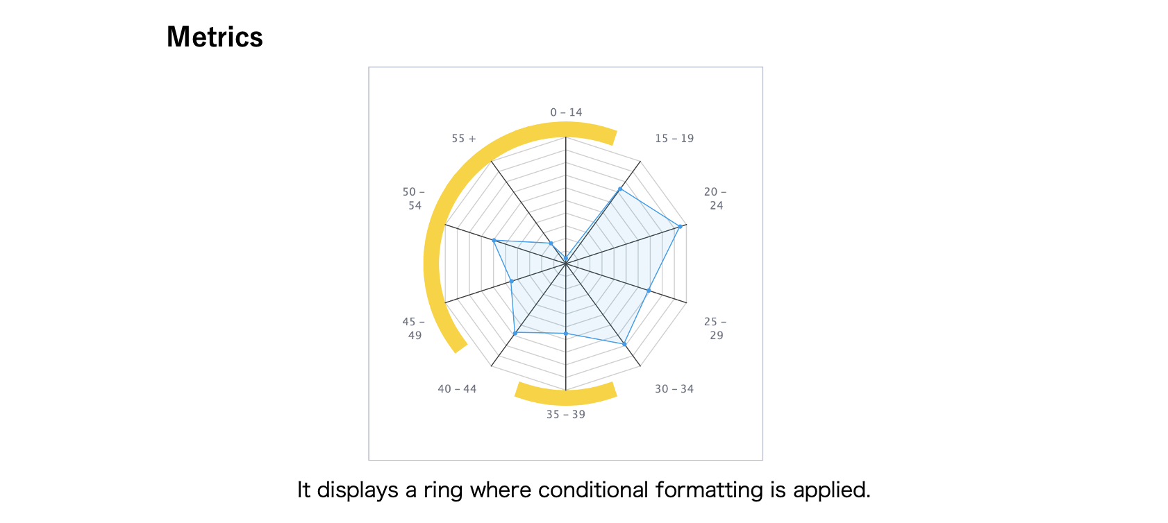
Here is an example of using the conditional formatting for【Age Group at Camp】and set to the ‘Radar Grouping Field’.
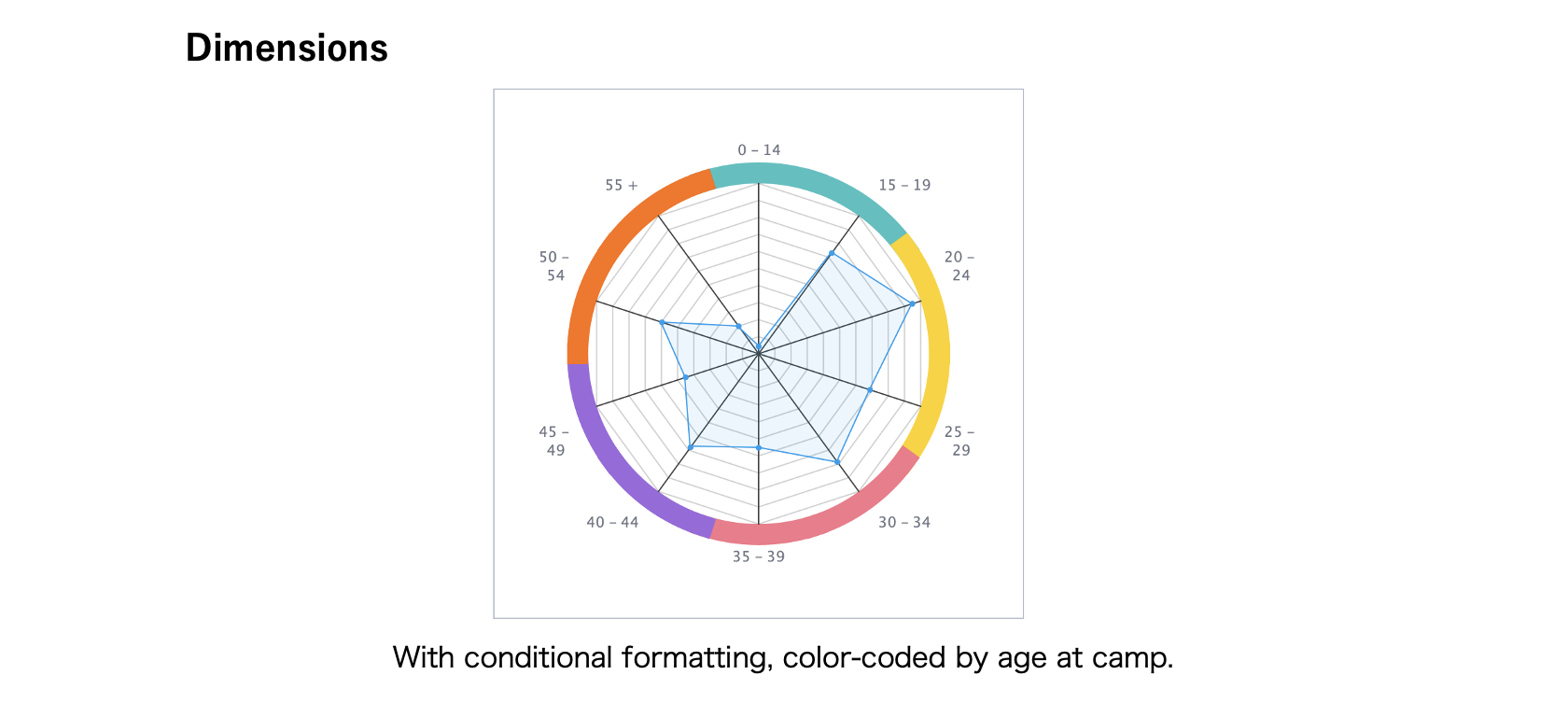
If you want to change the color of the ring depending on how large or small the value is, you can use the conditional formatting set on the metric field. If you want to change the color of the ring depending on a specific group, you can use the conditional formattings set on the dimension field.
Conclusion
Learning how to use conditional formatting in charts using Yellowfin BI is not only easy and filled with options, but can really help enhance the accessibility and interpretation of important data and metrics in your Yellowfin reports, especially with visual options that may not be as readily available or easy to set when doing conditional formatting in Excel, conditional formatting in Power BI, or other more popular but restrained BI tools.
Yellowfin's functionality of conditional formatting is also available on the Report Canvas, so in the next article, Yellowfin will show you how to use conditional formattings on canvas objects. Stay tuned!
Next steps: Yellowfin Charts in Action
Discover Yellowfin's powerful conditional formatting and rich data visualization chart library Get in touch with our team today for a free demo.