Best Practice Guide
The ultimate step-by-step guide for analytic content creators.
Color
-
The importance of color
Colour is an extremely effective way of helping guide the end-user through your dashboard, charts or data visualizations. Color can be used to take the user to data that they need to see in the order they need to see it. There is often a tendency to use too much color on a dashboard which can make it very difficult for the viewer to identify what is important or what has changed and what isn’t.
-
Choosing a colour and theme
Quite often brand guidelines will determine a suite or range of colors available for use. Unfortunately, this is often not extended to use in analytics. Whilst there may be a few colors available, the number of colors required may not satisfy the number of metrics or dimensions that need highlighting. Also not considered in many brand guidelines is the need for colors within a theme to stand apart from one another, as may be needed in say a bar chart with multiple metrics. If colors that do not stand apart enough or show enough contrast are used, the chart and the individual components will be hard to distinguish. For this reason, you may need to adapt or extend your company’s color scheme to suit your analytics needs.
You may choose to start with a key color such as blue and then work around that color to establish a theme of colors that both complement and contrast that base color. Consider how many colors are needed in a worst-case scenario like a pie chart with 10-12 colors. This will then require a full palette or theme of colors that can comfortably sit side by side with each other in this scenario.
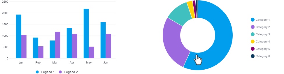
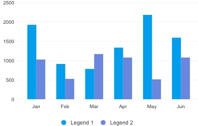
Yellowfin automatically assigns colors from a theme to charts as they are generated. For instance, a chart with one metric will get the color ‘one’. A chart with two metrics will be assigned color ‘one’ and ‘two’ and so on. This ensures chart colors are consistent and not random.

The Yellowfin Chart Colour theme allows for up to 12 metrics in one chart.

Default 2 column chart and a default pie chart with 6 metrics shown.
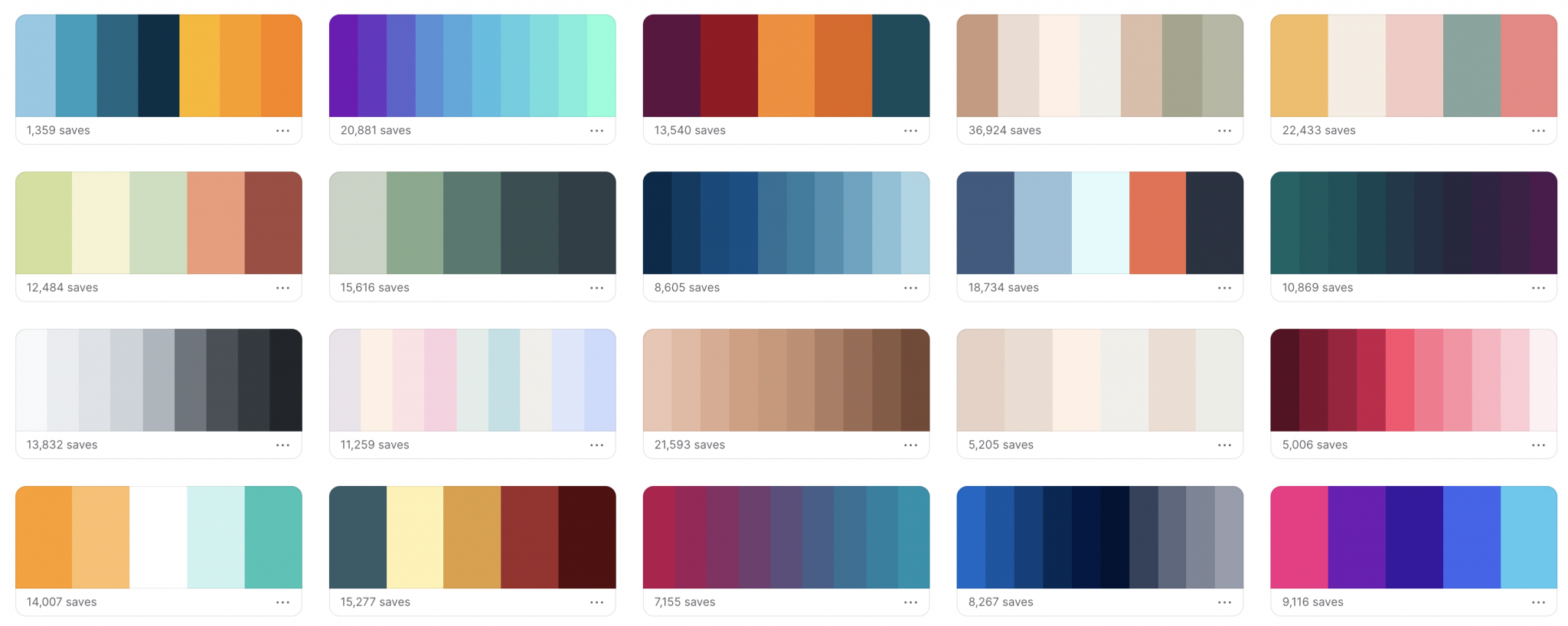
There are a few great resources out there that will help you pick colors to form a theme. Try coolers.co as a place to generate your own theme or choose from thousands of pre-defined color themes available.

Coolers is a great place to generate a color theme.
When defining your color theme, you may also want to consider gradients or tones within that theme. The Yellowfin color theme extends to consider both a darker and lighter variant of each color within the theme. This can help with charts that specifically require variation within a single color.
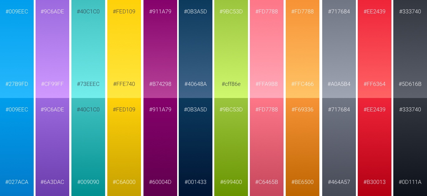
Specific gradients within the Yellowfin chart color theme.
-
Usability
When choosing an analytics color theme, you need to consider the usability aspects of color.
Contrast
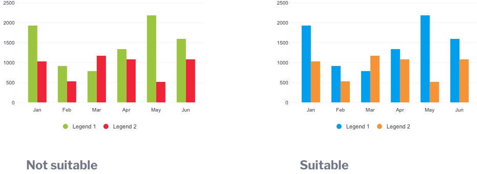
As mentioned above, it’s important to ensure colors have enough contrast between each other so that they are easily distinguished when side by side in a bar chart or next to each other in a pie chart. Low contrast values between the colors make chart hard to read.

Low contrast values between the colors make chart hard to read.
Accounting for color blindness
A large number of the population encounter what is known as “red-green” color vision deficiency. (around 1 in 12 men and 1 in 200 women). Someone with this type of color vision deficiency may find it hard to tell the difference between reds, oranges, yellows, browns and greens.

-
Consistency
With an established color theme, where possible, it is important to ensure that colors are consistent across similar metrics. If say ‘sales’ is blue in one chart, keep sales as blue on the next chart or across tabs on a dashboard. If colors change throughout, the user must work harder each time they look at a chart or dashboard to establish the data story. This can become quite overwhelming when there are a large number of metrics being shown. If the data becomes too hard to interpret, you risk pushing your users away from looking at that data.

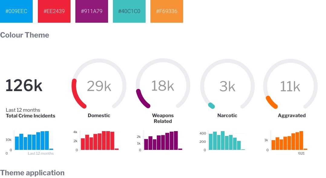
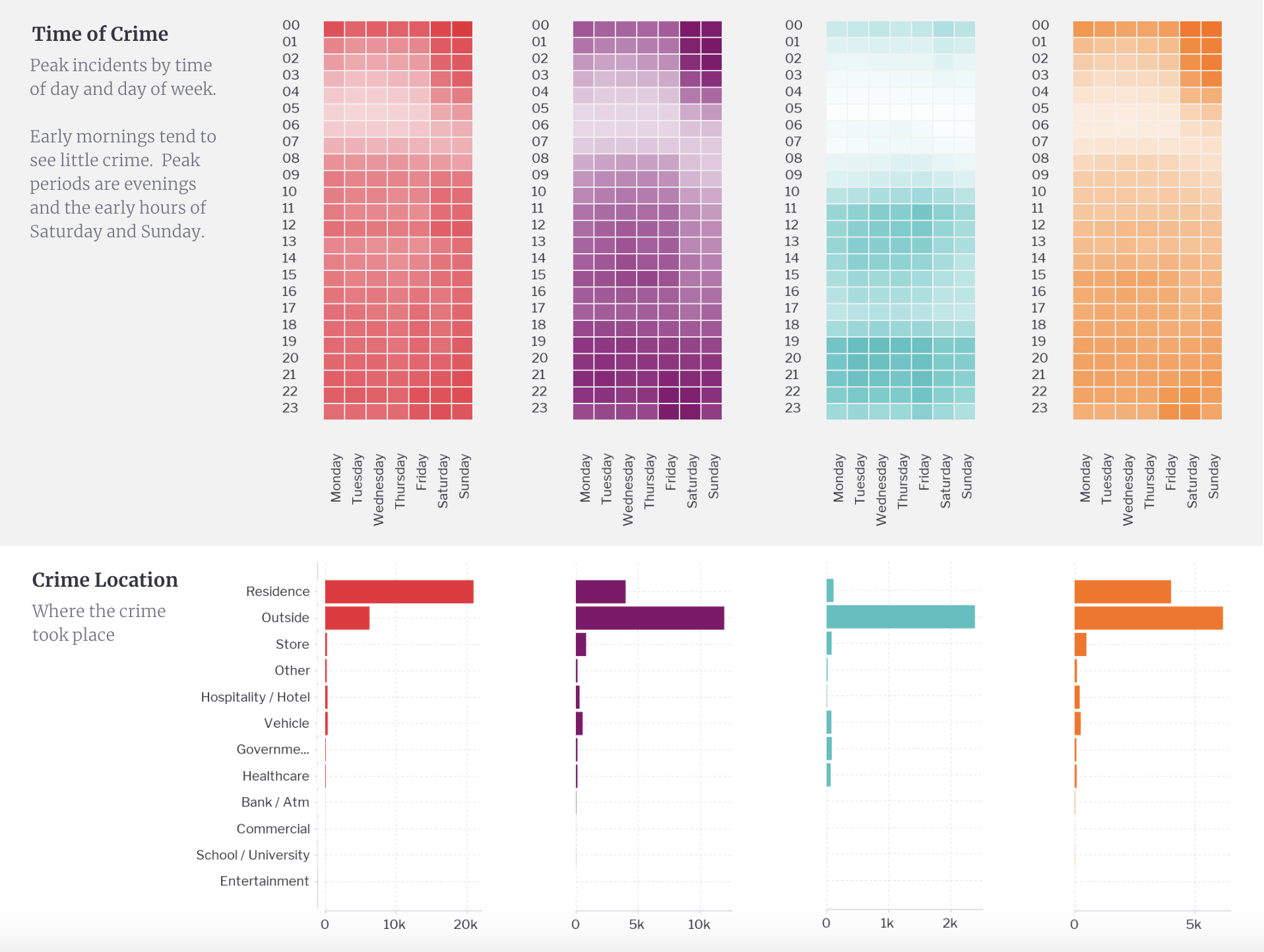
In the example above, a simple theme with each individual color is used across the different types of crime in Chicago. On every chart, dashboard and across different tabs, the same color is consistently used for that particular crime event.
When different representations of the crime types are shown, such as a time heatmap and a location chart, colors are kept consistent for the crime types.

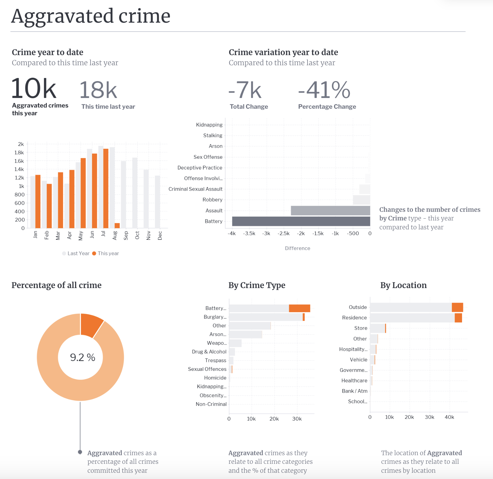
This consistency carries on across different tabs on this particular dashboard. For example, when looking at the aggravated crime tab, orange is kept to represent the key metric and all other types, which are not as relevant on this sub-tab, are represented as grey making it extremely clear for the end-user which components of the charts are needed to be looked at and reviewed. This is a perfect example of choosing to use color to reduce complexity and to highlight and guide end-users through a predefined analytics experience.


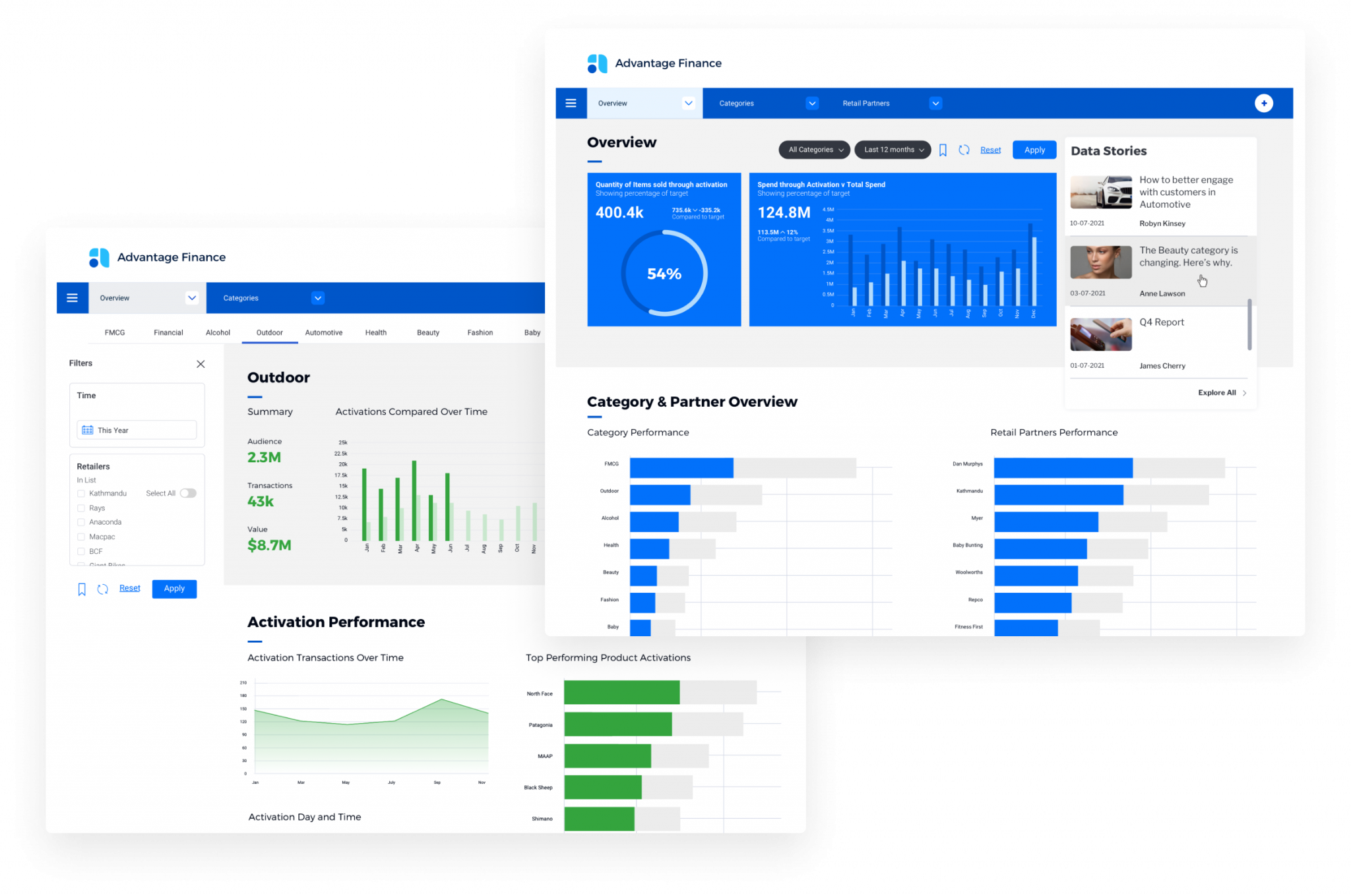
Another example of a clear, complementary color theme used across a dashboard.