Best Practice Guide
The ultimate step-by-step guide for analytic content creators.
Legends, Labels & Tooltips
-
Never use a chart legend for single series
Remove chart legend when a single metric is used in a chart, since there is really no need for one in such cases.
-
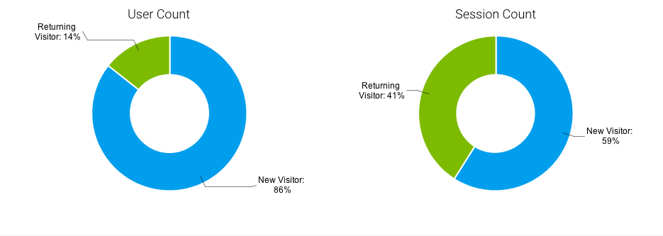
Use a legend or a label not both
If labels provide clarity and understanding there is no need to add an additional legend. This will just be redundant.

-
Legend Placement
Legends should be placed below or to the right to a data visualization, depending on the type of data being labeled and the available space surrounding the data visualization.
<106 insert image – legend at top versus on the bottom>
When a large set of values exist ensure the legend is placed on the right of the chart.
<107 insert image – legend at bottom lots of values versus on the right lots of values>
-
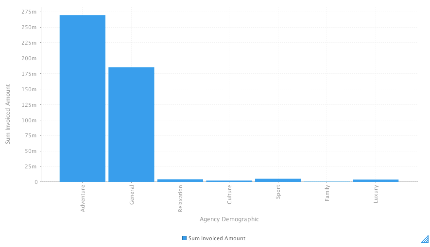
Avoid data labels on charts
Charts are not designed to convey data precisely at a glance. Labels on charts are often used to add precision. If this is needed use a table instead or relay on tooltips to provide the exact value.
<108 insert image bar chart with labels, bar chart none>
-
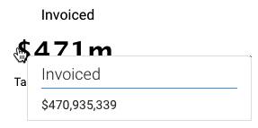
Turnoff Tooltips for Big Number Charts
Turn off tooltips for big number charts as they do not add value. They will hide the number by appearing over it, as is evident in the example below.

Advanced Tooltip
<Insert something here with an advanced tooltip – a chart within a tool tip>