Best Practice Guide
The ultimate step-by-step guide for analytic content creators.
Introduction to Dashboard Design
-
The following is a set of design principles to ensure your dashboard is usable, used and importantly, looks great. This section is highly relevant to anyone looking to better connect their audience to their data through stunning data visualizations that communicate effectively.
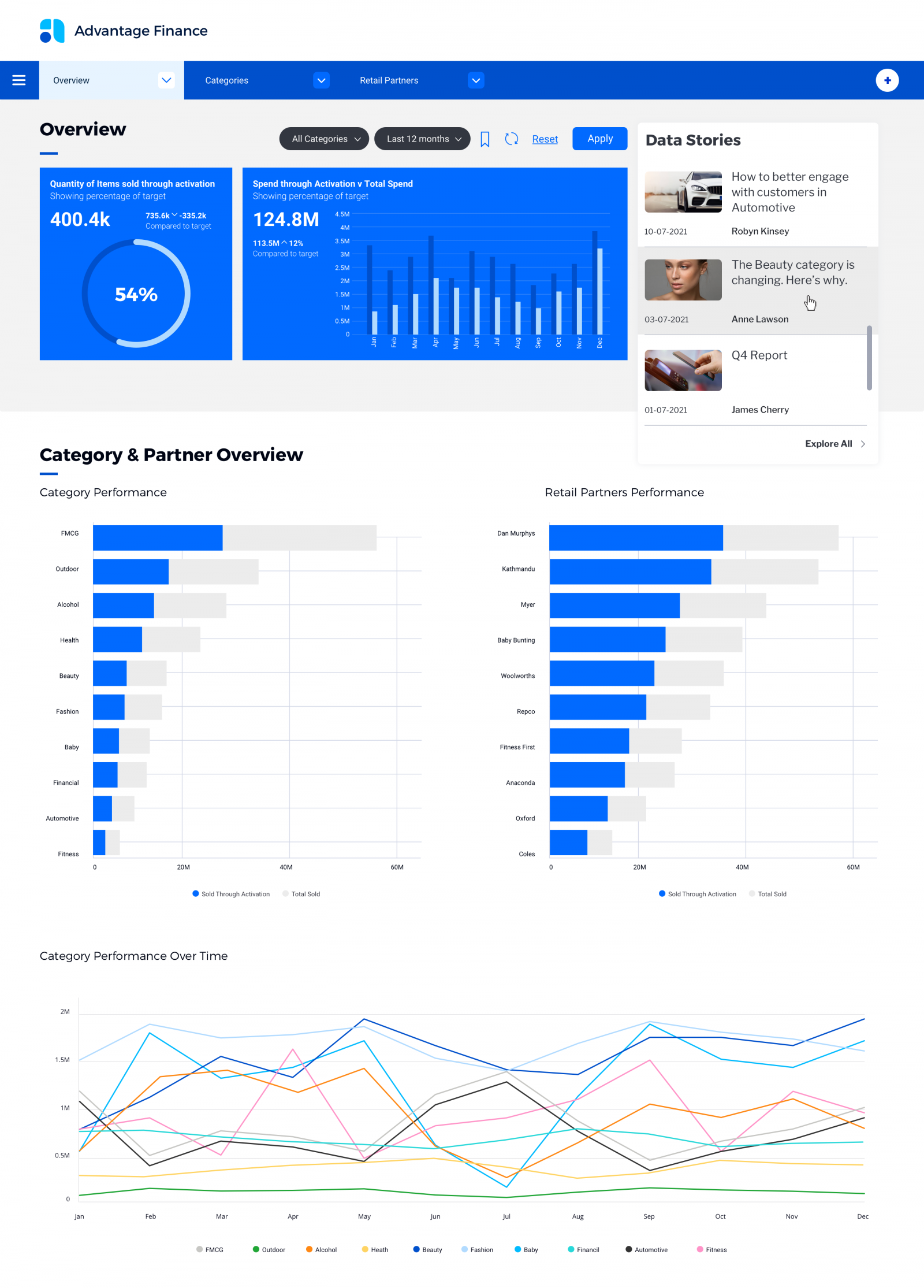
The main purpose of a dashboard is to communicate data in a visual form that highlights to the reader what’s important, arranges it for clarity and leads them through a sequence that tells the story best. Design exists to assist this purpose. From this end users can make decisions and take action – be ‘data-led’ Unfortunately the best thinking and planning can come undone by poor design execution where bad design decisions put users under increased cognitive load and render the dashboard unusable.
Dashboards are already often communicating quite complex scenarios. There is a lot for the user to take onboard – multiple visualizations, metrics, dimensions, scales, descriptions and colors. It is therefore critical that the dashboard designer do what they can to both guide and simplify the experience for the end-user to make it as easy as possible to interpret what they are being presented with. Put simply, they should not let design complicate the experience and get in the way but be a vehicle by which the dashboard story is best communicated.
In summary, you can increase the adoption of your dashboards by end-users by incorporating common design and usability principles including;
-
Effective information presentation
Begin with a clear understanding of the end user/s, their analytics capability, their needs in terms of how data can better inform their decisions and actions. This is then delivered using an appropriate strategic or operational dashboard interface that is designed in a way that guides the user through the data journey needed to deliver the insights they need.
-
Consistency
Clear dashboard design is delivered through consistent use of typography, colors and graphic elements. Dashboard design exists to aid the end-user and design should be used as a subtle, almost sub conscious tool to guide through the analytics experience. There should be a consistent hierarchy and method to presenting all of the elements.
-
Efficient interactions
An efficient dashboard will not try and cram everything onto a page because it is available. Remember, just because you have access to a particular report or visualization, it doesn’t mean you have to use it. Any visualizations superfluous to the needs of the end-user should be removed. Filters and any actions or interactions need to be clear and logically align with the end-users workflow.
-
Effective use of language
Language is as much a design or user experience tool as color, font and style. Use clear and considered labelling, notes, and explanations to ‘speak to’ and guide your end users through complex visualizations and layouts.
-
Minimizing cognitive load
Overall, good design is successful when it minimizes the cognitive load or effort required by the end-user to interpret and use the information in front of them. Without meaning too, we will avoid interfaces or situations that are mentally straining. So whilst design is often described as something to be visually pleasing, its aim is to really be ‘mentally’ pleasing. Yes, it should look good, but it must also ‘feel’ good to be considered ‘good design’.