Best Practice Guide
The ultimate step-by-step guide for analytic content creators.
Accuracy
-
It is critical that a chart conveys the data and insights accurately to the user. When creating a new visualization it is possible to skew the meaning of a chart depending on the choices made.
-
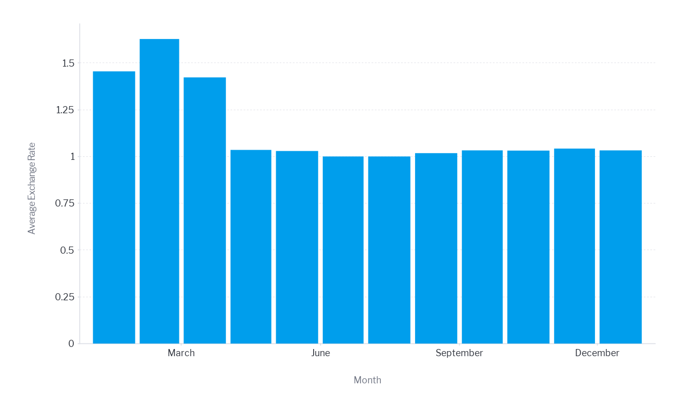
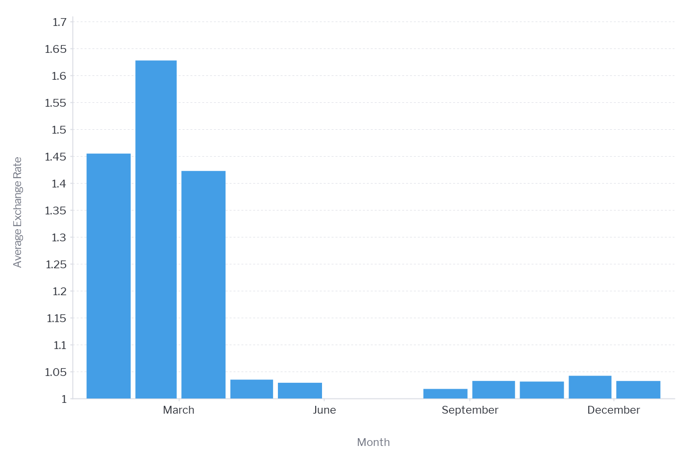
Ensure Proper Aspect Ratio
Aspect ratio is defined as the ratio of the width to the height of a chart. It can have a strong impact on the insights gained from your visualization, so optimizing it is important.
This is shown in the pair of graphs below that plot exactly the same data points but have significantly different aspect ratios.

Not sure if this is the right image??
The gradient or ratio of the slope for both charts is exactly the same. However, due to the difference in aspect ratio (the width of the chart relative to its height) the angle in the first chart is much more pronounced. It makes the growth rate look far more impressive.
In graphs such as this, which involve the reader making slope or trend assessments, you need to take care to avoid introducing unforeseen bias.
Avoid extreme aspect ratios in charts and maintain consistency of the aspect ratio between different charts in the same dashboard wherever possible. An aspect ratio greater than 1 but less than 2 is ideal when categorical axes are used. When using two numeric axes like a scatter plot a 1:1 ratio is best.

-
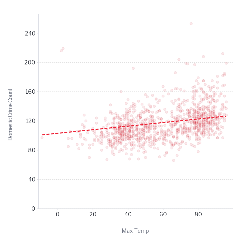
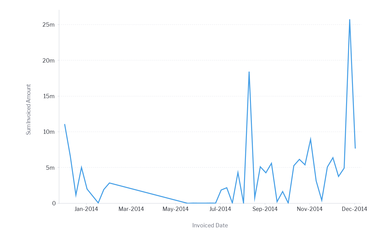
Take account of seasonality
Ensure that the use of time periods accurately reflects the analysis needs of your users and includes enough time periods to take account of seasonal variations. Do not omit surrounding periods when those provide context to the change in metric. For example, if monitoring sales by month it is best to include 13 months of data (or a year-on-year comparison) so that seasonality, if any, is clearly visible in the numbers.
<C24 insert 3 month chart versus 13 months chicago crime with seasonality in it >
-
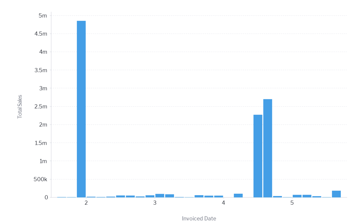
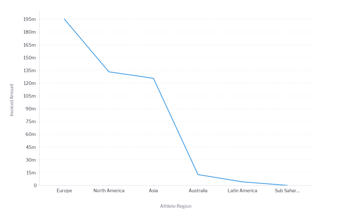
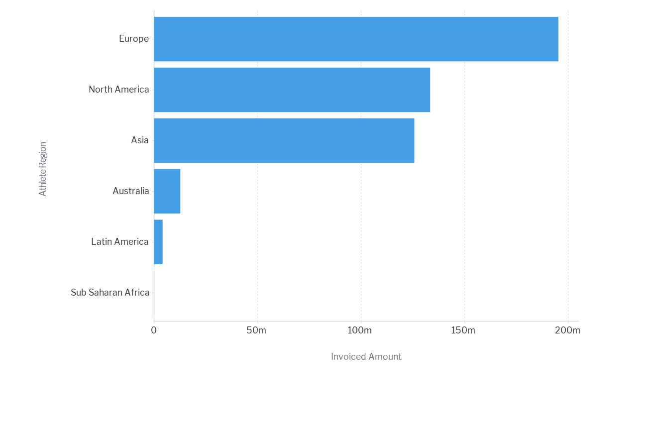
Avoid Axis Distortion
Use a base line of zero
Generally, the numerical axis must start at zero – especially for Bar and column charts. By truncating the axis to zoom in the chart will overemphasize the difference in values between bars or series – leading to inaccurate conclusions by the user.


Use of a range for correlation analysis
Analyzing correlation and relationships using scatter plots – where the user is looking for correlation it is acceptable to truncate the axis to focus on a range and not start at zero.
Use of a range for trend analysis
Use Analyzing trends using line charts – where the user is looking for changes in value on a continuous basis. There will be some cases where a line chart is meaningless with a baseline value of 0 because slight changes in trends will be hidden. In this case it is fine to zoom into a range that will make the changes visible.

-
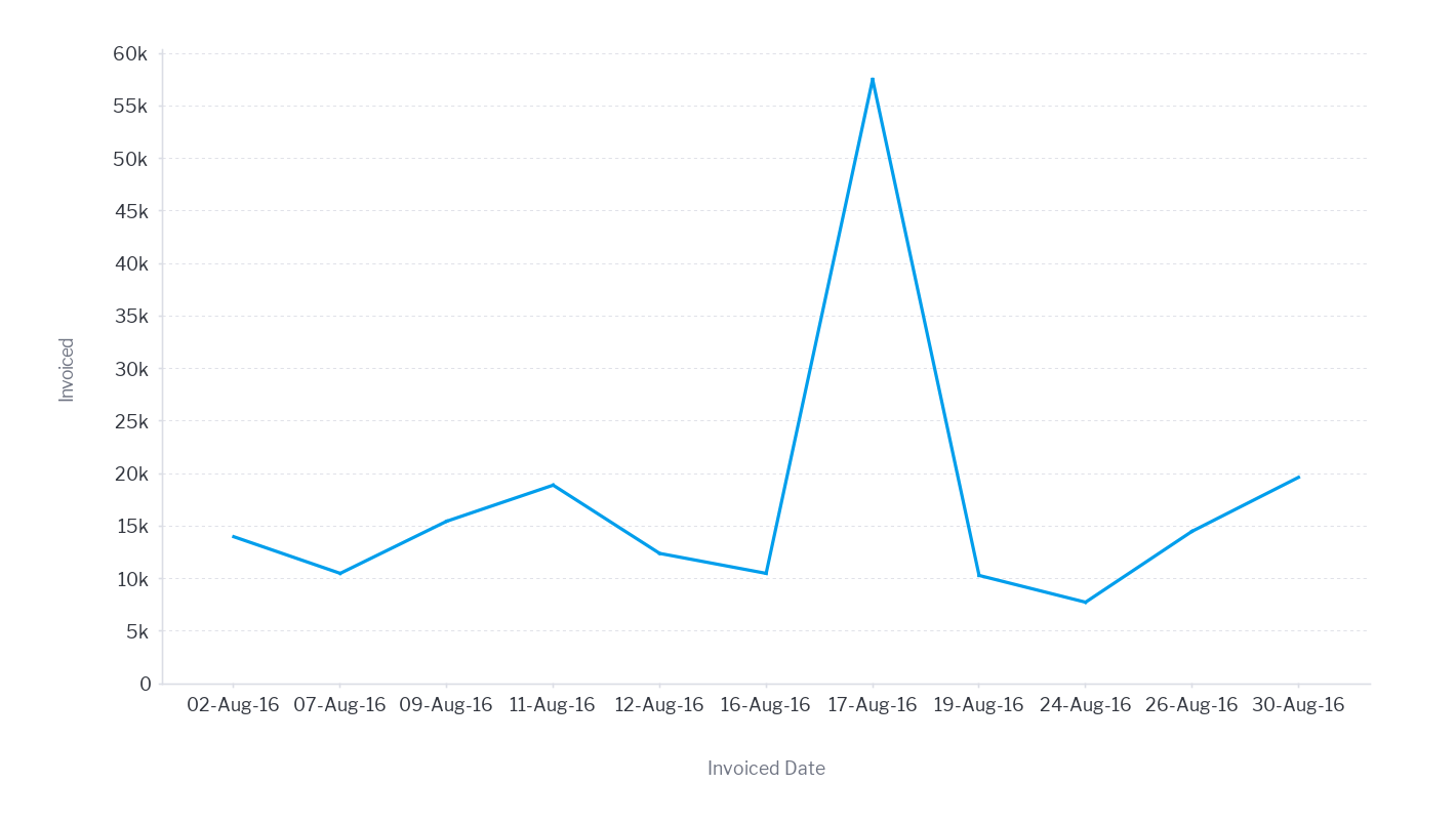
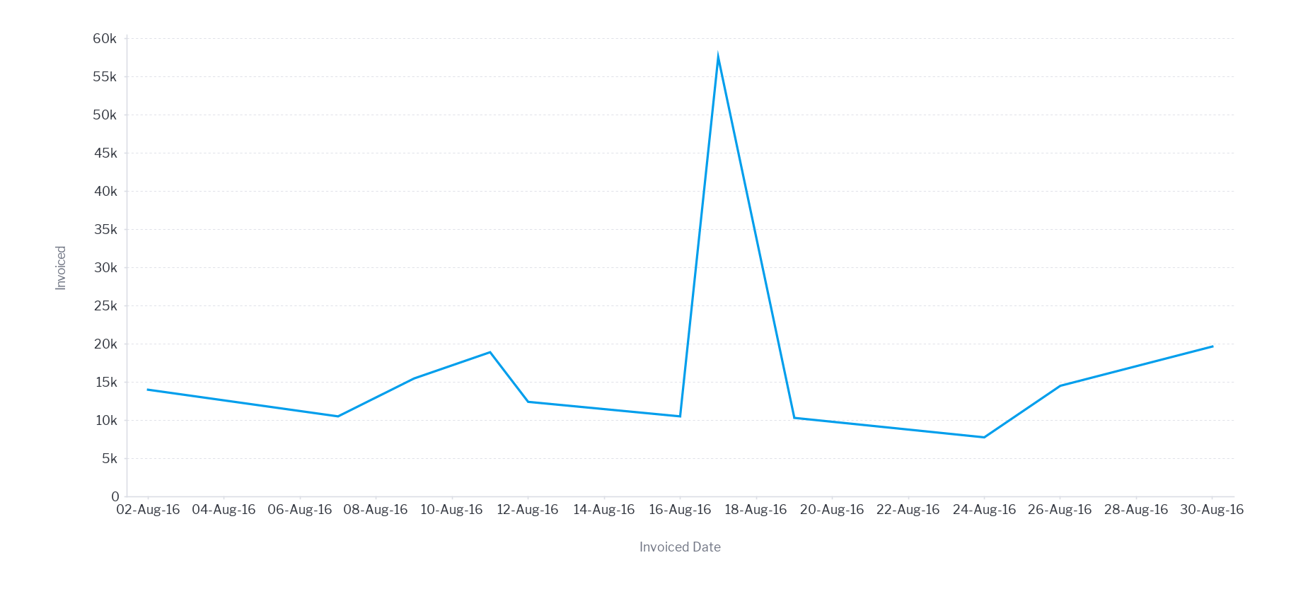
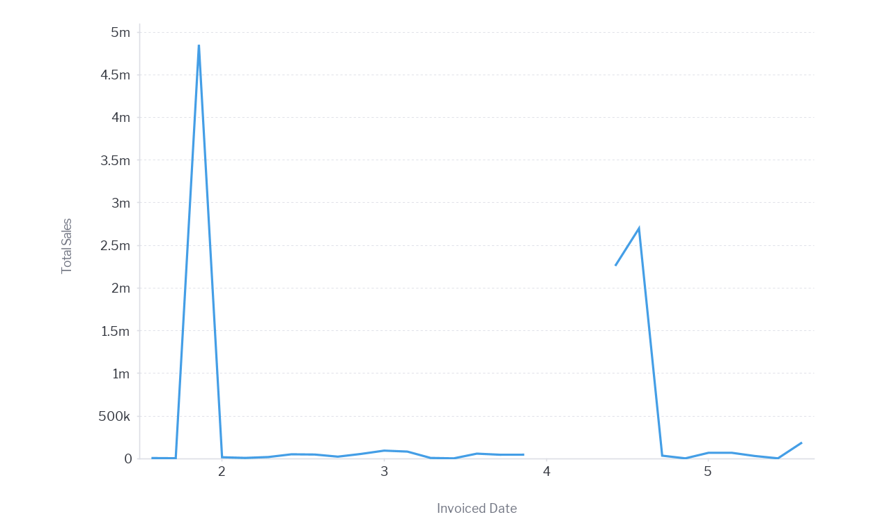
Use consistent axis intervals
For the numeric axis and especially the date axis, you should not skip any values. This is quite a common error with date fields if the axis is not set to a continuous time series. In this cast the values are treated as ordinal and missing dates will be skipped – distorting the trends within the data.


-
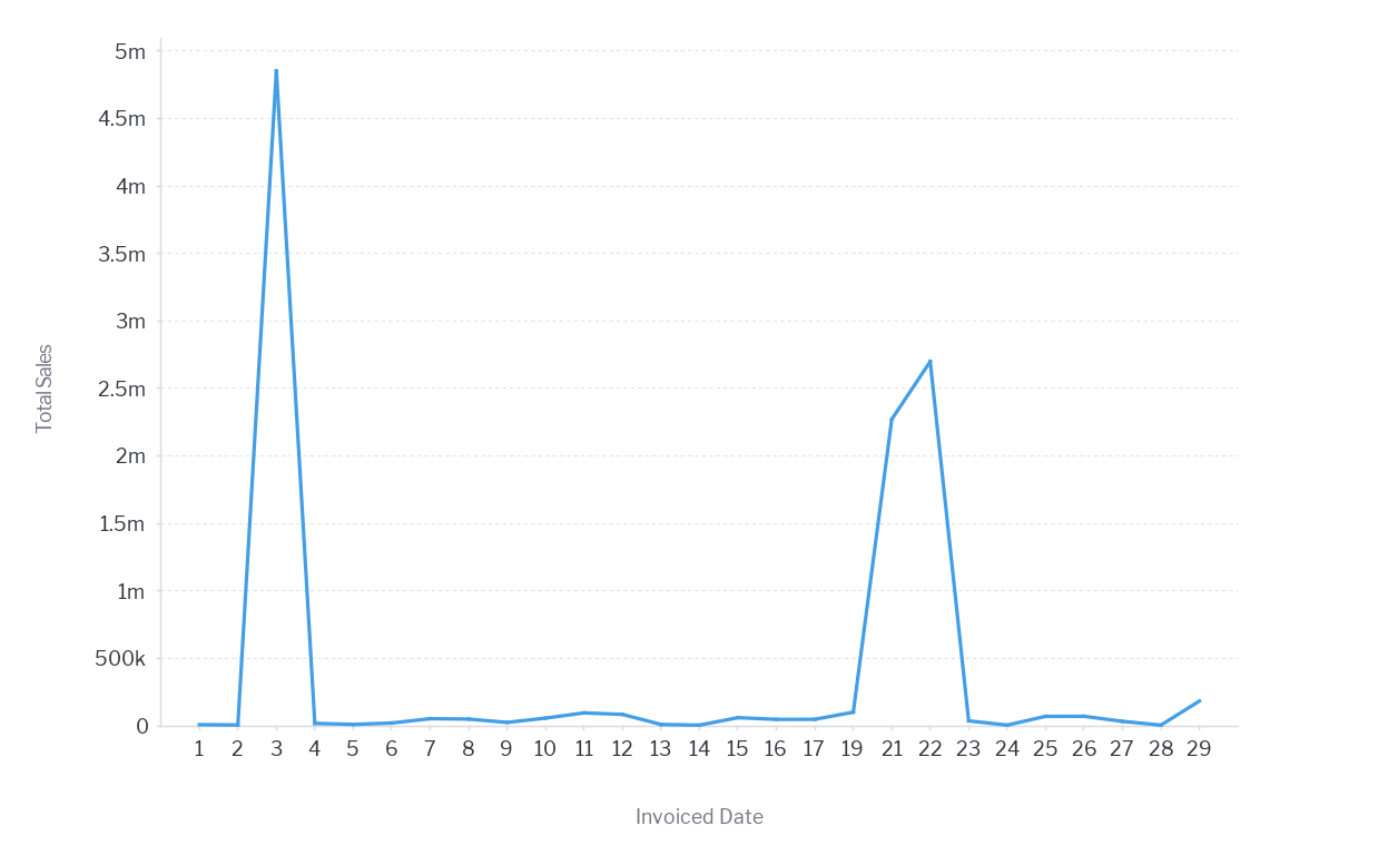
Do not fill gaps between points
Line charts often fill gaps between points, giving the impression that data existed for those missing periods. Consider either going to zero or breaking the line so that the user is aware that no data existed. Alternatively use a column chart where missing data is a common occurrence so that null values are easily visible.


-
Use line charts for continuous data
Line charts imply the continuation of the metric from one interval to the next. This is why they are so useful for time series analysis. Line charts should never be used for discrete categorical values. For example, the line chart makes no sense when plotting sales by region. There is no implied link between each region – as each of them is their own unique entity. Use a bar or column chart instead.


-
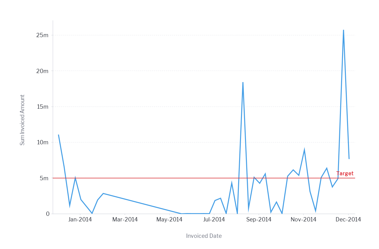
Focus on what is important
Reference, trends and average line added to a chart helps to inform the user of what is a good or expected outcome.
<Insert 3 charts – target, trend, and average bar>
If the analysis is intended to help a user track to a target ensure that that target is displayed on the visualization. This removes any ambiguity and helps a user clearly understand how they are tracking to their goals.


-
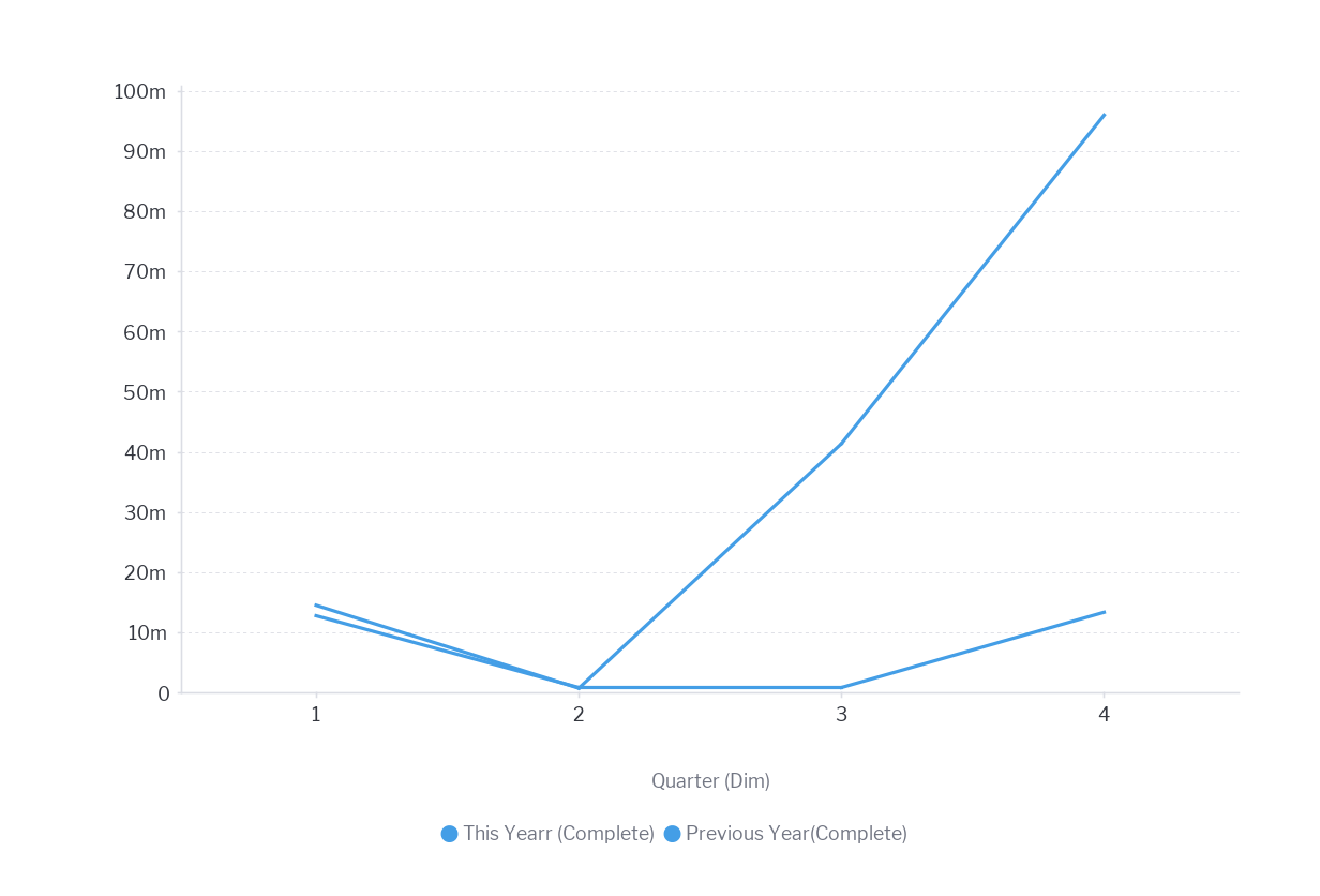
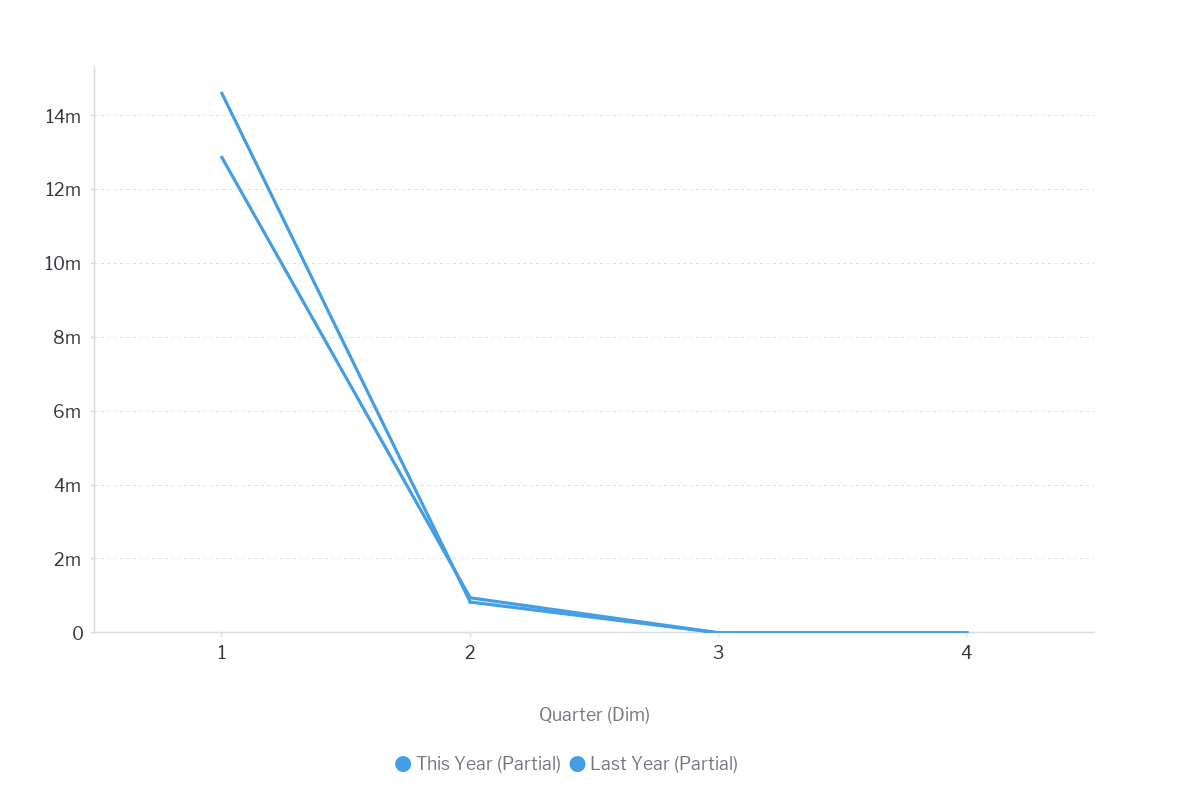
Avoid Partial Date Periods
When building KPI reports for threshold analysis be careful of how you treat partial date periods – especially if doing period-on-period comparisons. For example, if you are comparing this quarter’s sales to the same quarter last year and you have only completed the first month of the quarter you want to avoid comparing Sales (1 month The Year) versus Sales (3 Months Year Prior). This will distort the analysis and make it appear you are significantly behind.
For partial date periods you can either:
- Wait till the end of the quarter and compare full quarters; or
- Compare a partial period with a partial period for the prior period so that you are comparing like with like.


-
Ensure correct scale
Whilst basic charts like line and bars provide ample opportunity to communicate data effectively there are occasions where infographic displays are sometimes used. Often these are used for aesthetic reasons. A dashboard designer feels that they will tell a better story. If you choose to use this type of visualization ensure that the scale of the objects accurately reflects the variation in the numbers.
<C33 insert image infographic do and dont>