Best Practice Guide
The ultimate step-by-step guide for analytic content creators.
Creating composite visualizations
-
When planning a dashboard or a single report consider how multiple charts can act together as a single integrated object to create a more compelling composite visualization. For a composite visualization the individual components all work together to provide everything the end user needs to understand a particular metric.
-
Explanatory charts
Basic charts can be used to augment more complicated visualizations. For example when using a scatter plot to indicate a trend it can be useful to augment it with a simple bar chart that helps the user to understand the context.
<C112 Insert image – plain scatter plot. Scatter plot with bar by season – see crime dashboard>
-
Create KPI Style widgets
A good example of a composite visualization is a KPI widget shown below. In this visualization, there is a combination of big number charts, icons indicating variance as well as a traditional column chart. In combination, this set of visualizations conveys information far better than any one chart or visualization could in isolation.
<C54 insert image – KPI widget – show components versus basic chart>
-
Integrate numbers with text
Consider integrating aggregate number charts within text. The text in combination with the number provides added context to the user about the meaning and possible importance of the number.
Do not simply treat the text as a label – integrate the number into a meaningful statement.
<C55 Insert image> – ISV Demo is a better one
Conditional Text
For advance usage of this type of statement use conditional text to only show text and numbers when a condition is met. In this way, you can provide incredibly useful prompts to end-users.
<C56 Insert Image – two images showing two different states
-
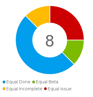
Add big numbers to simple charts
Consider using a big number when using pie, donut or meter charts so that the user knows what the aggregate value that chart is related to. This provides a clearer understanding of the part to the whole.