Best Practice Guide
The ultimate step-by-step guide for analytic content creators.
Chart Color Use Best Practices
-
Color usage principles
Color has meaning. When using color in your visualizations, for data and supporting objects like titles and axes, you are communicating meaning. The use of color and in combination with its surrounding elements will influence the way your users will interpret the data.
There are three fundamental use cases for color in data visualizations. Use color to:
- Distinguish groups of data from each other;
- Represent data values; and
- Highlight data of interest
The types of colors we use and the way in which we use them are quite different for these three cases.
Use color to distinguish items
Color is often used to distinguish discrete dimensional items or groups that do not have an intrinsic order, such as different products or regions. When coloring dimensional values a qualitative color pallet is used.
Use color to represent data values
Color is commonly used to represent the quantitative value of the data such as Dallas ($), Temperature and Units Sold. There are three possible scales to use to represent data values there are:
- Sequential – to visualize data is changes from low to high
- Divergent – to visualize the deviation of data values in one of two directions relative to a neutral midpoint; and
- Threshold – to visualize and assign meaning to intervals. Such as Below target, on target, above target

Use color to highlight items
Color can also be an effective tool to highlight specific items in the data. For example, if doing benchmark analysis and you want to highlight a specific store relative to others, color that item differently to draw the user’s attention to it.

-
Use an appropriate color pallet
Based on your intent choose the right color scheme for your charts and visualizations.
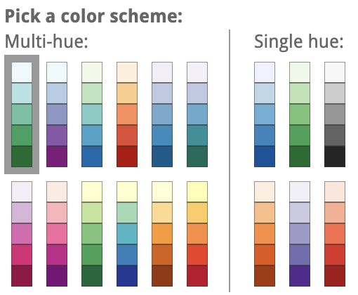
Sequential palettes
These are suited to quantitative data that progresses from low to high values. A sequential color scale should:
- Indicate which values are smaller or larger than others
- Indicate the relative distance or gap between values
- Be uniform across the entire range
- Use a single color scheme for the entire range
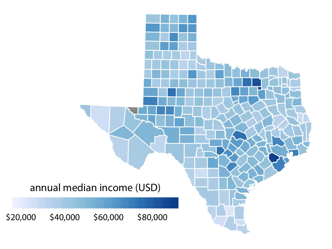
Typically light colors are used for low data values and dark colors for high data values.

Sequential pallets are ideal where the value is always greater than 0 such as actual sales data by location.
<C61 insert image map with many colors versus map one color hue>
Diverging palettes
These highlight extremes on the value range and are useful for variation analysis where both positive and negative values are possible. The extremes are highlighted with darker colors and the midrange tends to be light greys or muted. For diverging use two hues one communicating desirable values versus the other undesirable.

These pallets are ideal for using color to denote variation. For example variation from prior periods. In the example below sales by-product is used for the main axis whilst color shows the change from the previous period.
<C62 insert image – variation white to blue versus red to blue.>
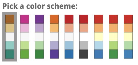
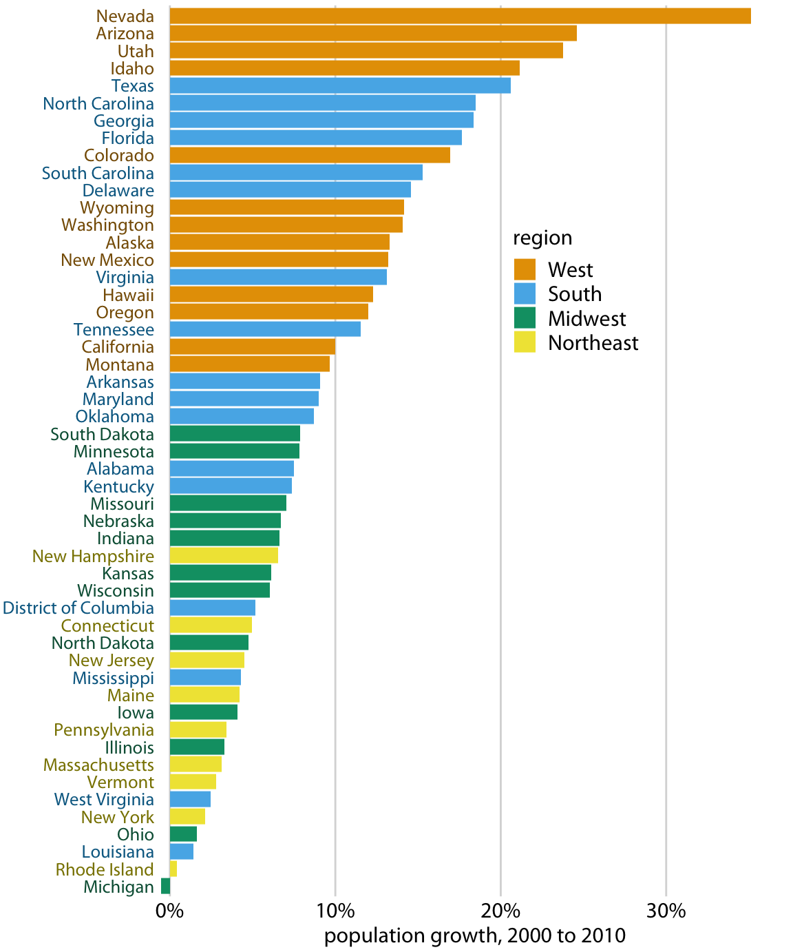
Qualitative palettes
These are used to separate data into distinct groups (categorical values) instead of imply quantitative differences in the data. A qualitative color scale should:
- Contain a finite set of colors that look distinct from one another.
- No color should standout from other colors and be dominant
- The color set should not imply order. Ie get lighter or darker
<Insert some example pallets>
You would use qualitative colors when you want to show the relationship of the metric to the categorical values. For example sales by product category.
<C63 insert scatter plot monochrome versus color – grouped by category>
Interval Pallets
Interval pallets are used when an interval scale is created from a quantitative value and color is used to assign meaning to those groups. For example, taking percentage of target and creating 3 groups.
- 0-85% Below target Red
- 85-110% On target Grey
- 110% + Above target Blue
Typically interval pallets are created when doing conditional formatting. The pallets tend to be much simpler – two to three colors only.
<Insert some example pallets>
When using threshold pallets ensure that the good and bad colors are consistently used and that you avoid red and green.
<C64 insert image – example of conditional format used on a bar chart>
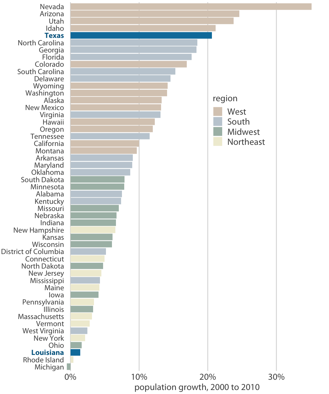
Highlight Pallets
When highlighting data use a darker color or accent color to draw the user’s attention. For example, if the dashboard is focused on a single store then highlight that store in your visualizations using an accent color.
<C65 insert image – bar chart all bars same color, bar chart store highlighted – liquorio isv dashboard>
-
Common pitfalls of color use
Color is a very effective way to enhance your charts and visualizations. When using color within a chart ensure that the color has meaning. You should only add color with purpose – to achieve a particular communication goal.
Do not encode too much information
Avoid using color when there is a huge amount of variation. Color should only be used when there is a limited set of variation that users need to interpret. Consider using more aggregated groups when too much variation exists.

Do not use color to decorate components
Do not use color for irrelevant details or to decorate your chart. For example using brightly colored titles or legends and axis only distracts a user from the data
<C67 insert image – don’t cololored titles, do greys>
Do not use color to decorate series
Do not use color options such as gradients to decorate a series and imply meaning where none exists.
<C111 insert image – bar chart color gradient going from left to right, versus flat bar>
Use color to denote differences in data
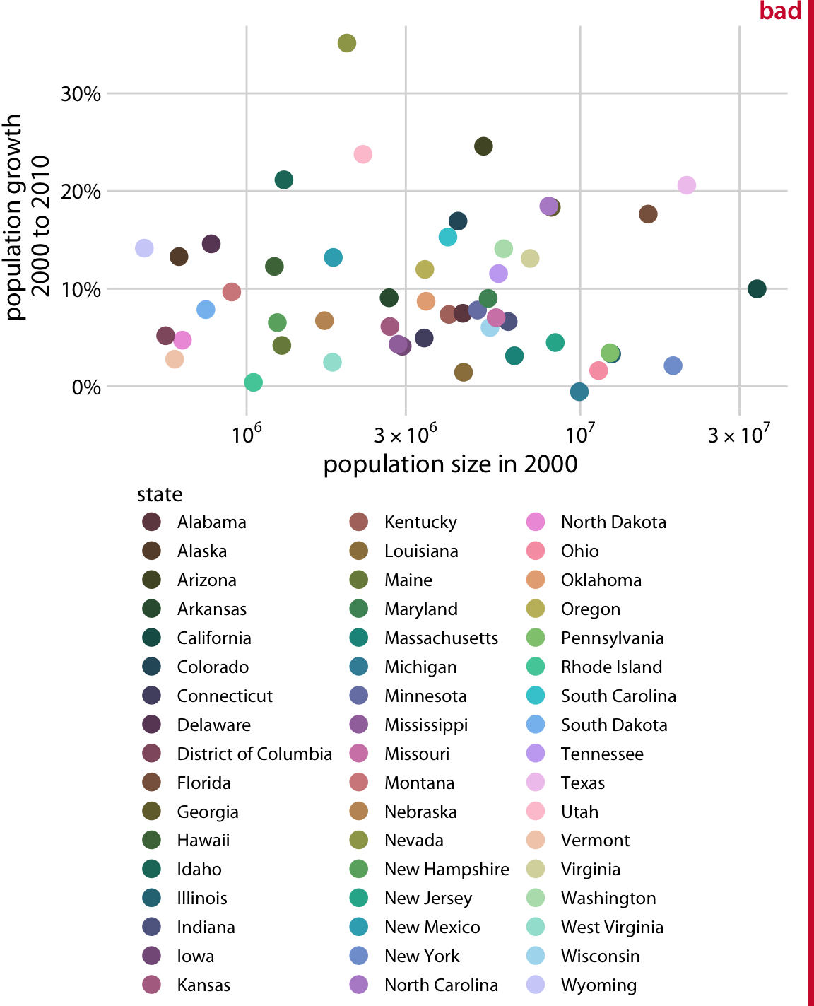
Color in data points should only be used to denote differences in data, For example, do not color bars for region by region. The axis already communicates the regional factor. Adding color only implies that there are additional differences between the bars that a user should be aware of.
<C68 insert bar – colored by region, by region no color>
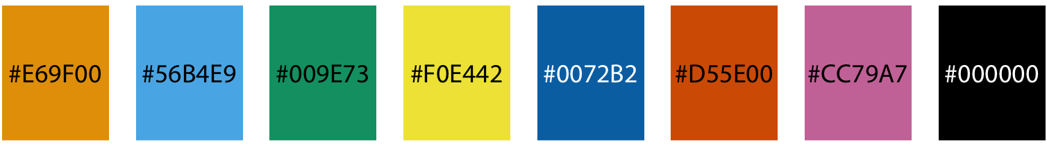
Use colorblind-friendly palettes
Nearly 10% of males and 1% of females suffer from a form of colorblindness, with the majority being unable to distinguish between red and green. Even though this combination is often used to denote good and bad it should be avoided. Consider using the following pallet to minimise the impact on the color blind.

Name Hex code Hue C, M, Y, K (%) R, G, B (0-255) R, G, B (%) orange #E69F00 41° 0, 50, 100, 0 230, 159, 0 90, 60, 0 sky blue #56B4E9 202° 80, 0, 0, 0 86, 180, 233 35, 70, 90 bluish green #009E73 164° 97, 0, 75, 0 0, 158, 115 0, 60, 50 yellow #F0E442 56° 10, 5, 90, 0 240, 228, 66 95, 90, 25 blue #0072B2 202° 100, 50, 0, 0 0, 114, 178 0, 45, 70 vermilion #D55E00 27° 0, 80, 100, 0 213, 94, 0 80, 40, 0 reddish purple #CC79A7 326° 10, 70, 0, 0 204, 121, 167 80, 60, 70 black #000000 – 0, 0, 0, 100 0, 0, 0 0, 0, 0 Contrast between dataset and background
If you want to make sure that your data elements are easily seen ensure that their colors contrast sufficiently with any background colors or elements nearby. You want to draw the users attention to the most important element on the page – the data not the background.
It is OK to have a dark background or a light one – so long as the color contrast is sufficient.
<C69 insert image – chart dark grey background and colored dost versus a dark background and colored points>
-
Use color consistently
Color should be used in a consistent way throughout all of your charts and visualizations on a dashboard or across a set of dashboards. This ensures that once meaning has been established it is used the same way in every visualization – making it easier for your users to interpret.
Good versus Bad
Often color is used to indicate whether a number is good or bad. It quickly tells the user that a indicates to the user the meaning of the number without the user having to actually read and process the value of the number. If using color in this way be consistent. Always use the same colors to indicate good and bad – do not vary from this throughout your dashboards as it will only confuse the end user. Avoid red-green indicators – refer to color blind color pallets.
<C70 insert image – conditional format columns some blue red others green red>
Metric colors
If using the same metrics repeatedly consider assigning a color to the metric. In this way, users will quickly be able to view a chart and know what the series is showing without needing to focus on a legend or title.
<C71 insert image – multiple charts different colors for series versus same color for series>
Categorical Colors
Where analysis is performed across a series of metrics using a common dimension – for example, sales region you should consider assigning colors to the dimensional values – in this case, each region should have a uniquely defined color. This enables a user to quickly inspect multiple visualizations knowing that the categorical color is always the same.
<C71 insert images – dashboard diff colors for dims in charts versus the same>
Color for highlights
If using color to highlight a particular categorical value use that consistently across visualizations. This is useful when your dashboard is focused on a single entity and is comparing that entity to all like entities. For example store sales versus all stores in a particular region.
<C72 insert image – store map and bar chart>