Best Practice Guide
The ultimate step-by-step guide for analytic content creators.
Chart Axis Best Practices
-
Most charts have an axis. The axis plays an important role in explaining the data to the user. A chart axis works like a scale for data plotted in a chart as well as a reference for what is being measured.
There are two primary types of chart axes. The first type is called a numeric axis, which is used to scale numeric data. The other primary axis type is called a category axis, this is used for categories such as time or dimensional values.
The use and design of the axis can have a profound impact on the way a user will interpret a chart.
-
Formatting Numeric Axes
Updated 24 September 2024The numeric axis provides the scale for the visualization. It is the key to how the data should be read and interpreted. Numerical and Currency fields typically have specific formats to convey meaning and avoid ambiguity. Format your axis to let the user know what’s being measured.
Minimise use of decimal places
Charts are not the best way to convey precise data – tables are better for that. So in a chart it is best to use no decimal places unless the level of scale of the data demands it. Where your data is less than 5 decimals are acceptable.
<C81 Insert image – Chart with high value of 100k plus NO, chart with Axis to 1 Yes>
Summarize values
Charts with large numeric scales should be rounded to the nearest thousand or million instead of displaying the full number. For example use 100K instead of 100,000. The full number can congest the axis and adds little value in interpreting the data.
<C82 insert image – Chart big numbers, chart summarised numbers>
Use thousand separators
If not summarising values use thousand separators are a common device for making large numbers easy to read. It is recommended that they are used for all numeric axis.
<C83 Insert image – chart with 100000 versus 100,000>
Avoid prefixes and suffixes
Whilst you can add a Currency symbol prefix or percentage suffix to your axis labels it is better to keep the axis values simpler by not adding them and simply add the appropriate prefix or suffix to the axis title.
<C84 insert image – chart with $ in axis label, chart with $ in axis title>
Logarithmic scales
There are times that these make sense – especially when there is huge variance in your data or you can have negative as well as positive change.

-
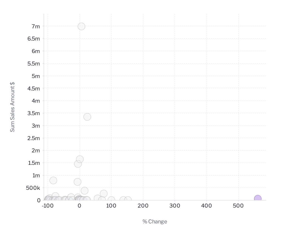
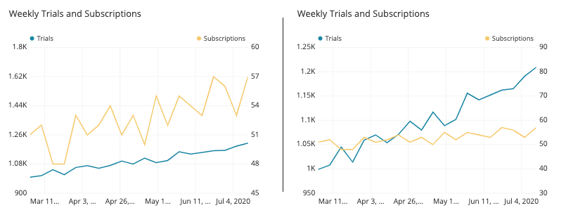
Using dual numeric axes
Dual axes should only be used when attempting to show the correlation between two series and either:
- Their units of measure are different. For example sales in dollars versus units sold; or
- The metrics are fundamentally different but use the same unit of measure but the relative scales are significantly different. For example, comparing the price of 1kg of flour to 1 ounce of gold.
Use dual axes with different numerical units
When the numerical units are different plotting series on a dual axes allows the user to see the relationship between the two variables being measured. For example sales in dollars versus units sold.
<C86 insert image – dual axes dollar sales over time, units sold line charts)
Use dual axes when the scale is significantly different
When measuring very different things that happen to use the same unit of measure it is acceptable to use a dual axis. This will enable a user to see the relationship between the two items.
<C87 insert image – find a good example where the same unit is being used>
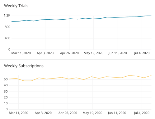
Avoid relationship distortion
Dual-axis plots are open to distortion by manipulating the axis scale range. In the example below the relationships, although positively correlated, to look quite different.

To counter this always use a baseline of 0 in the numeric axis; or use a trellis chart to plot both series sequentially.

-
Categorical Axes best practices
The categorical axis provides the reference to the user for the metric being measured. It is the dimensional value that gives the metric context. There are four types of scales used for a categorical axis and each of these are treated differently to ensure clear communication to the end-user.
Continuous Scale
A continuous scale is where the axis has an implied order and all values are accounted for in the scale. This is most common with a date or time-series axis as well as age (0-100 years old as an example). In the case of date, each date period is accounted for in the axis whether data exists for that period or not. In the example below the discrete date axis hides missing values whilst the continuous axis clearly shows periods missing a transaction.
Continuous axes should always be placed on the horizontal plane and running from left to right. If the axis is a date, always use a time-series axis so that dates will be rendered correctly no matter what the size of the chart.
<C90 insert image – Discrete column chart with dates missing dates formatted at 90degrees up, continuous chart showing missing dates>
Interval Scale
Interval scales consist of quantitative data that has been ‘binned’ into groups whether the groups are of equal range or not. They have an intrinsic order and should be plotted sequentially. As an example, Age 0-100 is binned in media advertising into the following groups 0-11, 12-17, 18-34, 34-49, 50-64, 65+. They are not equal but they are sequential and the axis must display that.
Continuous axes are best placed on the horizontal plane and running from lowest to highest in a left to right direction. If being used for distribution analysis they must be placed on the horizontal plane.
<C91 insert image – binned axis sort value descending wrong, binned axis sort by sequence good>
Discrete Scale
A discrete scale is when the values have no intrinsic sort order and do not represent any form or quantitative or continuous data. For example product categories. These are simply labels that describe the dimension but do not relate to each other in any other way.
Axis placement for ranked analysis
A discrete axis is best placed on the vertical plane for ranked analysis the values should be ordered highest to lowest or lowest to highest or alternatively in an alphanumeric order.
<C92 insert image – bar chart with product category not ranked versus ranked >
Axis placement for composite analysis
For part-to-whole analysis, it is best to put the discrete axis on the horizontal plane if there are few items and on the vertical, if there are many ranked highest to lowest.
<C93 insert image – waterfall for a few items $value, bar with % of total for many>
Ordinal Scale
An ordinal scale implies that there is a specific order or sequence to the dimensional values but unlike the interval scale they do not represent quantitative values. Examples of this include day of week (Monday, Tuesday, Wednesday etc) or performance categories (poor, average, good) where users expect a sequence to be maintained.
The ordinal axis can be placed on either the vertical and horizontal axis running from left to right or top to bottom in the sequential order. For distribution analysis it is best to place the axis on the horizontal plane.
<C94 insert image – show sales by day (Mon-Fri only) out of order and in order>
-
Working with dates
Time and dates are a unique form.
Size of bin or date unit
When working with continuous and interval scales it is important to choose the right level of unit. In the case of dates you can choose Quarterly versus daily. Essentially by changing the size of the bin or date unit you will show more or less trend related details. Choose the level that makes the most sense for your analysis.
<C95 insert image – chart with 24 months daily data versus quarterly>
Date Unit Selector
For Date Units you can also include a date unit selector on your chart to allow users to select the unit level that is of most interest to them.
<C96 insert image – chart with date unit selection highlighted>
Discrete dates versus continuous dates
NEED CONTENT
<C97 insert image – continuous dates versus discrete>
-
Axes style formatting
Line and Labels
Axis lines, tick marks and label fonts should not dominate the chart but be clearly readable. Use muted colors and light weight fonts and lines.
<C98 insert image – bad chart heavy fonts and labels versus light font and labels>
Axis Titles
Axis titles need only be used when no other visual cues are provided to the user to denote meaning. If you have used a very descriptive chart title your axis titles may be superfluous.
<C99 insert image – good chart title no axis title, no chart title – axis titles>