
Best Practice Guide
The ultimate step-by-step guide for analytic content creators.
Images and icons
-
Yellowfin Canvas has unique functionality that allows images and icons to be placed on dashboards.
-
Images
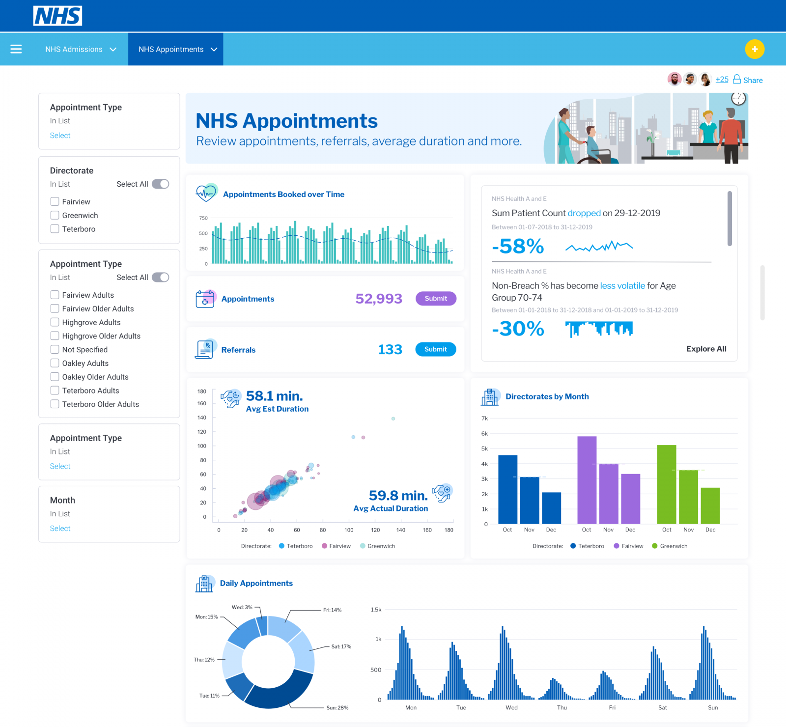
Images can be a great way of adding in some existing brand componentry and help bring some ‘brand’ familiarity and personality to your data visualizations. The key with images is they need to not distract the user from accessing the data within a dashboard. In other words, avoid adding complexity by overwhelming the dashboard with irrelevant imagery. In the NHS example below, some subtle imagery has been added into the header block to make the admissions dashboard more visually appealing and to feel more like a ‘product’ This is done to increase the adoption of the dashboard by the non-technical user.
-
Icons
Icons are a great way to provide visual shortcuts to common words or types of information. Such as using a “$” to represent sales. This can save the user from having to read chart legends and understand the types of charts and metrics being displayed. Icons can also become great learned visual prompts for users who need to continually check-in and use a particular dashboard with the icon making it easier to find the data they commonly look for. In the example below, icons have been used to differentiate between a number of metrics that are quite similar in value. This helps the user easily identify which metric (transfers, downloads, uploads) is which without having to process the information every time.

As a general rule, use imagery and icons to support and assist the end-user and to inject some brand elements into an analytic experience. If imagery and icons become overwhelming, they will tend to distract and confuse the user.