Best Practice Guide
The ultimate step-by-step guide for analytic content creators.
Language, Fonts and Typography
-
Use of language
Language, such as the labelling of tabs, axis, charts and sections within a dashboard as well as any instructional notes can play a very important role in guiding the user through the dashboard journey. Language provides context and as such always try to provide maximum information.
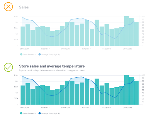
Make sections and labelling clear and descriptive. Remove any ambiguity by using language that closely describes the section or chart. For example, rather than have a period compare chart that simply says ‘sales’, expand on the description to make it very clear what is being shown – ‘Monthly sales compared with previous period’. This ensures any new users are given a clear understanding on charts within the dashboard.

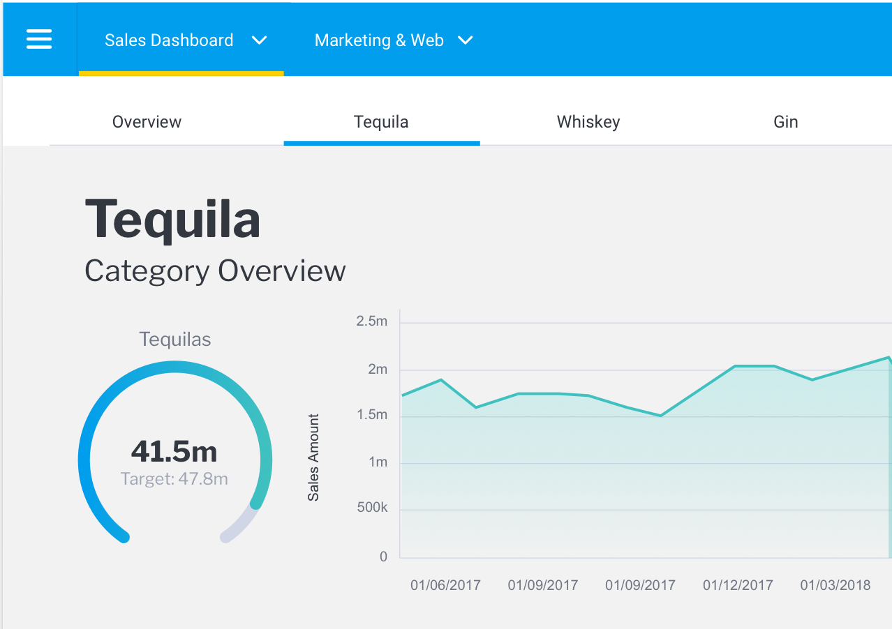
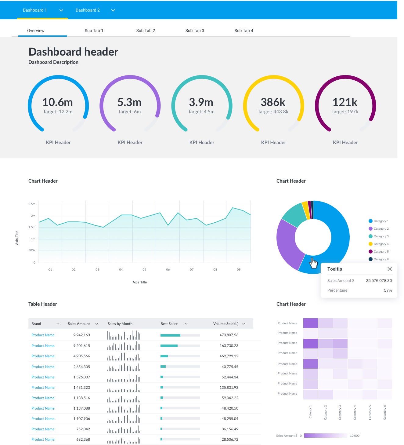
Dashboards and tabs within each dashboard are clearly labelled. Typography also clearly spells out the dashboard title.

More descriptive chart titles guide the end-user and ensure what is presented is explained.

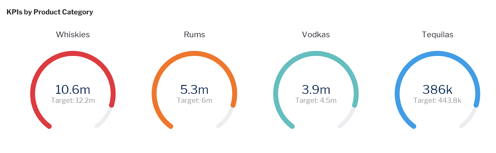
This set of KPI’s is clearly labelled despite each KPI having a label.
Finally, don’t assume that your end-users actually know what they are looking at and what it all means. What is often obvious to a data analyst can be confusing to a business user.
-
Choosing the right font for data visualization
Normally there is quite specific instruction within an organization’s brand guidelines as to what fonts should be used. Often however fonts required for charts, dashboards and data visualizations are not specifically called out. If possible always refer to your brand guidelines for specific instructions on which fonts to use. If there are multiple fonts available, it is best to choose the most readable font that is specified for long-form content rather than the ‘hero’ brand font if it contains too much flourish or is not suitable for data visualizations.

Use your brand guide to determine which font to use.
If you do not have a brand guide available, choose a highly readable font that is clear to read at both large and very small sizes and has a number set that has suits being used in data sets. Text that accompanies a dashboard needs to be very easy to read and there are a number of fonts that suit this purpose better than others.
-
Serif and Sans-Serif fonts
Serif typefaces have small accents or feet on the characters and are generally better for reading. Most newspapers, books and long-form text tend to be serif font.
Sans Serif (Sans literally Latin for without) refers to more modern fonts that are without the accents or feet. Sans serif fonts are generally better for numbers.
-
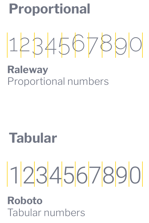
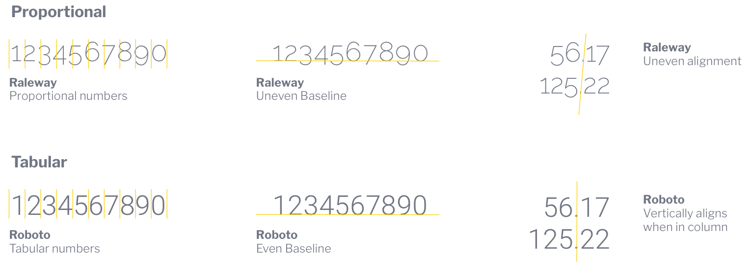
Proportional and Tabular fonts
Typefaces or fonts can have two different types of spacing; tabular and proportional. Proportional figures tend to work well when read in a paragraph of text such as a data story.

Proportional typefaces have variable spacing whereas tabular typefaces have an even amount of spacing between the characters or in other words, the same width and as such they align vertically. This makes them better suited for tables, reports and data visualizations.

For reports, charts and dashboards, it is best to pick tabular fonts.
A selection of suitable dashboard fonts
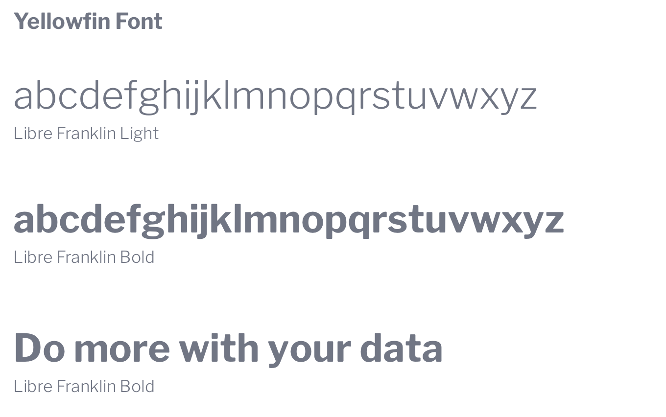
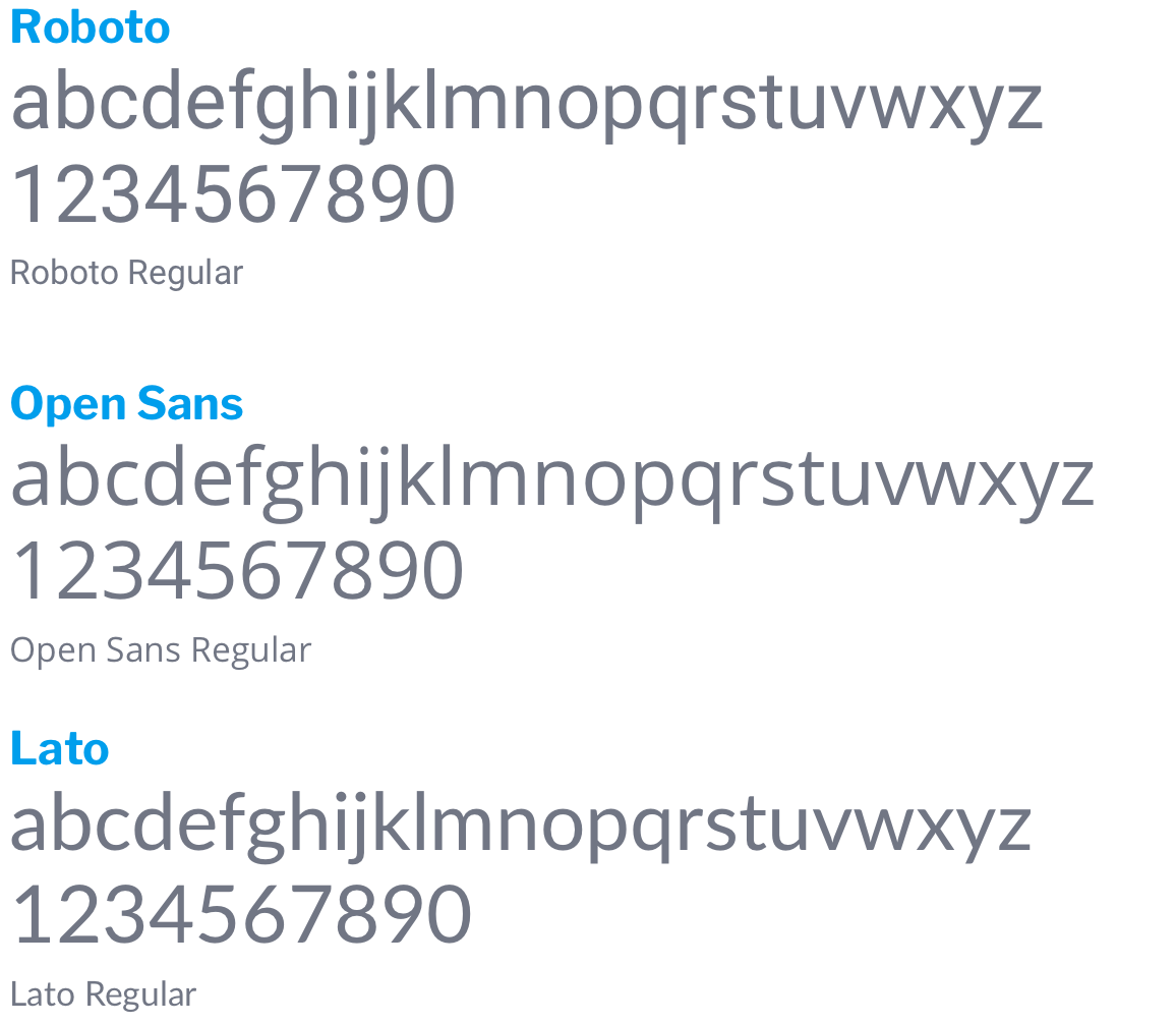
Roboto, Open Sans and Lato are all tabular Google fonts best suited for use on dashboards, reports and charts. These fonts are also highly readable at small sizes, clean and contain a wide selection of weights (eg light, regular, bold, extra bold etc).

-
Dashboard Design Systems
Before designing your dashboard, determine the fonts, font sizes and weights, or ‘design system’, that you plan to use across the entire dashboard including all your tabs. There are of course an infinite number of combinations that can work for your dashboard with no correct or right way to do it. There are however a few ‘don’ts’ that for various reasons either increase the end-users cognitive load or just simply don’t look good!
-
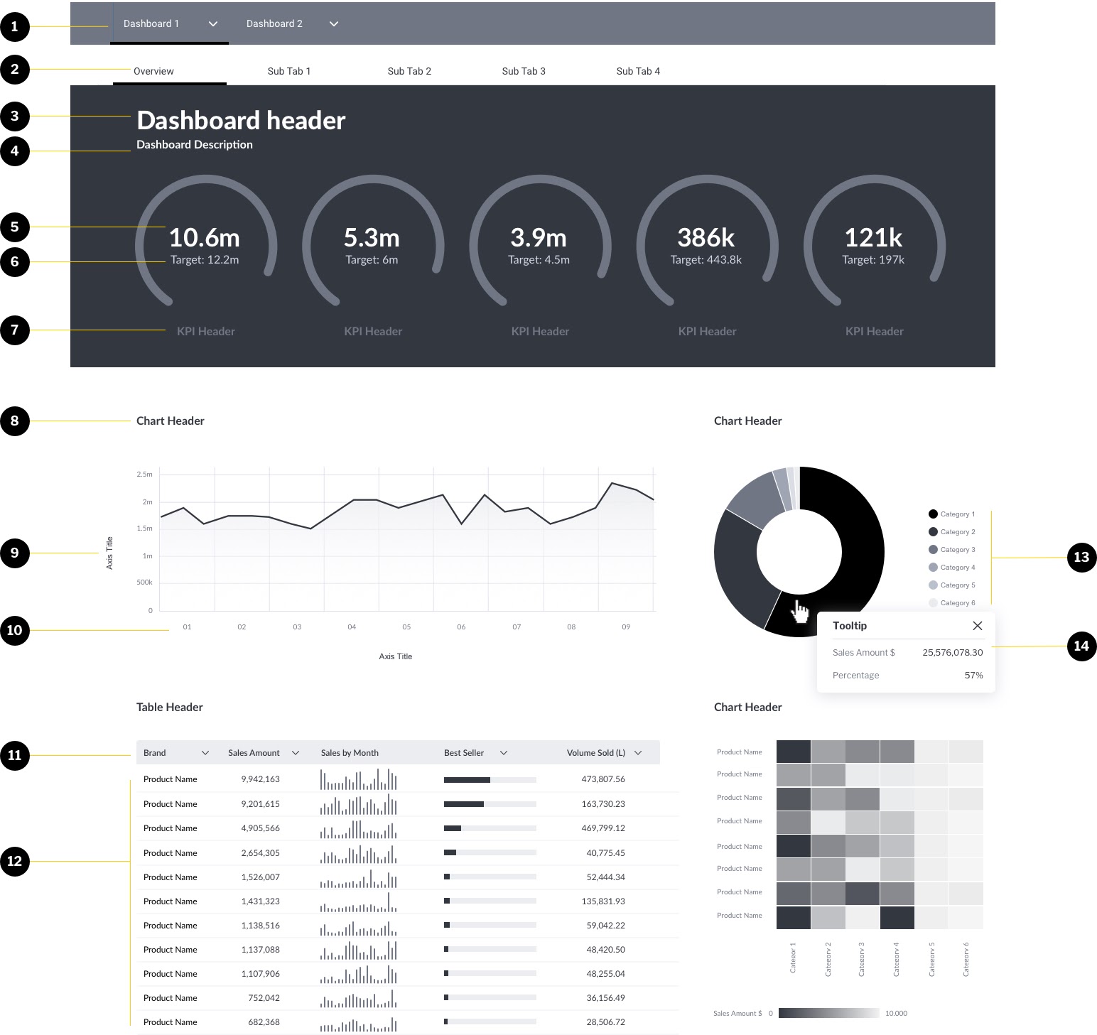
Dashboard typography components
There are a number of regular components across most dashboards. It is important to establish a consistent, defined style for these components.
These include:

- Dashboard selector (often defined by platform)
Used to select dashboard - Dashboard Sub Tab (often defined by platform)
Used to select active sub-tab within a dashboard - Dashboard Header
The name of the dashboard - Dashboard Description
A short description of the dashboard - KPI Big Number
Current KPI value - KPI Target
Target KPI Value - KPI Header
Label multiple KPI’s to make it easier to understand - Chart or Table Header
The header of all charts and tables - Axis Title
Clear Axis labels - Axis Values
Values of chart - Column/Row Header
Header of column and/or row within the table - Table Value
Table values - Legend
Legends of all charts where required - Tooltip Value
Values displayed on the tooltip
- Dashboard selector (often defined by platform)
-
A basic design framework for dashboards
- 1x font
- 2x weights
- 4x sizes

Component Font Weight Size Dashboard selector Lato Regular 16 Dashboard Subtab Lato Regular 16 Dashboard Header Lato Bold 36 Dashboard Description Lato Regular 16 KPI Big Number Lato Bold 36 KPI Target Lato Regular 16 KPI header Lato Bold 16 Chart/Table Header Lato Bold 16 Axis Title Lato Regular 12 Axis Value Lato Regular 10 Column Row/Header Lato Bold 12 Table Value Lato Regular 12 Legend Lato Regular 10 Tooltip Value Lato Regular 12 Generally, it is advised to use a single font type across no more than 3 different weights (e.g. regular and bold) using a maximum of 4 font sizes on a dashboard. This allows enough variety to ensure you can guide a user’s eyes to prioritized content, such as table or chart headers whilst being able to also have axis and labels that are not too dominant. This is across a whole dashboard (including all reports, charts, headers, labels, legends notes and axis).
-
Using one font with different font weights
If using one font, adjusting the weight (thickness) of components such as headers and subheaders, helps prioritise different information and lead the eye through a more guided journey.

The example above contrasts Libre Franklin Bold with Libre Franklin Light to ensure the small description does not overwhelm the reader.
Don’t – Avoid using a single weight and size for all text and numbers. Use varying weights to control the user through the dashboard. Bigger KPIs will be consumed first and then lead the user to more detailed analysis in subsequent charts and tables.
-
Using more than one font
As mentioned numbers in your dashboard should generally be a tabular (evenly spaced) font. This can be contrasted with an alternate font that can be used for reading and headers as shown below. Combinations can include two different san-serif fonts or a serif and san-serif font.
As a general rule:
Serif fonts for reading, san-serif fonts for labelling and numbers

The example above has replaced the san serif header and labels with a serif (Merriweather).

In this KPI component of a dashboard, Roboto has been used for numbers, labels and headers and Merriweather, a serif font, has been used for supporting text.
Don’t – use more than two different fonts. This can give the dashboard an unnecessary degree of visual complexity and will often come out as messy. Avoid using serif fonts for numbers.
-
Typographic Hierarchy
no content?
-
Dashboard Design Components
- Breakout Boxes
- Diving Lines
-
Dashboard Design Principles
- Do’s Don’ts
- Purpose
- Groupings
- Sub tabs
- Alignment
- Breaking the Grid
- Placement size and Variation
- Variation in Chart types
- Hierarchy & Size
- Filter placement (global v
- Naming and Titles Conventions
- Use of images and icons
-
Typographic layout suggestions
Chart/Report/Table
1 font type 1-2 size 1-2 weights including header
Dashboard