Best Practice Guide
The ultimate step-by-step guide for analytic content creators.
Chart Selection
-
Choosing the right chart or visualization for communicating your analytical intent is one of the most important decisions to make. Whilst this may seem entirely obvious in practice this is not always adhered to. Chart selection is often ‘design’ driven, based on what looks best, rather than what communicates the best.
Before you choose a chart or visualization, you must understand what type of analysis is important to your audience and have a very good understanding of the data. Only then can you make a valid selection and highlight what is important in the visualization.
-
Analysis Types
Updated 24 September 2024Data analysis generally falls into a set of well defined categories. Understanding the type of analysis that your users want to perform is the first crucial step in chart selection.
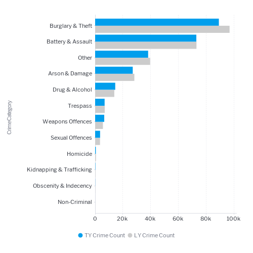
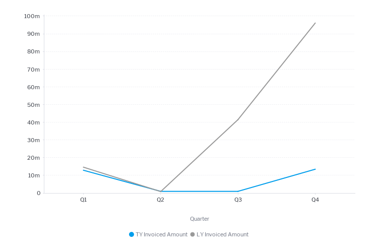
Variation & Comparative Analysis
Variation analysis enables a user to understand how a metric has deviated from a target or comparative value. For example, if you want to understand what caused an increase in revenue this year compared to last year you may look at how revenue changed by each product category to understand the drivers of that change. Variation analysis is most useful when users are trying to understand what changed and what the key drivers for that change were.
Variation analysis is used to compare performance between items such as:
Compared to Example Plan (or budget) Actual sales compared to the sales budget Forecast Actual sales compared to the sales forecast Time Period Sales this quarter compared to sales for the same quarter last year Average Telesales conversion rates for an individual compared the average conversion rate across the whole organization Benchmark The percentage of loan defaults for a bank compared to the industry average Standard Number of manufacturing defects compared to a defined standard (eg ISO) 
Threshold analysis
Threshold analysis or KPI reporting is a very common analytical use case. The data is visualized very simply as a number for a particular time period. It can be as simple as a single big number chart – showing revenue to date or include variation from plan or target. Thresholds are very common and popular for dashboards because they immediately provide information on overall performance. They generally must have supporting charts and tables to allow a user to understand the detail behind the number.

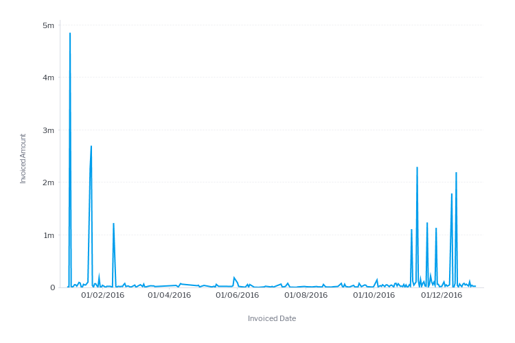
Time Series Analysis
Time series analysis is one of the most common ways to present data. A time-series displays how a metric changed over time. Users are looking for trends, changes in direction, spikes and drops. For example revenue over time may show variations over a holiday season or growth over time.

Accumulation Analysis
Accumulation analysis enables better tracking to a particular goal over time. The end-users want to see how with each passing day or week that they are approaching their goal. Instead of each time period representing the actual value for the period, it shows an accumulation of all prior values up until that date period. For example, how are quarterly sales tracking to quarterly sales targets.
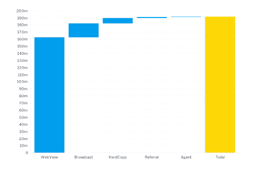
Composition analysis
Composition analysis is used when users want to understand the proportion that each categorical value represents to the total. It is very useful to know how a metric is divided into parts and the percentage of those parts. For example sales by product. Knowing the percentage breakdown of sales by product provides insight into high or low-performing product categories.
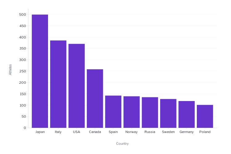
Ranking Analysis
Displays metric values for categorical data in order by size in either ascending or descending order. The ranking is useful for users when they want to see relative performance or compare between categorical values. For example top 10 salespeople or bottom 15 products.
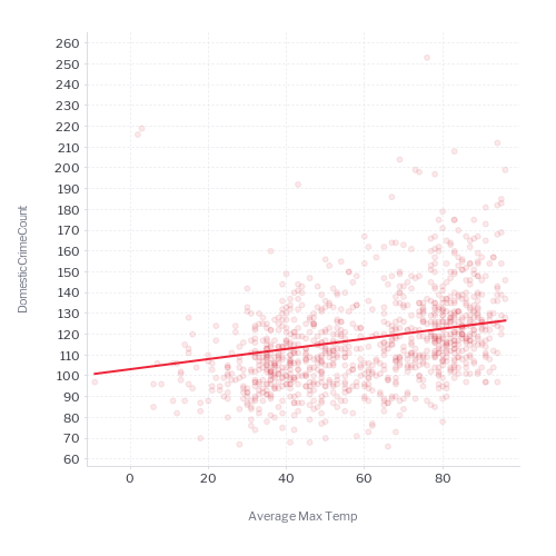
Relationship Analysis
With relationship analysis users are looking for correlations in their data. For example, is there a relationship between weather and umbrella sales. Relationships help users to predict what will happen if certain scenarios are repeated or if patterns are predictable.

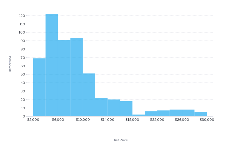
Distribution Analysis
Distribution analysis provides a user with insights into the spread of values across their data. For example, if you want to know how many customers you have in low, medium and high profitability segments you would use a distribution analysis.
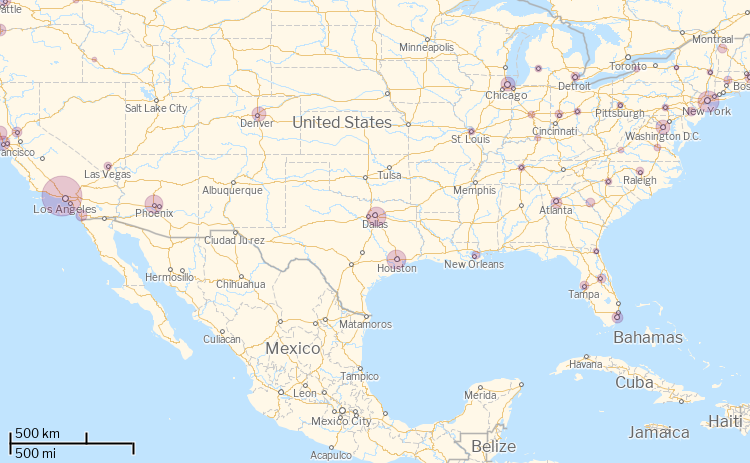
Location Analysis
Location analysis enables a user to understand a metric in terms of location or geography. This could be sales by store location or even by shelf location within a store. More importantly, location analysis is unique in that it is one of the few analysis types that tells a user where something did NOT occur.

-
Chart Types
The following is a list of commonly used chart types and their purpose.
Chart Type Purpose Example Bar C9 Column C10 Line C11 Pie C12 Big Numbers C13 Meters & Dials C14 Stacked Bar C15 Stacked Column C16 Map C17 Scatter Plot C18 Histogram C19 Box and Whisker C20 Heatgrid C21 -
Chart and Analysis Fit
The following table provides a guide for chart selection based on the analysis your users want to do or the way in which you want to communicate your data.
Analysis Type Best Alternatives Variation Bar Column, Heatgrid, Line Threshold Big Number Meters, Dials Time series Line Column, Area Composition Waterfall, Bar Column, Stacked Bar & Pie Accumulation Line Column Ranking Bar Column Relationship Scatter Plot Line Location Map Scatterplot Distribution Histogram Box & Whisker